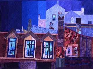
Value sketches are so important both for the quilts and for the watercolors that I do. Two people responded to my request for value sketches!!! (see below)
If you try out several different value studies, you can then pick the one that’s most interesting, and also the one that best reflects your theme.
Whitney had looked at many “Old Masters” and analyzing their compositions in terms of 3 values (light, medium, dark) came to the conclusion that there were 5 variations that seemed to occur very often:
a dark shape with a medium background,
a light shape with a medium background,
a large dark and a small light shape with a medium background
a large light and a small dark with a medium background
a gradation of values from light medium to dark across a light background.
But, as the mathematically inclined have already figured out, there are several more possibilities!
One thing to remember is that a piece is both more cohesive and more interesting if one value is dominant, and another used very sparingly as an accent (obviously that works better with the lightest or the darkest value).
I like to use Photoshop when working out compositions – you can use it to assess values but also in many other ways: crop a piece, to enlarge horizontally or vertically, to flip images, to repeat images, or layer them. Generally I make a line sketch, scan it into Photoshop so then I can resize at will, crop as needed, print out several copies and then shade them in different value variations. For simple reversals of values, use Ctrl-I – a marvelous command which instantly reverses the values. It would be good if there was a command that would print out all possible value variations for you!! You can use the fill tool but it's a bit laborious I think, though it might be interesting to use it for whole areas!! hmmmmm, now there's an idea!!
Nina sent these two images:
- she has changed a very small section of the values only, but if we look at one inverted, what a different impression we get!
I wouldn't suggest leaving the face that dark of course but the lovely soft background would make a much lighter value face glow!
On a two value study, there’s a very different mood with each variation:
Here are Nina's hand studies alternated:
Using the photoshop move tool you can build up an image;If you use transparent layers, you can superimpose and create a whole forest of hands!!
Here is the same image shaded two different ways from Jackie: you can see that a different mood is indicated quite clearly by the different shading:
Taking an old image of mine (the quilt I made from it is at the top), I first changed the shape to a square

then doubled with a reversal,
then layered 3 images:
Lots of fun!!! I just keep generating images, what if I try this? and How about that? at this point No Editing...
once I have a lot of ideas, then I try them out with different values, then I pin them all up on the wall and live with them for a while, gradually removing those that are boring, or awkward. and that's just the beginning of the design process of course, sometimes more ideas come to mind, frequently as I begin to block out the quilt, I'll make more changes...
And, if you have been, thanks for reading!!! Elizabeth


3 comments:
Your post of today reminds me that I need to get more "with it" with the Photoshop business. I can see what a great design tool it could be for ideas. But I need to get a bit more confident with sketching first! However, I could see cutting out stuff from magazines, for example, collaging those and scanning those in to see what comes forth too....My new edition of Photoshop Elements 6 for the Mac has a collaging tool to play with. Thank you for your ever informative posts.
Just wanted to say that I enjoy your blog. I actually read and think about what you have opined. I just got Adobe photoshop (totally overwhelmed) aand I can see where many variations could be shown without sacrificing fabric or other mateials. I tend to work in medium values and add dark for my accents. I just like the satuation of color. I like the idea of working with the line drawings in Photoshop. I had another program that gave me great outlines on photographs. I hope this new one will do it. I have been told that it can do anything if I just learn how to control it.
I too love your blog and have
Photoshop Elements but haven't yet taken time to learn it and play with it..... there are so many exciting things to do but it takes time to learn.
Your blog is the most thought provoking -- I absolutely love it.
I hope someday you write a book.
Post a Comment