Wednesday, December 30, 2009

The Elusiveness of Simplicity

I’m struggling with simplicity!  In art, in life, in the garden, in the wardrobe!  Simplicity is achieved when anything that is unimportant, never used, irrelevant, superfluous (not to say redundant as well!) is removed.  I do love to get rid of things…but when the naked few are left, they have to be perfect.  Art is not only choosing what should be IN but also what should be OUT.

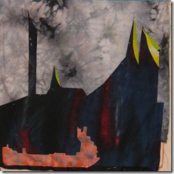
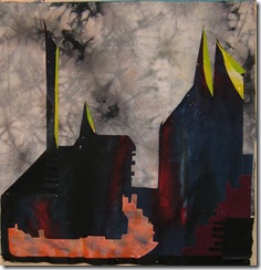
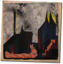
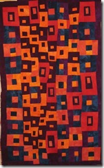
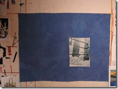
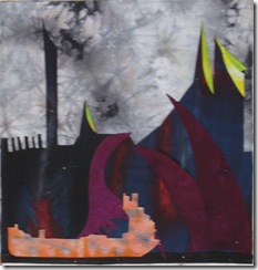
I hate books or films that are padded out with rubbish, so I’d like to get rid of it in my quilts…IMG_1929 And everything that is IN should relate to everything else that is left.

IMG_1930


IMG_1931


IMG_1932


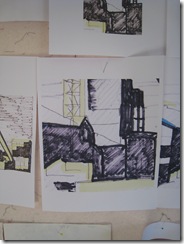
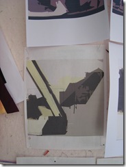
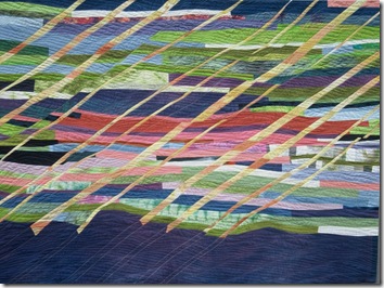
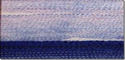
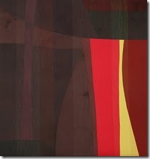
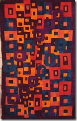
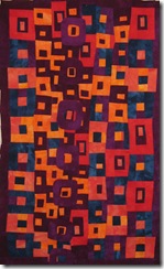
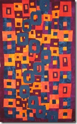
In the above sequence of pictures you can see my first attempt …which included pipes sticking up on the left and 3 purple monsters approaching the barge!!!  Well I got rid of those (image 2) but then felt the very dark shape in the middle ground was just too solid and boring…also it meant that the whole piece was almost equally divided between light and dark….so I increased the amount of light and cut into the dark to make the positive /negative shapes more interesting…also that would enable more of a connection between the light shapes and the dark ones (image 3).

Then it felt like the very light foreground shape on the left didn’t connect with anything else…also you couldn’t really see the similar shapes on the bottom right so I added in more orange…but now I’ve got too much again!!!  so I’ll be working with my trimming shears this morning!

And if you have been, thanks for reading!  Elizabeth

Monday, December 28, 2009

Strengthening exercises

a new day                       A New Day  (55”w, 26”h)
it’s the New year’s Resolutions time of year…in the few days before I have all these wonderful ideas about the amazing changes I’m going to make!!!  well…it’s lovely to think about anyway…

The way to succeed in many pursuits is by practice and by doing strengthening exercises: most athletes these days work out to increase their skills, so do dancers, musicians, mountain climbers and truck drivers.  So what strengthening exercises might we as fiber artists do?  I want this to be a very collaborative blog...I have a few ideas, but need input from every one! Including the reader in my 106th country - the Isle of Man!  ( I do love the widget that tells me how many countries are represented by readers of this blog - even if some of them got here by accident!).

barton jaunty ladies                       Jaunty Ladies (those are the ones that exercise!) (45”w, 27”h)

So back to some possible exercises. In no particular order…
1.What would make our critical eyes stronger?  Maybe a  half hour of looking at art each day...being inspired by it, then by thinking about what it was that really touched us and made a connection.

2.  Lie back and imagine how you could make a quilt based on one of those images.

3.Look at pictures and squint up your eyes to see the values...go for a walk, every 10 minutes stop! and squint up your eyes...observe the value pattern.

4.What would make our compositional skills stronger?  maybe looking at  possible inspirational photographs each day and deriving a quick value sketch.   What would you need to move, add or subtract to improve the composition?

5.Every other day...we could take the best of  those value sketches and quickly cut out a small piece of no more than 5 elements...just following the value pattern..

6.Twice a week take one of the elements that you cut out and place it on a plain background and then add 4 more shapes ....  think about harmony - the shapes should be from the same family...but with their own distinctive characteristics, however one should be dominant.
distant lights from slide

on the left: Distant Lights (38”w, 56”h) – don’t let the lights be too distant!


7.Every day drink a cuppa tea and gradually read all those books you've been buying!! figure out which will be helpful and which not.  Learn to discard unhelpful practices.

8.  challenge yourself to come up with new and interesting colour schemes...try to notice one each day - on your daily walk, while reading a magazine, or surfing the 'net....pull out fabrics to match and cut snippets to make a sample page to keep in a notebook.

okay! now it's your turn!!! what exercises would you recommend?  the Olympics are just around the corner! Let’s all be stronger in the New Year!

And, if you have been, thanks for reading!   Elizabeth

PS All the above quilts are available for purchase, prices between $1600 and $2500 depending on size.

Wednesday, December 23, 2009

Beginning a New Piece: the sketching stage

I usually overlap several pieces and ideas at once…I find that works out better given my restlessness…if there’s a problem with one piece I can put it aside on the “other” design wall, and turn to pieces at a different stage.   I’ve finished the commission piece I wrote about before – finally opting for the less cluttered version:IMG_1920                                                                                                                                                                                                                            

IMG_1921

Full view on the left, and detail on the right.  I havn’t worked this colorfully, abstractly or traditionally in several years and it was a lot of fun…I think I might have another go at it!


However before that,  I need to make one more piece in the industrial landscape series for the Festival Of Quilts, where I’m mainly going to feature industrial pieces – but not entirely!! don’t want to seem too one-dimensional!

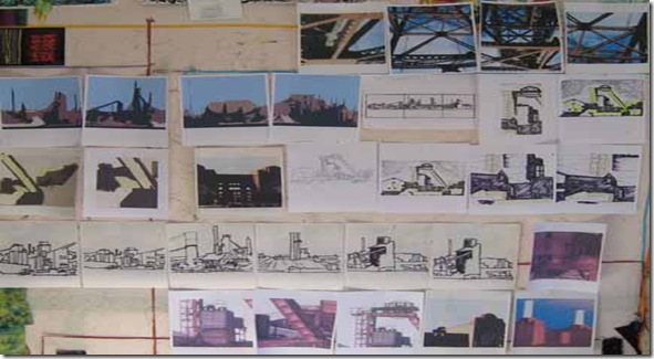
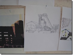
I’ve been sketching out ideas from some of my photographs:

IMG_1916 

I definitely think I have enough to be going on with!   I blow up, crop, distort and simplify both the photographs and the sketches based upon them – I’m working from the steelworks in Ontario again, plus some bridge struts (lying on my back in the car while we went underneath (and no I wasn’t driving!)) and some old colliery pictures – my grandfather was a miner at Stanley in Co. Durham so I like that connection and of course I’ve visited the fascinating museum at Beamish – definitely recommended.  I also have some photos I took of Battersea power station when I took the Thames trip upto Hampton Court.  I love boat trips!  If there’s one to be had – I’m on it! Let me know if you need a companion!

IMG_1917 IMG_1918 IMG_1919

I’m going to let these “air” a little bit on the wall, while I pick out some juicy colour schemes .  I continually cast my eye over the sketches and gradually eliminate those of less interest.
While at the same time, of course, consuming Christmas cake, mincepies, apples and cheese and various libations to the the solstice gods!! All my good wishes for peace, health and creativity – or if you can’t be creative yourself, then an appreciation of creativity in others!
And, if you have been, thanks for reading!   Elizabeth

Monday, December 21, 2009

on the virtue of patience

I used to really panic if a piece wasn't working out right, franticly ripping out bits and trying other sections, will this fabric work? will that? should this bit be smaller? larger? until finally of course I had cut all the table legs down to stumps trying to make it balance!

 383214-R1-E009
The same with watercolours - I'd keep slapping on paint...and, of course, end up with mud.  Watercolor tells you pretty quickly if you're doing too much!
I've seen it in workshops often...a person tries every fabric she's brought, rushes down to the vendors...comes back with all sorts of trial bits..but none of them is quite right, back down to the vendors, prowling restlessly round other people's tables..either eyeing their stash, or despairing at the other person's progress compared to their own - admit it,  you've done it!!

  383214-R1-E005
But the answer is patience...eventually the right resolution will come..take your time, leave it a bit..look at something else..even put it up on another wall..if you've got the main structure and large shapes worked out right, there will be a solution.  With the watercolors I've found working on several at once helps me...of course with paint you have to wait for it to dry..but that is good, it forces you to wait, stand back, take a look at what you're really doing.  Is it working as a whole even if the details aren't quite right?  So, next time you feel that panic coming over you, stand back and let the fabric dry!!

383214-R1-E006


It’s the winter solstice today!  Rejoice!  Tomorrow will be lighter (unless of course you’re reading this below the equator, in which case enjoy the midsummer rites!!  If you have been, thanks for reading.   Elizabeth

Friday, December 18, 2009

A grey day, sitting by the fire and reading Hawthorne

framed allatsea 72dpi

It’s a wet, cold, grey day here in sunny (?) Georgia and my thoughts are turning to colour!  I was reading Charles Hawthorne, an early 20th century painter who founded the Cape Cod school of art.  When he first went to Provincetown it was a small fishing village – imagine! – he was so impressed by the light and space that he began painting and teaching painting there.  Often he had classes of upto 100 painters spread around him on the beach figure painting from a model! Sadly, I have no photographs of these events!  His constant aim was help his students see their task as one of getting spots of colour in the right relationship with each other.  He wanted them to forget about details, and focus on the large masses of colour:  “Simplify the big notes of color: ralize that the notes of color make the object ..reproducing the relation between color values recreates the object.”

Some of the  art quilters whose work I admire most do exactly this.  They are not afraid of big pieces, but these are not flat colours they’re full of depth and gradation.  The relationships between the positive and negative spaces and  the light and dark values are balanced close to perfection – but not so close that the composition is static, just a little off to give some tension to the piece.

BEHINDTHEVEILFULL

This is Terry Jarrard-Dimond’s quilt: Behind the Veil.


Stills_25_lg


And this is Dominie Nash’s Stills from a Life #25.

Nancy Crow also has made some amazing pieces where large “spots” of colour are balanced one against another e.g. her piece Constructions #25.
I don’t know Nancy so can’t ask her permission to show an image, but you can see them on her web page.

Hawthorne wrote: “ it is virility of colour that makes truth”  and you can certainly see strength, boldness and a great creative force in each of the above quiltmakers. 

There are so many bon mots in Hawthorne’s little book (Hawthorne on Painting) that I’ll just give you one more and then I must go and seek spots of colour!: “don’t be the one who knows how to do it, but be the one who recognizes beauty when it comes – then stops…when you get it, be intelligent enough to stop”.

and, if you have been, thanks for reading!   Elizabeth

PS  the piece at the top is a small stitched piece I made a couple of years ago called “All At Sea”, which I often am!

Wednesday, December 16, 2009

Choosing Colours

One of the most fun parts about making an art quilt is picking out the colours!  It’s like a wonderful feast with all your favorite food, drink, music and companions!   I like to keep an eye open for colour arrangements that really sing – whether it’s in a painting, in landscape, or just in piles of fabric lying around the studio.  Paintings are one of the best places, though, to find great colour schemes because the colour varies so much more in a painting and it’s all those subtle variations of colour that really make the scheme rich, fascinating, memorable.

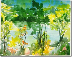
here’s a little watercolour:

pond late

this isn’t the most exciting composition – that’s for sure! but the colours in this little piece look so fresh they constantly draw my eye.

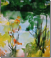
so I reduced the resolution down to about 5 pppi:   IMG_1911 

I find doing that helps me to focus more on the colours…

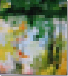
I then step down again and again until I feel I have “lost” the impact of the range of colours.   So going down to about 3 ppi, I still have a glorious summer range of colours:

less


but notice how important that one bright red square is…if, I reduce the pixels even more – down to 1 ppi you can see that the piece becomes much duller without that contrast:

least


In fact, it’s positively dull!!

so when I go to pull out fabrics that match the colours, I’ll be sure to work from the 3 ppi or even the 5 ppi…

As well as helping you choose a really beautiful colour scheme, one of the things that doing an exercise like this does is to show you the importance of simultaneous contrast.  Colours look richer when there is an adjacent colour that is highly contrasted in one of the four variables along which colour changes.   If you want a colour to stand out, to look richer and more noticeable, put next to it another colour that is very different in hue, value, intensity or temperature.  The red spot stands out because the colours next to it are much softer (lower saturation or intensity), they are also paler, and if you notice there is a blue one that is much cooler.

Now to dive into my stash!!!  If you have been, thanks for reading!  Go forth and Look At Colour!   Elizabeth

Monday, December 14, 2009

The Education of the Artist: Getting to work

Sometimes when I’ve finished a piece I’m just raring to go with the next piece taking shape in my head, but other times I find myself wallowing. Especially when I’m distracted by other activities – like holidays!, like finishing up a commission, and also like framing up 12 new watercolours for a show!

iona 5 north west beach

I  started doing watercolours for two reasons: first, I found them a good way to sketch out an idea for a quilt, especially for a commission. I could draw/paint several ideas pretty quickly and because it was a little painting I wasn’t completely Locked In to specifics. (I’m not good at being Locked In!  I don’t think creative people are). Secondly, I thought that in painting classes I would be able to pick up a basic art education. Well, I was wrong there! The painting classes  I took were as lacking in composition, design, colour theory etc as the art quilt workshops I had taken at that time.  In frustration I turned to books, and from them I have learned a lot – people have been writing books about painting and art for hundreds of years!

I learn best from books if I make myself take notes, articulate the ideas aloud, then type them up and reread them a couple of times. Recently I’ve been reading a very old book on Composition by Arthur Dow first published over a hundred years ago…..And what is he complaining about? Poor art education!!   He felt  very strongly that learning about composition (which he defined as the putting together of the elements  of line, value and colour) to be a better approach to understanding art than what he styled “imitative” drawing.

He stated that the first step in an art education  should be learning how to unite elements harmoniously. He proposed a series of exercises from “simple harmonies” to the “highest forms of composition”. You can see this in music training and it makes sense – but I have not seen it done in art. He felt approaching art training in this way “through structure” was vastly different from the main training method used when he was a teacher in the early 19th century which was “imitation”. (and is still be used today!).
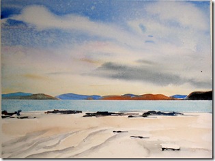
iona 3

He wrote: “composition, building up of harmony, is the fundamental process in all the fine arts”.  His main thesis was that one should learn the steps involved in making art one by one, practice them…and then gradually being able to use them without thinking about them consciously.

Imitation vs structured learning.
It’s tempting to teach by imitation (in Yorkshire we called it the “sit by Nellie” approach!)  because it’s much less onerous for the teacher… that’s the way art classes were done when I was at school..but how much can you actually learn? Unless you have a natural talent and actually just forge ahead on your own while sitting by Nellie. ..Imagine trying to learn to play the piano without knowing about different keys, different rhythms, or even what a rhythm was? It’s the equivalent of playing you a recording of Rubenstein and then saying well there’s the piano, now have at it!!!  As Dow says “an infinite amount of time is wasted in misdirected effort”!

A more recent book which also advocates a basic understanding of elements and principles  is Picture This by Molly Bang.  Molly Bang describes her own art education as beginning when she was told by a friend that she  didn’t  really understand how pictures worked.  In order to learn this,   she read books, took classes, went to museums and galleries and finally decided to teach it herself – to children.  From the children she learned that certain shapes and colours can evoke various feelings…and from that discovery she tells a story, a very emotional story involving hope, fear, terror, love, anger (Little Red Riding Hood) using just Dow’s three basic elements of line/shape, Notan (dark/light) and colour.
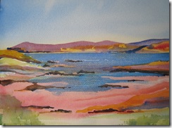
aurum 1 iona 1

  From the children and,later, adults she taught she became convinced that anyone could use “a few clear principles to build powerful visual statements: emotionally charged arrangements of shapes”.    Using only those three basic elements in their simplest form she  beautifully  and clearly illustrates the basic principles of contrast and harmony, proportion and direction, rhythm, movement and economy all working together to convey the basic theme of each picture. 

So…if you’re wallowing! Settle down and read a good book – there are lots of them out there!

And, if you have been, thanks for reading!  Elizabeth
P.S  all the pictures are of Iona which I visited last summer.
Friday, December 11, 2009

Revelation: art is improved by subtraction, not addition!


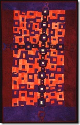
chain cross 300

Michaelangelo realised this long ago when he said he “simply” removed from the large block of marble everything that was not the subject of the sculpture! 


It has taken me the act of revisiting a piece I made in 1995  to come to the same conclusion.   I was given a commission to make a piece similar to Chain Cross (see left) . 


chain cross 2 a 

First, I began with the basic structure…I immediately junked the border – I think borders are a hangover from traditional quilts …where their purpose was simply  to extend the quilt over the edges of the mattress…since (with luck) my quilt is going on the wall (not on a mattress!), I had no justification for adding a border and it restricted the action unnecessarily. 
The second change I made was to vary the fabric much more…slightly shifting hues, values and intensities brings a piece to life..it’s a little more effort than cutting everything out of one piece of fabric (which we’ve been taught to do doing with strip piecing) but adds so much more depth to a quilt that it is well worth it.  I must admit I wondered when I took the improv strip piecing class years ago WHY one should use the whole width of fabric to strip piece …who wants 45” of the exact same colour?  So….my advice would be NEVER use the whole width!!  Much more exciting. 
The third thing I did was to try to make my value shapes join up much more…so the lights add together to form more of a cohesive pattern, as do the darks…I never even thought about value and value patterns in 1995.  But doing this gave my piece depth and movement that didn’t exist in the original.

The original design had a chain across it…   I tried several different ways of adding this chain.    I tried doubling it in purple and blue, I tried one vertical purple chain, and then a kind of spiral.  I did also try it with the light centres that I had on the original piece – but didn’t take a photo…they looked so bad..like giant zits!

chain cross 2 blue chains chain cross 2 one purple chain chain cross  one blue spiral chain

I wasn’t really happy with any of these possiblities, they just looked messy and confused: I remembered that I had added the chain all those years ago because when I first started making quilts I was afraid that I wasn’t putting enough into a piece.  I would add more and more things in case the quilt was boring.  Also every time I looked at an “in process  piece”, if I was unhappy with it, I had one solution: add more!  Eureka!!  I still  do that!! Aha!! 

I sent the client the pictures ( I love to do this for a commission, try out all the different possibilities I can think of and then get some input)..hoping that he could see what I (with my more mature  and hopefully educated vision) could now see…that the piece when unbound and enriched with more colour and variety instead of the rote strip piecing did not need a chain or anything else.  It’s rich enough on its own without adding any clart!

and I’m happy to say he could!   So now I must baste and quilt it…before starting something anew.
If you have been, thanks for reading!  And now I must go and frame a dozen watercolours – life is so hard when you have TWO engrossing interests!  I think I’ll give up housework as well as cooking and shopping to make time!    Elizabeth

Monday, December 7, 2009

Beginnings: first to tidy, then to find five strong shapes!

I’ve reached a stall point on my chain/unchained piece (!) – i.e. it’s in the client’s hands to decide the next step for there are many possibilities …..my studio is cleared – I only allow myself to tidy up when a piece is finished – or, as in this case, when my active part is suspended for a while.  I find having this rule is really helpful because it’s so easy to convince oneself that things need tidying and there you are right into a displacement activity and no energy is directed toward solving the problems in the piece on the wall!

IMG_1188

However, all is calm and still now in the studio…ready for the beginning of a new piece.  So – how does that happen?  some people are able just to jump right in, pick up a piece of fabric, on the wall and off they go!  I admire this freedom! but cannot do it…I’m one of those people who makes lists and packs for days and considers all the alternatives before making a trip and making a piece is a journey too.  I’m more sanguine about reaching the end of the journey than I used to be…I know I usually reach the end, and if I don’t well, the sky actually has never fallen down!

So here I am in list making and alternative assessing mode which for me first involves harnessing the vague tendrils of thought  I’ve had about the next journey  – with luck I’ve written them down, or at least begun to collect items.  Twyla Tharp makes a shoebox for each piece she creates..it’s a great idea.  Very few artists begin in a complete vacuum…though many do the opposite:  start with a giant idea and vacuum away to approach the kernel!  I like to think back to what theme or image has tended to repeat or stick in my mind…I’m still very drawn to the industrial buildings, but I would like to break out into colour.

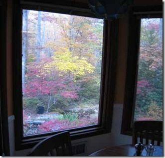
07novf   We planted several hundred acers (Japanese maples) around the house and my eyes have been feasting on all that saturated colour contrasting with the soft greys of the other trees in the background.  So I think that’s going to be my palette. 


I feel the need for a slightly bigger piece since I’ve just made several small ones for the FOQ show…

bluebeard's castle tracy st silos collieryhamilton small detail_thumb[4] thames power station_thumb[2]

So I’m beginning to firm up: size, shape (landscape), palette and theme.   Now I’m going to permit myself to play with sketching and particularly with reducing the elements in the sketches.  My friend is right! I do focus too much on details and that’s not what I like in other folks work, so why do it myself?aorist

I’ll give myself the goal of producing 10 sketches in the next couple of days based on industrial landscapes, but not excruciatingly realistic…looking at the big shapes and values only.   I read recently that a strong composition will have a very limited number of big shapes (as defined by different values)….I’ve tested this out by looking at work I really like and it’s definitely true of those pieces.

My frustrations with the chain/unchained piece have been because it doesn’t have such a defined composition being a more traditional overall pattern.  It was a good exercise to revisit the idea, but it helps me to see that is not an underlying structure to which I respond.  That’s not the tune I’m singing right now (insofar as a frog can sing of course!).    So having played and drawn 10 ideas out, I’m going to assess them for shapeliness!  I want about 5 strong shapes….off I go!

In order to really push myself, I’ll state that I’ll blog the sketches very soon…( though I am getting a new (yes! finally…a laptop! ..thank you to all those who’ve bought from me this year!) computer today – in the other operating system – I’m told switching is hard but it will be worth it when I get there!!  And it will definitely be good exercise for the little grey cells!)   …And, if you have been, thanks for reading!  Elizabeth

Friday, December 4, 2009

Robert Genn on Reinvention

I was very interested this morning to read in Robert Genn’s newsletter his thoughts on the same topic I addressed yesterday – that of going back to an older piece and working again from the same idea, but with considered cogitation!
  He writes: “While appreciating what you did right in the past, free your mind to reinvent and refine in areas previously not thought of.”

As well as the points I made yesterday about removing unnecessary detail, adding interest where it lacked it and needed it, making the colours richer, subtler and more varied and overall being looser…he also advocates looking at every aspect of the piece and seeing if you can push it in a slightly different direction.  Instead of working more quickly, try to work more slowly…but with a great flourish.  Definitely loosen up where things were too tight.  Address the negative areas ( I really didn’t have any in my first piece, but tried to get the effect of some in the second) and check out the focal area and the track of vision – was it strong enough?  or alternatively, was it too obvious?  Was there some mystery?  or if things were too vague, could they be clarified?

Reworking a piece is a good time to take risks!
This could be the start of a series…

If you have been, thanks for reading!  Elizabeth
PS I still havn’t figured out whether or not to include the chain on Chain Cross #2, I think I’m going to send the client pictures both ways and let him choose!

Thursday, December 3, 2009

Rethinking, remaking, updating

I’ve been asked to remake a quilt I first made around 1995..at first I thought no! I’m not going to repeat myself, no! I’m not going to back track…but then I started cogitating…

One of the things I’ve learned from watercolour painting is that each time you try to paint something again you can work faster and looser, you have much more  sense of what it is about the image that is important to you, you’re less inclined to add in fussy details, but at the same time you can recognize areas that might be flatter or less interesting than they need to be.   chain cross 300

So I looked again at my original piece to see if any of the “watercolour improvements” could be used in remaking the piece.     Could I work faster?  Well, no!! That one wasn’t on…but that is the least important.
Could I be looser?  I felt that I could: after making the first piece I was sorry I had trimmed the edges of the central panel so straight..it contained the action too much.  I tried to overcome that by extending the chain out across the borders but I did it too meekly and they just disappear.  So I knew I would want to keep more of an irregular edge.   
Also back in the 90s, I was still thinking you had to add a heavy border to everything which again is too controlling.  One of the advantages of getting older is in relinquishing control (not that my daughters would always agree!! but I’m trying, I’m trying!)…so one thing I could do would be be to minimize the border.

Another improvement that I’ve learned from watercolor painting – is to keep shifting the colour slightly…in painting you rarely want to stick with the same flat colour for long, and it’s easy to shift the hue, value and intensity slightly.  Of course with hand dyeing – once you got a stash big enough (and believe me mine is bigger than it was 15 years ago!! along with…but no we won’t get into that!)- shifting colours is easy…important to stay in the same colour family though.
  chain cross 2 a larger file


Looking back at the earlier piece, I realised I did like the way the darker colours formed sort of pathways through the piece and I knew I wanted to keep that effect.   However, I think I want to integrate the “top” chain much more with all the background chains… that I have yet to do… this is the piece so far – I’ve got more depth, more colour, more movement..now to figure out that final effect of one chain coming a bit more forward than the others…

Surprisingly then, I think I’ve really benefited from thoughtfully reworking this old idea..I could see both what is lacking in the older piece, and what it is that I want to retain and, if possible, enhance.   It’s also been fun to revisit a palette and series that I’ve not worked in for a while!  a much more worthwhile exercise than I ever expected.

Let me know what you think!! 
And if anyone else wants to commission me to rework an earlier piece – I’m all for it!!
if you have been, thanks for reading!   Elizabeth