Wednesday, September 30, 2015

the Best way to improve.....

Don't forget if you're in Athens, GA to come down to Clayton St tomorrow night! October 1.  6-8.30
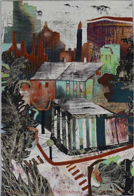
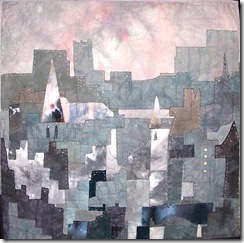
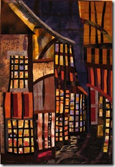
to see a show of parallel paintings and quilts...

The watercolor


The quilt

Meanwhile, having got the show all delivered and set up, I turned to other things......and......
I was talking to a 17 year old boy last week - since I left the university I rarely have a chance to talk to people in this age group and it was lovely to get back to it - especially as he was very polite!
But talking to him about a number of different activities (reading, typing, swimming, dancing, speaking a foreign language, music, learning, drawing etc), I realized that he kept coming back with the same refrain:  "I wasn't naturally good at it, so I gave up". Sadly he may well have tried these things but been laughed at by his peers...or even parents or teachers.

Of course few of us are "naturally good" at anything!  And those that appear to be, are generally speaking the product of homes where that particular activity has been encouraged, taught and stressed from a very early age - so early that they don't remember a time when they weren't engaged in it.
Yes it would be lovely to grow up in a bi- or even trilingual home with highly artistic or musical parents who had us drawing, painting, singing and playing at an early age with lessons in skiing and skating and swimming and tennis, and lots of books being read and discussed, and computers with fun typing games - oh yes! that would be really lovely!  And then we could be so happy because we were "naturally good" at an amazing number of things!

The childhoods of Picasso and Mozart and the Williams sisters and many others such are well known and you can see how the access, the encouragement, the teaching and training began right from the minute they could hold a pencil/racquet or plonk out notes on a keyboard (not at the same time of course!)

It's been said many times:  the way to the famous musical performance venue,  Carnegie Hall...is "practice, practice, practice".    And, while you won't get good at doing everything by practicing,  I think it's pretty clear you will get much better at your practiced activity.  I doubt Mozart was very good at tennis, and I don't think Picasso or the Williams sisters could form a musical trio!  Be interesting, though, wouldn't it?

With something like art and art quilts, the best way to "practice" is to keep making work of the same type - focussed practice .  (I'm sure that's true of other activities but I don't have much experience of them.)   Working in a series, whether it be a series of serves, of sonatas or of serigraphs, develops one's abilities tremendously.  You can become very good at what you do if you specialize.  That's why you don't go to a rheumatologist for brain surgery!

Working in a series is also very emotionally satisfying.  You're not scattered around trying this idea you saw there and that idea you saw here, you're looking inside yourself:  finding out what really really draws you in, what subject, what format, what focus makes you feel really connected - to yourself, to your art, to your subject.

it just so happens (!!!) that I have a short course focussing on Working in a Series beginning this week with the Academy of Quilting  and I do have a book out - with the same name - published by C&T last year, you can order a signed copy from me, or go to your local independent book seller, or Amazon. Do think about the class though...you don't need any prior experience.  Also it would be helpful for other media..other than quilts.    It would be lovely to see you in class!  Please feel free to use the Comments section of this blog for any questions, or email me privately (link on the sidebar).  But whether you're interested in the class or not, do think about the importance of practice next time you feel those words "I'm not naturally talented" about to pop out of your mouth!!!

There's the old story about the famous pianist who was approached by an admirer after a concernt: "I'd give an arm and a leg to be able to play like you", said the fancily coiffed admirer.  He replied: "Madam, I gave 40 years of my life!".   Now you don't have to give 40 years to improve!!  Really, it does start working in the first couple of weeks.....give practice a try!

And, if you have been, thanks for reading!   Elizabeth

Wednesday, September 23, 2015

A local show: the many benefits


                                         (yes, it's a quilt!)


quilt
 In nearly every town there are lots of places to show art: local art centers, public libraries, small galleries, restaurants, doctors' offices etc.
 It's a really good to get your art out there, maybe sell something, probably not...but you will always benefit in many other ways.


1.  Firstly, it's a really great way to make you finish work!! so often I have a piece almost made and then run into a problem, meanwhile another piece is calling out to be worked on and the first one is put aside..yet another unfinished object circling the orbit of the sewing rooms.....


2.  A show forces you into the next step too:  Not only to actually getting  the work finished but also to prepare it for  showing.  I have quilts and paintings stacked up...no sleeves on the quilts, no threads nipped off neatly, photographs not taken, rods not cut, paintings not matted, backed and framed etc etc.

3.  Organisation!
quilt
watercolor
I do so envy those people - though I think they are Very Rare - who have an idea, make the fabric, cut it out and sew and quilt and finish the piece. Back it, photograph it, cut the hanging rods, make a cute little - well labelled - cloth bag for it and place in neatly on a rack somewhere.  I have rooms with quilts spread out on the floor as I hunt madly for The One that someone (finally!) wants!!  "I'm sure it was in here somewhere."  The noodles are all labelled, alas with the names of quilts long gone!!  I think there was a system here one time - now was it chronological, or size-logical?  or something else?

watercolor
4.  Letting others see your work and realize they have an Artist in their midst!! 
 Having to live up to something, really does make us reach higher.


watercolor


5.  Seeing all the work hanging beautifully in whatever facility you've persuaded to show it.  It's a real thrill!!

quilt
6.  Also as you see the work, the stronger pieces and the weaker ones make themselves known, and you can also spot those places where if only you'd added something or, (more likely) taken something out, the piece would have been better.
You see the work with new eyes when it's hanging in a gallery.

watercolor

7.  And some really places print up nice postcards!!  And (icing!) have an opening!!

OKAY!!  so did I take my own advice??  well...come and see:

So, for those of you that are in or near Athens GA....the opening is
Thursday October 1st: 6.00-8.30pm 
 at Aurum Studios, 125 East Clayton 
in Downtown Athens.

I have 4 new quilts, 3 about Athens, Ga and one landscape....and lots of watercolors!

If you have been reading, thank you!  If you are planning to come, I look forward to seeing you there...no nice cups of tea alas...but there will be a drop of the stronger stuff and a few good nibbles!!

Elizabeth

ps - all comments will be read and cogitated upon with considerable relish!!

Sunday, September 13, 2015

Colour: the big attraction


Like it or not, color continues to be the big seducer. So many people respond "the color" when asked why they like something, or when they reflect on what attracts them.  I wonder why?  Why is it important for us to see in color?  I couldn't find any obvious answers on the net...yes there are plenty of studies on which colors make us Buy or Consume the most!  As you might imagine more psychological studies have been aimed at advertising than anything else.  There are also some "color therapies"!!  Red will make you feel sexy, green calm, yellow energetic, grey depressed etc...presumably Damien Hirst figured that polka dots in many colors would attract a lot of mixed feelings!    But it's hard to see how color helps in survival...well, yes, perhaps at the traffic lights!!  

However, whether we know why or not, it is important to know that the colors we use in our work should be thoughtfully chosen.  It really doesn't work to just slavishly follow "local color" if you're working from a particular photograph - whether representational or abstract.  Sometimes the local color (i.e. actual color that the landscape or whatever really is) is gorgeous, but often it's a little dull and predictable.  Few of those city scape quilts that I made actually reflected the real color of the cities - which were mainly grey.  Not that I don't love grey! (see below!)

  Using a lot of different colors at once  does not constitute good color practice.  Think about it in terms of interior design – only one thing worse than beige beige beige is red yellow green blue brown and pink in one room!!
In the same way that a composition is strengthened by harmony within shapes/lines and textures, so is color harmony also something to be sought.  
Here's an example of what not to do (actually it looks a LOT worse in real life!)
dog
 Had I entered it into a show, I think I would have got the “most use of colour prize” !!  I have pink and red and orange and yellow and purple and turquoise and ultramarine and brown and black and white!  A great example of what not to do!  I do have some awful dingy beige  pieces in there too....I think somebody told me it was always important to add beige!!  

  It’s a great idea if you can discipline yourself (sadly something I’m not very good at!) to cut a small swatch off every fabric you own (that’s a different color) and work out a scheme from the swatches.  I usually do this with the whole chunk of fabric which means the studio looks like a tornado came through flinging fabric into the air.  You do need to see the color on the fabrics in real life though to make a good decision.  I'm not good at imaging a color scheme...I like to get the fabrics all spread out and see if they are both harmonious AND interesting.  Now that's a delicate balance:  too much harmony is Dead Boring and too little is jumbled, confused and unattractive.  But if you have the fabrics all spread out...you can see which way the balance is leaning.  

The first solution to consider for a color scheme that looks boring is actually not adding more color, but rather increasing the value range.  That, plus the addition of a little spice of a saturated color, might well be enough.
If the opposite is the problem: an eye shattering explosion of color, then the answer is to begin by removing the screamers!!  Then decide which color you have most of, which secondary color is its complement...and then remove all the other colors.
e.g. if there is a lot of blue, then you could keep all the blues, and  the complementary yellows, peaches, ambers and oranges, but remove the reds and the greens and the purples (which might look very good together in a second pile for another quilt!).

As most of us know there are really a limited number of generic colour schemes: monochromatic (one color), analogous (several adjacent colours on the colour wheel) and complementary (colours opposite to one another on the wheel). (split complementary is the same only you add the colors adjacent to the opposites).  Yes you CAN take 4 colours that form a square or rectangle on the wheel but it’s difficult to make a harmonious scheme doing that so I'd advocate against it, unless you're devising an advertisement for sugary cereal!

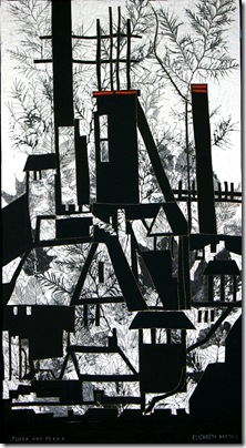
flora and ferra k
I love monochromatic – there’s nothing better for really giving a crisp result than one colour and white:  and I’ve used it a lot  - especially black and white.

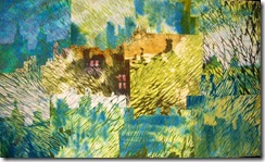
A monochromatic scheme is also great for setting a mood .  Here’s a quilt all in greens giving a soft woodland mood.
greenmansions
And another:   


And grey has been another favorite – grasping the softness of a misty morning:
foggyday
    I spent a whole year on grey!!  


An analogous scheme gives a soft rich mood – 3 or four adjacent colours on the wheel can be  so luscious.  Think redorange/ red /red violet – how sumptuous!  Or turquoise/blue/blue violet – cool and marine.  Or yellow/yellow-orange/orange – so tangy and fresh!  Yes you can almost taste those colour schemes!  it’s good with an analogous scheme to add a touch of a complementary colour as a minor note, a 7th note!  This can really pull your eye to the focal point.  In the largely green piece above you can see how I’ve a tiny touch of pink in the windows..
   petergate  
Complementary schemes: blue/orange, purple/yellow and red/green – and all the ones in between – yield a more complex harmony.   It’s important to make one of the colours dominant, however, in order that there’s no Battle of the Colours!  The choice would relate to the theme.   I have used the purple/yellow scheme many times, especially in the night scenes I’ve done.

Colour:  an excellent servant, a poor master!

And, if you have been, thanks for reading!  Elizabeth

and do let me know WHY we need color!!