Friday, June 25, 2010

Let us not contrived be!

“Don’t let your art look contrived!” said my friend as we viewed my latest efforts.  I knew exactly what she mean as I love work that looks fresh and spontaneous – while all the while being the product of great thought, balance, compositional control and probably years of practice and the result of many attempts to achieve this effect.  It’s like the actor playing a part in a long running stage play – every performance must be true, valid, dynamic and effortless.  Most great performances (whatever the medium) have this quality – it doesn’t happen as a result of being very young, very drunk and  (one thinks!) very spontaneous!  it’s practice that counts of course.  Practice, practice, practice and then letting go and being in the moment when faced with one’s medium.  I’ve been reading a very revealing book about the performance of tennis  (Open by Andre Agassi)where he demonstrates over and over the validity of this observation.

The problem of being too contrived occurs in so many situations: online,  I came across a beautifully scathing review of the work of Tamara de Lempicka   in the Sunday Times.  “Clumsy, Hollow and Contrived” wrote critic Januszczak.  de Lempicka’s contrivances were the result of attempting to copy Cubism, to fake much more knowledge (according to the writer) than she had of that particular art movement.  He stated that her nudes are worse than Clive James’ description of a certain body builder  running a Western state: “a brown condom stuffed with walnuts”!  Can you imagine that line in a quilting magazine?!  Read the art critics!! They are hilarious!

Januszczak writes about deLempicka adopting a style and attempting to use it even though she didn’t understand it and had nothing to offer it in terms of her own imagination.  This is a  problem evident in many a clone quilt!  de Lempicka painted mainly in the early 20th century; she continued for many years to search for new possibilities she could “adopt” without success.  

Following the inspiration of “primitive” art is a tightrope that many have tried to walk.  We know about Gauguin sailing off to the South Pacific and, of course,  Picasso was very influenced by African art and “our own” Nancy Crow was terrifically inspired by Anna Williams quilts.  They were all successful, but so often the result of a such a strong source of inspiration leads to one producing contrived art.  Inspiration plus development and work, not mockery and thoughtless reproduction, is required. Of course the twist in the tale (or tail!) is that de Lempicka’s work has sold well – apparently Madonna and Streisand collect her!  Hmm….I will leave you to your own thoughts there…

The opposite of contrived work is work that has variety, unexpectedness, bold strength not wimpy efforts, and has a clear impact on the viewer.  These qualities (and vice versa) were clearly shown on the Work of Art show currently on Bravo. where probably the most contrived piece of wall was the one that lead to that contestant’s exit.  There’s a lot to learn!  And that’s what so great about it!

So, if you have been, thanks for reading…apologies: my posting may be a little slim in the next couple of weeks as I’m teaching a two week class at Penland, up in the Smoky Mountains – looking forward to cool!  Elizabeth

Tuesday, June 22, 2010

Summer time! And the dyeing is easy……..

Dyes love the temperature above 70 degrees and here in Georgia they’re having a ball with mid to high 90s almost every day now.  So I’m alternating between agonizing over climate change and rejoicing in the reactivity of dye particles with fiber!
I posted before about RTS – reducing the stash…and since I’ve just returned from helping my daughter cull her shoe/boot collection by 50%…I’m in the “out, out out damned spot!” mode and even more determined to get rid of some of this stale, safe fabric that’s been languishing in my fabric collection and make some new bright inspiring saturated rich cloth.  
  My favorite substrates are Testfabrics 419  and an Ultra Sateen cotton produced by Kaufmann.  I’d be very interested, though, to hear of other fabrics that you have found to work really well. I know a lot of people like prima cotton, but I’ve never had a really good source for it, and I’ve heard that Kaufman (at least) is not going to be producing any more.
The Testfabric 419 is  a  densely woven bleached mercerized cotton that gives very crisp results with any kind of manipulation – whether it be painting, screen printing, stitch resist, clamping or tyeing.  The higher thread count does mean that handsewing is pretty much out but it does result in very rich bold dyed marks and images.
The Ultra Sateen, being a twill weave (ie. diagonal, rather then straight up/down), yields a softer, more blurred result with surface design, but in immersion dyeing gives beautiful glowing colours.
Like most people, I’ve found the MX fiber reactive dyes to be the easiest to use.  They work at reasonable temperatures (between 90 and 110 F for the most part) requiring no additional steaming or heating.    They store well refrigerated in solution – I have used them upto 3 years old.  Now there is definitely some loss of colour in 3 years, and I don’t recommend keeping them that long, but if life gets in the way and you happen to do that – as long as they’ve been kept cold, they will work.  
I mix them in the simplest way possible:  first I dissolve some urea in a little hot water in a jar. Then I put that jar in the glove box* (this prevents both me and the atmosphere around me being exposed to floating dye particles) with a small jug of water, a container with water for the mixing spoon, a spray bottle of water, and the jar of dye powder plus a clean, dry tablespoon measure.  Close the lid, hands in the gloves, add the required amount of powder to the urea solution, dirty tablespoon into the container, spray around with the waterspray to dissolve any spills, water added to the jar with the dye.  Lid on.  Shake ++.  Spray around again.  and that’s it!    I do then usually decant the mixture into a 16 oz bottle, adding more water to fill about 15 oz – leaving a little shaking room!
Of course the minute you’re trapped in the glove box, the phone always rings!! and your nose itches, and the music you put on reaches the end, or worse, gets hung up!  but all this just proves how needed you are!
I love to mix up a bunch of bottles,  and then have at it with low water immersion, dye painting, screen printing and shibori without worrying about whether I have enough dye.    I always have a big pile of fabric to be overdyed waiting too.  While I rarely “dye to order”, I do have a kind of shopping list in the sewing room with  “make more stripes” or “gradation dye lavender to purple” etc
So I hope your summer is going dyeingly well…and for those readers on the opposite end of the world…well…look forward to all that dyeing fun in 6 months when the thermometer gets into 3 digits!  oh good! it’s going to be 100 blissful dyeing degrees today!    
if you have been, thanks for reading!  Elizabeth
*a friend and I made our own glove boxes from acrylic sheet designing one loosely based on the lab boxes we found on line and No! I do not use an old incubator from which I tossed out the unwanted baby! (as one online rumour was reported to me!!)

Saturday, June 19, 2010

Fabric, fabric on the wall, who has got the most of all?

IMG_2242 
Are you in favour of a large stash? or do you dye or ( gulp) purchase (I just found out how much fabric COSTS now!) fabric for each new piece?

I was always a stash maker but now I’m beginning to wonder.     I can really only remember about 10% of the fabric I’ve got …and rarely do I have exactly what I have in mind as being the perfect colour for a particular shape.  Imagine a painter wanting to put a little dab of ultramarine in a picture and saying “well I’ve got pthalo, that’s close enough…it’s blue, it’s saturated, it’s dark and I bought this tube from that really fancy store and paid a lot for it – so I’ll use that!”
Yes…. sometimes that can work amazingly well because it just throws things slightly off  course and, believe me, I don’t like perfectly matched things.  I don’t even see why one needs to wear matching socks or mittens – why?  But if you’re aiming for a cool palette to show a cool mood and you throw something that jars for no reason other than that’s what you had….it’s not a good choice.

I see this happening all the time in workshops..people will say I have to use this green because it’s what I brought with me…oh yes, it is expedient and less wasteful, but is it artistically right?  And what is your goal here?  One of the problems of having a large fabric collection is that you feel you should use it.  There’s a guilt trip if you head out to buy or make more…oh yes, I know about sneaking bags in from the car, heading straight to the washing machine!!! (they don’t notice you’ve got new fabric once it’s all wet and crumpled!)  I suppose you could keep a gallon of water in the car actually and just douse and wrinkle the stuff even before you get home! But, I digress…again: what is the primary goal?

I remember years ago thinking a famous artist couldn’t be a proper quilter when she told me that she had no stash!!  “Oh” she said “I’ve a few leftovers on a small bookcase, but mainly I dye what I need for each piece.  When I have the idea for the piece, then I plan the fabric”.  I actually thought: “well she’s an artist not a quiltmaker and that explains such weird behaviour”!!  Ahh, blissful youth!

So now, I’m planning on liberating yards and yards of old fabric from the stacks in the sewing room – I want to see air at the tops of those piles, not pieces squashed in every which way.   I’ll be an artist AND a quiltmaker!

And, if you have been, thanks for reading… AND commenting!!   Elizabeth

Thursday, June 17, 2010

The Generalization of Critique

karen dec 09 005

Watching the dance show on TV last night (and stitching of course, forever stitching!), listening to the judges’ comments on the individual dancer’s performances, I was struck by how applicable those comments were to Art Quilts.

The most frequent criticism was that the dancer’s technique was flawless, but the performance lacked something.   And oh, haven’t we all seen quilts just like that? Beautifully pieced, neatly assembled, straight binding etc but just blah.  They don’t grab you.   Recently I’ve seen some exquisite pieces with tiny bits of painted fabric, lots of extra stitching, many details…but they’re dead.  Oh yes, beautiful, but on to the next one, this one’s a corpse.

And technique isn’t limited to sewing and assembly skills.  I think it applies to the composition too.  You can have a piece that is harmonious (no sore thumbs, no kitchen sink), that is well balanced, where the rhythms  and repetitions are appropriate and varied, where there aren’t any elements that are unnecessary – but they don’t come to life, they don’t fascinate you.  Like a room decorated by a run of the mill interior designer: safe.

So I was interested to see if the judges would give any particular advice on how to jump beyond these basic levels.

One obvious necessity was that the piece should cause an emotional response in the viewer.  There was one dance where the audience went totally quiet, it was chilling – the dancer was able to create a raw emotion which all watching felt immediately.  I don’t quite know how you’d achieve this in a quilt!!  But I did once show a piece to 4 friends, two said they loved it, two hated it – and they wanted to argue!  Maybe that’s a start.   I’ve also read many a juror’s statement and one of the things they always mention is looking for a piece that creates a visceral response from them.  You have to try to put the feeling into the art work as the dancer put it into his dance.

Another judge made a comment about the emotion being revealed by the details: little compositional adjustments that bring out what you feel about the piece.   So your quilt is about a fresh spring day where you literally feel you can bounce..how can you push the freshness, the springness, the bounciness?  What details must you be sure to include?  You might think of the colours of spring, the temperature of spring, the intensity of the colours, the new growth pushing upward shown by an upward movement in the lines and shapes.  The temperature in spring is usually cool, but occasionally you’ll hit a warm burst of air in the sunshine – include that.  The air has more space – make sure you have that space and openness in the piece.

Sometimes the judges talk about forgetting technique in favour of pushing the performance?  How could that work in an art quilt?  Your piece is about raggedy lonely old ladies….d’you want the quilt to be raggedy?  d’you want to surround those old ladies with space?  The piece is about fireworks – should the colours explode screamingly off the piece even if the colour scheme is then a jarring one?

One of the dancers clearly wanted approval from the audience throughout her piece and was told  that the first approval for a work must come from yourself, not an audience, real or imagined.  Don’t think “will they like it?”  (though, sadly, quilt sales might be better if “they” do; decorative and cute being ever more popular than real, fresh and meaningful).   Instead always seek to satisfy your own standards, does it say what you wanted it to say?  For this you might have to look deeper into who you are, and what you want to say and your motives for saying it.

The judges defined the successful dancer as one who had beauty, quirkiness, athleticism, technique, who knew  who he/she really was and also knew exactly what they were creating.  Some goals to reach!  Might manage the quirk, not sure about the athletics!   And, if you have been, thanks for reading.  Elizabeth

Oh! and comment…do please comment!

Monday, June 14, 2010

More Images from the Ohio workshop

As promised, here is the second half of images from the workshop I just taught at QSDS in Columbus, OH.  The emphasis was on working from an inspiration – and reaching the fulfillment of a quilt!  The variety shown is stunning, everybody had a different idea, a different way of working and the talent was brimming over!

IMG_2196

Here are Margie’s gorgeous growing flowering creatures!  these are totally the product of her imagination – how doth her garden grow!  This is all hand appliqued beautifully and she plans a few more hand stitched tendrils (you can just see one in the lower centre).  Such a lively piece!


IMG_2215


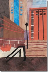
This is Lois’ piece based on a photo her son took in Columbus in the winter.  I love the way she has abstracted the lines of the buildings, steps and walls and grouped them very dynamically around the lamp post.  The white area is yet to be filled in of course.  A very nice loose interpretation of an architectural scene.


IMG_2200

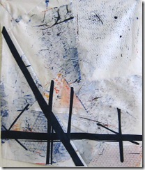
Kevin had lots of photographs of details of buildings, juxtapositions of worn out fences (this was part of a barbed wire fence), the faded surfaces and deteriorating architecture of New Orleans.  This piece perfectly captures the subtle textures of peeling paint, old stone and mystery that is an iconic part of that city.  The surface is contrasted with the harsh beauty of the barbed wire – a super interpretation of the layered faded glory of N’orleans.   He wisely eschewed a more lyrical pastoral background, choosing this grittier and much more evocative fabric.  It was a lucky find at the bottom of his stash of brightly coloured material!  I was thinking I’d have to send him out to the car park to drive his car over some fabric to get the right effect!

IMG_2216


Kay made a gorgeously coloured piece based on her photographs of Western landscapes; there’s great depth here and a “land” feel even though it is also quite abstract.  Super choice of fabric!  The hints of the complementary  yellow just made it perfect.

IMG_2218

Linda G made a very exciting piece manipulating her basic drawing in several ways to achieve this fascinating quilt.  It has such character – and a very fresh and original feel.   Again a rich but beautifully balanced colour scheme.  Overall the people in this class came up with interesting, coherent and sensitive colour schemes – I won’t say anything about rules about Not Going Back into the Stash once the colours were decided!!!

IMG_2207


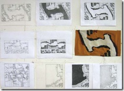
Barbara B drew several designs based on a much loved landscape.  Her simplification reminded me so much of Milton Avery’s work and I wasn’t surprised to learn that he is one of her favorite painters.  She made four versions of the landscape, each one showing a different mood, different lighting and balance of the six main elements.  Wonderful economy, great balance and a very thoughtful series of pieces.  I hope there will be more!!


IMG_2198

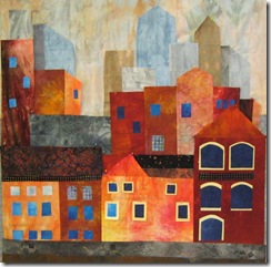
Floris designed and made this lovely little abstract of a city scape…I really like the way she pushed the idea into abstraction which layers meanings within the piece.  Lots to look at and ponder over together with great overall harmony.

IMG_2226


Shanna produced sheaves of wonderful drawings based on the lake near her home…she has a whole series designed already!  She decided to make the piece all in silk dyed with natural dyes…all hand stitched.  These choices very sensitively reflect her feelings about this stretch of lakeshore and are very evocative.  It’s what you feel about the image that counts, not just a reproduction.  Shanna’s work shows that so beautifully.

IMG_2210

Barbara E also wanted to show what she felt about her image.  She designed a lovely piece – the one on the right based on the trees in winter - but realised that wasn’t what had caught her imagination.  Instead it was the fragility of the branches, so she started work again using only transparent fabric in soft subtle colours (on the left) and this time felt she had really captured the feelings in her heart about the image.   Both pieces will be beautiful, but it’s important to listen to what you are telling yourself about the inspiration.  Barbara did and it will be a very sensitive and lovely piece.

IMG_2225


Elizabeth D is inspired by cityscapes; she achieved a wonderful depth in this piece.  The colours and shapes intertwine in a fascinating dance!  Lots to look at, and your eyes want to travel all over the piece exploring the different sections.  Again a great colour scheme and stunning use of value to create depth.


IMG_2213


Amira’s very witty interpretation of a village street is a great ending to this quilt show!  She is inspired by Hundertwasser and Gaudi but is also able to bring her own humour and love of colour to this piece – which was totally finished – quilted and bound!


I haven’t shown work by Priscilla, Nancy and Ginny because they requested no photographs, but their work was also strong and beautiful.  It’s great to see pieces gradually appearing like magic on the design walls – what a group of amazingly talented and intelligent people!!  also, even more importantly, all very good at laughing!!  so good to laugh!

and I hope you’ve enjoyed the show…thanks for reading and looking!  Elizabeth

Saturday, June 12, 2010

Back from teaching in Ohio

I had a great week teaching in Ohio.  There were 24 people in the class and each one had a different vision as to what they wanted to achieve and the results were excitingly varied, fresh and inspiring!  Over this week, I’ll post some of their pieces before I head on out again!

IMG_2224

I’ve never had anyone work from a photograph of an interior before and this piece by Janet worked wonderfully well.  It’s so good to see someone tackle different imagery and in such an imaginative way.  She also had several more pieces designed from her photos of interiors.


IMG_2223IMG_2192


Diane got two pieces all pinned together.  The colour choices on the one above – based on a photograph of raindrops on waterlily leaves – are jewel like.  The little white dots are pin heads (oh that they would make sets of pins with black heads!) so please disregard those.  Her other piece is based on grasses.  Each piece has a lovely flow to it.


IMG_2222

IMG_2221

Alice also made two pieces, the one on the left was completely finished right down to the sleeve!  Her inspiration was the holes left in her hostas by night time chewing critters…tracked down in the dark by Alice with camera and flashlight!!  A great detective story!

Alice used a soft green taffeta that shimmered with different shades and gave an eerie night time glow to her pieces which was immensely effective.


IMG_2212

I love the mystery  that is in Lee’s piece.  This is  based on a photograph of people standing in a shrub strewn desert…the layers are built up with organza and outlined with black stitching…Lee plans more stitch mark making.  This piece has such delicacy and a wonderful use of positive and negative space – and is a beautiful abstraction from the original picture. 


IMG_2209

Betty plans to put an apple tree with bright red apples in front of this moody rich landscape…the picture doesn’t really do justice to the depth that Betty achieved with all the layering of the different blues and copper tones.  The piece was so rich and satisfying in itself, I tried to persuade her to do another one for the apple tree!!  She diplomatically did not tell me of her final decision!!!


IMG_2211

Linda’s gate houses  glow: her colours are so strong and warm.  She has boldly juxtaposed round against dynamic angled shapes which conveys the complex character of her original photo.   This piece is rich and robust and has amazing power.  Gorgeous use of shades and tones.


IMG_2220


Cathy made a very complex 4 part piece based on imagery from a trip to the Middle East.  I love the sense of the wide expanse of desert contrasted with the detailed stained glass from a church window in Bethlehem. This is a unique solution to conveying beautifully two very different impressions of the places she visited.


IMG_2219

Liz told a story of a polk weed whose progress from seedling to giant plan she photographed meticulously while apparently carrying out her office duties!!  You can find great inspiration anywhere!  this fellow was growing up by a dumpster and now its image (manipulated and repeated) makes a wonderful quilt.  Liz’s use of positive and negative space is masterly; there’s not a dull shape in the whole quilt.  And you can really see the polk weed reaching up and up into the sky!

More in my next post!!  Aren’t they super? and so varied – I just love it.  The class was called Inspiration to Fulfillment and was about creating strong and dynamic designs based on photographs that the students had found inspirational.

If you have been, thanks for reading!!!  and thank you very much to all the ladies in the class who worked so hard, and gave me permission to photograph and blog about their work.      Elizabeth

Friday, June 4, 2010

Off to teach a workshop!

IMG


Tomorrow I’m flying upto Columbus OH to teach a 5 day workshop. It’s .5 hour to drive to the shuttle, 2 hours on the shuttle, 2 hours in the airport with luck, 1.5 hours on the plane and probably 1 hour to exit the plane and get the shuttle to the hotel totaling 7 hours – I suppose it could be worse! If I drove it would be a little over 10 hours, says Mr. Google map – but then I bet he hasn’t been stuck in the endless traffic jams of Knoxville…still that’s not that much longer.

How to get there (and whether or not it’s worth it) is one of the many decisions the workshop teacher has to make when accepting engagements. The second big question is how much to charge (if you have an option, many places don’t allow any negotiation). Third: how long the workshop should be, and, fourth, how many people you should allow them to put in the class.

When thinking about a fee, I always add in the workshop prep time, the travel time and the actual workshop days. Even if the distance isn’t that far, you basically lose a day travelling each way – sometimes 2 days if you drive. Most workshops require several days thinking, planning , writing, making sketches or samples, packing and that needs to be part of the equation. I try not to do one day workshops because the travel and workshop prep time is about the same for one day as for five – which reduces my actual “day’s pay” considerably.

It’s important that if the fee is low, that there are other factors that balance against that such as the reputation of the place, the history or the location. I like to visit new places, I love to be in beautiful scenery and an art center with excellent facilities gives me opportunities I might not otherwise have. If the venue is somewhere I’ve never been before, an offer to take me out for a day to see the local sights is a great plus on the profit side!

I’m very against the overly large classes that some of the for-profit organizations encourage. I think it does everyone a disfavor – it is difficult and frustrating for the teacher to get to know the individual people well and to understand what will help them the most. One place I’m teaching this summer has a limit of 12 people, another has no limit and the class is already brimming over with folk. Teacher to student ratio does count for a lot in learning, we know that. And if you are one of 25 paying the same as if you are one of 12…I know which I’d choose!!

I really enjoy a mix of people in the class. Varying skill levels in the class add to the energy and excitement. It’s both wonderful to help someone’s first few steps and to find something new and interesting for an “old hand”. And it’s lovely if there’s a huge range of ages. Only once did I have a range of sexes, though! And sadly, he was a bit of a dud – which was a pity with all those lovely ladies to help him!!

I like to prepare for a class by coming up with some new ideas each time, even if I’m teaching the same overall topic. It’s just too boring otherwise!! One of the main things I teach is composition and design – there are so many different ways to come up with designs that I would be limiting everyone (especially me!) if I just stuck to 3 or 4 ideas. I just don’t know how other teachers do that!! I love devising different possibilities: some I’ll have tried myself, some I’ll have snitched from the fine art world, some just appear as I work through the variables. My aim is that at the end of the class everyone’s piece is different reflecting their own personal aesthetic and choices throughout the design process. I’ll be sure to capture the work next week and post the photographs the week after!

If you have been, thanks for reading! And if you teach yourself or want to comment on the above issues, I’d love to hear from you. Elizabeth

Okay, yes, that’s me at the top – about a hundred years ago…sewing..of course!!!

Tuesday, June 1, 2010

Which path is the right one?

I always enjoy reading Robert Genn’s newsletter Painters’ Keys because often he makes an observation that sets off my cogitations. Today, quoting Robert Frost whom as we all know took the path less travelled, Genn talks about the possibility of taking the wrong path with one’s art. If we can look back over our art quilt career and think of it as a journey, can we see any wrong turnings? I can certainly see places where I lingered too long and should have pushed myself onward and upward a lot more quickly than I did.

trellis detail

Almost 10 years making traditional quilts for which I had little talent (not having fine motor skills, nor being a person who can tolerate finicky details) was perhaps not a wrong turn, being a starting point…but a place I should have left much more quickly!! Even though it is difficult to leave the fellowship of the traditional guild and the certainty of following a tried and true pattern, I should have leapt out!

 fallstudy1greenpink

After that, like so many, I became influenced by a particularly brilliant star in the Art Quilt world and felt I had to follow her rules too. But it wasn’t long before I realized that this time I did need to follow my own path.

AGW I wanted my quilts to have some meaning and also to relate to my own history. I’m sure all immigrants feel the need to maintain some aspect of the old home country even if there are many advantages to the new one. I suspect that immigrants who engage in any art form will find it is significantly influenced by their original country. There’s a need to preserve a little piece of the culture – whether visual, or musical, taste or movement related.

barton_strengthofquiet Since then I would say I’ve explored a few different allees in the Art Quilt garden and definitely one or two mazes that were difficult to escape from! Frost was lucky he only had two paths from which to choose!


But how d’you know which is the right road for you?

And how d’you know when you’re on the wrong one ?

The answer to the latter question seems more straightforward – you’re on the wrong path if you’re not reaching your goals. Doesn’t matter what your goals are, as long as you know where you want to go. D’you want to be a Houston star? D’you want to be well known in the Quilting Arts world (oh, by the way, I do have a little piece and few pictures in this month’s Quilting Arts magazine – which is great! Nice to get published). D’you want an academic career? Or be a workshop person flying around the world? Or get into museums? Or sell a lot? Or bring social and political issues to our awareness? Tell your own personal story? Make real – i.e. lasting – art? Make beauty.

For me, I feel I’m on the wrong path when I notice I’m going round in circles (like those mazes) where I seem to be making more and more of the same type and quality of work. I am also a person who likes a beautiful view – about more than anything I think. I’d swap a view for a meal or a concert or a party anytime! Getting to know what is important to you should help you to find the right road. I know which of the above goals I can discard, and which are more important..I think it’s time to pack up my bags, pick up my step and start exploring! Onward and upward!

Do comment on your own directional decisions ..we may meet on a path one day! If you have been, thanks for reading! Elizabeth