Thursday, April 30, 2009

Inspirations

I described some of my recent Art Inspiration trip to New York City a couple of days ago…but there’s more!

One of the highlights of the trip was the Bonnard Late Interiors show at the Metropolitan Museum.    I have always loved Bonnard because of his unusual compositions – looking at many of them at once, I realised that he often crops the image severely.  It was fascinating to read that he actually worked on large pieces of canvas attached to the wall, and cut them down to size when the painting was complete.  That’s a technique I’ve used with quilts!  And now I can refer to a master painter’s similar habit!  Cutting down to the important part of the painting puts you right into the scene.

When Bonnard moved to the Mediterranean coast the change in light in his paintings was very clear – everything became infused with a golden hue, glowing and shimmering.   People have written about his wife being in many of the paintings, and reading the curator’s notes about his life, Marthe was a constant presence – bonnard3 a part of him -  and when she died after their long marriage, the self portraits he painted looking in the bathroom mirror were quite tragic.  Also imbued with anguish was a portrait of his mistress and his wife, the mistress with swollen drowning blue eyes – she later committed suicide.   Sadly, the catalogue had very poor colour, though it did include most of the work.    Many of the images I’ve mentioned are on this site.
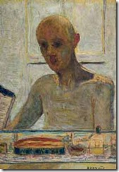
Bonnard constantly made sketches in little notebooks (3 x 5) – we have no excuses not to do the same!

After Bonnard we made our way down to the Armory to see the SOFA show.   There were only a few exciting things to see, and after Bonnard, many things looked so trite and glitzy.   There was definitely work where the artists should be shot!!  I noticed that attendance was sparse and although the attendant assured us he would “soon run out of catalogues” – there were huge piles of them around him when we left!   Most of the people inside appeared to be networking rather than looking at the work, and if you did admire the artwork , the dealers were really treating you like new best friends – from which I assume sales were very slow.  kobayashi, naomi
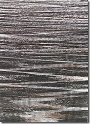
There were only two pieces I would have taken home (I always visit a show in the hopes that I will be awarded 3 pieces to take home with me!)….gorgeous understated silk carpets at Bennet Bean – one of those horrible Flash sites I’m afraid.  The piece I liked was 3 shades of grey – so delicate…maybe I should revisit grey!!  However, I think instead of more grey quilts, I might knit a sweater based on rug I saw – it was simple opposing incomplete stripes of grey.   A quick sketch and there was an idea!  Of course now  I need to improve my knitting skills!

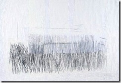
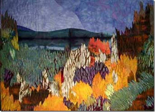
My other favorite was a small woven piece in the Brown Grotta booth (just visible above the seated woman) by Naomi Kobayashi.   Here is a different piece of hers, I lost my photo of the sunlight on water piece, sadly. 

The next day was Neue Gallerie, one of my favorite NY museums.  It was originally an elegant home overlooking Central Park and still has all that presence.  They show mainly 19th and 20th century German art – many of my favorite pieces – little square Klimt landscapes, like jewels, wonderful clocks (actually working!), jewelry and always there’s a special exhibit too. 

IMG_1252

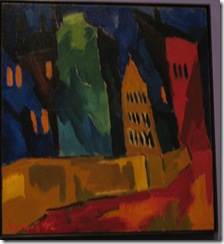
Currently it’s Brucke: the Birth of Expressionism in Dresden and Berlin, 1905-1913.  Brucke was a group of 4 artists, Fritz Bleyl, Erich Heckel, Ernst Ludwig Kirchner, and Karl Schmidt-Rottluff, who decided to live and work together to try to create a kind of utopia in a world that was falling apart.  The colours are gorgeous, the lines are sharp (they revered woodcuts), the emotions strong.  Here’s an example by Schmidt-Rottluff.    don’t you just want to eat those saturated colours?!!  Sadly, I could find no books of his art listed on Amazon for a reasonable price. Wouldn’t it be amazing to live and work like that?  Of course you have to be young!! and I believe various other “creative” activities were indulged in!

And now, I must get back to the sewing machine!  I have one more episode about my NYC trip to write, probably in 2 days…..and, if you have been
Tuesday, April 28, 2009

Rejuvenated and exhausted!

Only 8 days away in New York City, and I feel like I have 3 months of catching up! which is difficult because in 2 weeks I’m going off to Scotland for a month….a very different kind of visual stimulation from the city.

I saw so much wonderful, amazing, provocative, inventive, thought-provoking and intelligent art on this last trip to NYC, I feel as if I have mounds of boxes of delicious chocolates to explore for many months. But – to switch metaphors in midstream – you have to take it slowly….gradually parsing over each visual memory to see what can be learned and absorbed. I began the trip with The Third Mind at the Guggenheim: an exhibition of 20th century American art that reflects Asian art, literature, and philosophy – particularly philosophy. There were several pieces about letting things happen – letting nature take a course and observing the results. e.g. sitting in a small cage-like room (Tehching Hsieh) and clocking in on a time clock cum camera for a year – every hour! You observe hair growing, fatigue setting in, small shifts of posture – but at the same time this is presented in a flickering movie that gives the opposite effect of a slightly frantic ant!! I can’t imagine feeling calm if I had to clock in on the hour for a year…. so I think “frantic ant” definitely expresses the feeling I would have, not Zen-like calm!

Ann Hamilton had a little fluttering miniature ski lift that swooped down the inner spiral which was also disturbing in its haste to get to the bottom. One of the most interesting pieces was by a soldier (Kim Jones) who had drawn battle plans obsessively creating patterns of people and materiel connected with the Iraq war. A tight pattern but a chilling one…and a good one to remember if a quilting design were needed in a piece about war.

After the Guggenheim we walked across Central Park – the park (designed by Frederick Olmstead in the mid 19th century) such a brilliant idea and one that is bittersweet because I can’t imagine anyone devoting that many acres to pleasure for all city goers today. The magnolias were so beautiful, like an Impressionist painting and people were picnicking, and having watercolour painting lessons and rowing boats!!

labels

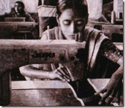
We visited the Museum of Art and Design show Second Lives: Remixing the Ordinary. This show was about using recycled or unexpected items to make hangings and sculptures. The most striking was a beautifully made and sad banner about garment sweatshops – made from tens of thousands of clothing labels by Terese Agnew. Yes!! it’s all labels!! If you go to the above website there is a large photograph by Peter DiAntoni that you can zoom in on to see the labels.

We also saw one of El Anatsui’s large “curtain” wall hangings. These are made of thousands of metal strips cut from the tops of liquor bottles. They are wired together by him and his assistants – of whom 20 might turn up to help him! When the piece has grown to the right size (usually very large – 10 feet or so high, 20 or 30 ft wide) El Anatsui arranges it on the museum wall, gathering it into folds (which are then tacked into place) to give it drape and presence – also the metal tags then glow and flicker as they catch the light. Here’s a video of the installation he made at the Met last year:

Regina Benson has also used curving and folding and bulging her works on the wall; she uses a metal armature to hold the piece in a given shape.

White 10 128 WR

More quiltmakers seem to be doing the opposite, however: stretching their work so that it is less textile in appearance. We saw a solo show by Jeanne Butler at the Noho gallery in which all the work was stretched flat and tight in a very painterly manner.

Jeanne works back into a heavily quilted white on white background, adding drawing, sheers and now torn brown paper to create ethereal abstract work. Jeanne’s wasn’t the only solo quilt show in town, however – Paula Nadelstern has a prestigious solo show of her amazing kaleidoscope quilts at the Museum of Folk Art. Paula’s show is up through September, Jeanne’s for another 3 weeks. Both Paula and Jeanne achieve great harmony and elegance in their work – and by very different means: Jeanne’s quilts are quite spare and restrained in their use of both colour and form, Paula’s are adazzle with glittering shards of fabric, the designs taken from the kaleidoscopes she loves. Each has followed and refined her voice for many years….putting in the 10,000 hours!

More- later in the week – as I catch up with myself!

If you have been, thanks for reading! Elizabeth

Friday, April 17, 2009

Recharging

 
What a great response to my request for information regarding the Starting Point!
One of the great rechargers for me is to go and see good Art and that’s exactly what I plan to do next week: I’m off to New York City for 8 days!  Unfortunately 4 interesting shows all close on Sunday so for the first two days I’ll really be racing to catch them: Bonnard at the Met, Third Mind (influence of Asian art) at the Guggenheim, the current exhibition at MAD, and SOFA.  I’ll write more on these when I get back.

Like many of you I keep files marked “Ideas” – they are stuffed with all sorts of things: pages ripped from magazines, print outs of various photos, rough sketches, sometimes just a title or a few words, colour swatches – for time management’s sake I don’t keep actual whole magazines any longer, as I read I rip!  the latest folder is on the table, and the picture or jotted thought goes straight into it.  At one point I had piles of journals, half open books, scraps of paper pinned on the board, notebooks of varying sizes…but now I find: one place is best, and it should be Very Easy to Access!!  After all, I want to spend my time looking at the stimulus material, not looking for it!  I love Ruth’s idea that the Idea files/sketchbooks/notebooks etc should be seen as a compost heap!!  We’re all waiting for that rich mulch to be ready!

I teach a workshop called Coaxing the Muse…and in it we explore  stimuli to as many different senses as possible – obviously pictures, but also poetry and music, stories and words, or even letters (I had a calligrapher in one class and letters were her starting point), sensations (smell, taste, emotion, physical movement), doodles, and even relationships.  These experiences are all added to that compost pile!

Playing with new media – like crayons, felt tips, paint, or thread – embroidered or arranged – works very well.  Fill up a page or a piece of cloth with colour, or with doodles, or just shapes….when you go and look at fine art, you can often see that’s exactly where many successful artists began.   I once gave a dozen people a small square of linen and a few  needles threaded with floss  and just asked them to stitch any old how!!  Came up with some interesting things – especially from people who’d never handled a needles before.

Yes, just Playing!!! That’s the good thing about a workshop, you’ve given yourself permission to play.  You’re not thinking I’ve only 2 hours in the studio today and I MUST achieve Something!  There’s a place for that, but not at the outset.  The beginning should be slow with lots of horizontal thinking (as opposed to vertical).  Vertical is good when you know your goal and you want to figure out the quickest way to it.  Horizontal is good when you’re looking for the goal.  It’s good to be able to switch thinking modes deliberately, and to stop the Critic when in horizontal mode.  Yes, we are allowed to play. Yes, yes yes!

Playing  can include playing with new techniques – but it’s important not to become a technique junkie!  find the ones that fit, and stick with them, at least for a while.

Playing with the fabric, arranging it on the floor or pinning on the wall is a great way to come up with exciting colour schemes.     Other ways are looking at art books, or books of photographs and seeing what colours you respond to – then trying to pull out those fabric from your stash.   Open your wardrobe!!  what array of colours is revealed?  How would that colour scheme work for a piece?

I’ve noticed that a lot of people  have a “favorite” type of image  or object they collect.  Deb Anderson loves dumpsters!!!  and Jeanne Williamson loves construction fences!  I do remember one night in New York helping her to “rescue” an interesting sample from some roadworks!!   She’s now produced a wonderful series of quilts all based on those fences.   magsramsay likes crumbling doors – and so does Sean Scully, interestingly.  He’s actually published a book, not of his art but of his inspirations – strange doors from all over.    I did a series on half timbering and went through my and many others’ photographs to get as many samples as I could – of half timbering in old UK houses.  I think it’s a great help to have a particular theme, but collect anything that intrigues!!     Nina-Marie responds to movement in others, it’s good also to be mindful of the feeling of movement in oneself.   Stand up and stride! How does it feel? How could  that be rendered in visual terms?  what colours would portray it?  what kind of lines?

Many people begin with a belief or a statement.  For centuries most art was related to a need to express religious thoughts or feelings, now we see more political statements than religious ones!  but perhaps the two are not so different?!!  Beans Gildorf has made many pieces about  the problems resulting from gun proliferation; Wendy Huhn has made pieces about the problems of extremely high haemoglobin.  Sue Pierce made a piece about deaths in the Iraq war.

I think it would be much harder to begin with an amorphous inchoate feeling that something needs to be expressed…I wonder if people who begin that way, actually don’t.  But rather that they play with the medium (whatever it be) and then, as they play, ideas and memories begin to emerge and a statement emerges.

So, in summary!, a compost pile of ideas….a willingness to  open oneself to stimuli of all kinds in a most mindful way, and then to play and to cogitate!

I’ll be back the week after next!  Filled with compost!!
so, if you have been, thanks for reading!   Elizabeth

Wednesday, April 15, 2009

Whence cometh the design?

This is one blog where I’d really like some input from readers! Where d’you start with your design? what is the beginning point? Looking around the Art Quilt world I see several starting points. It would be worthwhile coming up with a list so that when the well is dry and the Muse has gone on holiday (all nine of them! not that there is one for Art Quilts sadly, they were mainly concerned with different kinds of poetry!), one had something to turn to for direction.

Given that composition is an arrangement of elements (shapes etc) on a two dimensional plane in a harmonious, balanced and yet intriguing way…how d’you start? How d’you find the “entrance” to the maze? Where do the shapes, lines etc come from? I find I am not good creating in a vacuum – though virtually any sense can spark something that has me thinking “hmmm it would be interesting to see if I could get that onto cloth,I wonder if....”.
For example:

OLYMPUS DIGITAL CAMERA

The idea for this piece: Beehive was more conceptual – thinking about people in tenements or skyscrapers as being like bees – we’re not bee- shaped so our spaces are rectangular – but they are all stacked.

383214-R1-E010 The piece on the right, however, Visions,was inspired by the Hildegard von Bingen choral music I was listening to at the time. I was thinking about the notes pouring down from the dark spaces above in a cathedral like the light broken into specks of colour flows down through the stained glass windows.

383214-R1-E006

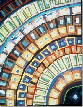
The piece on the left, Petra, was begun with a much more abstract concept: what if I bent these windows shapes into an arc? I love those “what if” starts to a piece!

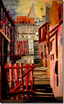
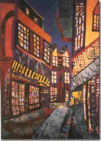
Of course, many of my quilts begin from a straight visual image, but frequently this is not a new photograph, but rather one I took years ago that has haunted me. So it was 30 years before I made the piece The Red Gate based on a photo of an old stairway ginnel in Whitby, UK.

theredgate

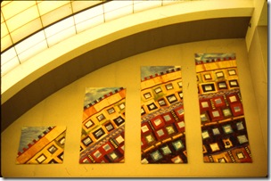
I love commissions that indicate ideas: here was the statement I got from a church in Atlanta: “ an original design to incorporate the thoughts and feelings in the mind of a person about to enter a sacred space..(plus) subtle representation of major liturgical themes: Trinity, gospels, Twelve Apostle, and incorporating some of the major colours used in the passage of the Liturgical year)”. (and, I’m sorry, I don’t have a picture of the quilts!but they are in The Trinity Presbyterian Church on Howell Mill Rd. and if you go there, and they’re still hanging in the Narthex – send me a picture please!) The church leaders’ request immediately flooded my mind with ideas. Feels great when that happens!!

So, whether it be music, memory, mathematics or a visual image, I generally begin with an actual idea. But I know a lot of quilt makers don’t – and not only quiltmakers. Yesterday, I went to see the MFA exit show at the local U and was surprised by how many of the artist statements indicated that the person began with a mark, and that mark led to another and another, until finally they felt there were no more marks to be made. This is a more discovery type of composing: if I play this note, then what note will sound good next to it? and so on. I know Emily Richardson composes in that way and her quilts were quite wonderful – shimmering light and shade. But I think that’s a very difficult thing to do and get right. And how about you? where d’you begin?

If you have been, thanks for reading! Elizabeth

Monday, April 13, 2009

A Day in the Life of a Quiltmaker

Like many days in a quiltmaker’s life not a lot of quilting got accomplished today!

I’m off to New York next week and spent the morning researching (Art in America and museum website) the must see exhibitions. Seeing the work of masters is vital to the artist’s education and I plan to see as many wonderful works as possible! Top of the list is the Bonnard show at the Met and then the Asian influence show (Third Mind) at the Guggenheim. Both shows close on the 19th (why d'they do that?!!!). I’m so intrigued by composition that I think I’ll learn a lot from both shows. Bonnard’s sense of place and compositional design is quite fascinating and different from his contemporaries I think. I also hope the American Watercolor society will have its annual show open while I’m there. Last year there was huge controversy over the Gold Medal winner so it’ll be interesting to see what they pick this year! There’s also an Abstract Expressionism show at Michael Rosenfeld that, I hope, will be exhilarating – not that I can see ever making an abstract expressionist quilt!! but you never know.

While looking for photographs of quilts to take with me to show friends I came across a couple of snaps that i thought would be of interest.

IMG

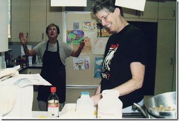
In this one Linda Levin appears to be praying to the heavens for me to see sanity? or maybe to receive creativity! or maybe she just wants me to wash the dishes?


IMG_0001

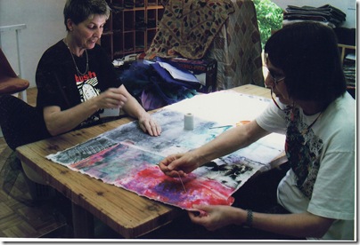
And in this one, a reminiscence of the old quilting days – when you would work quietly with a friend,
Dominie Nash, on a piece, stitching and talking…such a wonderful activity.


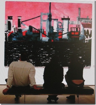
I did manage to get my Cement works piece basted:

IMG_1231

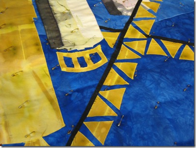
As you can see I like to use safety pins – for many reasons. It’s fun to take them out as you go along – which you can’t do with stitch basting. They’re totally renewable!! I’ve been using the same ones for about 20 years and I didn’t even buy them in the first place…just gathered them from labels and dry cleaning and so on. They don’t pollute the environment. And they don’t involve glue – me and glue don’t mix well!!


IMG_1228

I also had fun playing on the ‘net:


Then I was interviewed by a local journalist/retired professor and artist, John English, who asked me about the different periods of my quilting life…interesting to go back chronologically now I’ve done over 200 pieces and see how they all fit together. One day I went through the whole list and picked out my absolute favorites – I think that’s a worthwhile thing to do…then analyze just what it is about them that really strikes you. I do like work that is very pulled together and also economical – it says exactly what it needs to say, no more, no extraneous claptrap (unlike this blog at times!). I still need to subtract more than I add, I need to distill!

John is writing a piece for Athens magazine, I’ll give details when I have them.

Finally I got a note from Arrowmont School of Arts and Crafts in Gatlinburg, TN to say that my class in July has made! that’s wonderful, it’s such an inspiring place. I do hope now that the workshop in Syracuse at Quilting by the Lake (see sidebar) in late July will make – I just need 4 more people to sign up!! so if you’ve been dithering, hesitate no more!!! and thank you……also, I’m happy to answer any questions, if you have them, about any of the workshops.

If you have been, thanks for reading!!
Elizabeth

Friday, April 10, 2009

In the Studio

So, what’s happening in my studio today? I’ve been gradually sewing down the different sections of the Cement Works piece I started a couple of weeks ago. Last time I posted I had just begun to block it out on the design wall, having chosen which design and which colour scheme after much playing with sketches and piles of fabric lying around on the floor. For some reason I always find the fabric needs to be on the floor for me to decide what works best!!! somebody commented on the number of sketches I do, it’s because
a) I find I like to live with the idea for a while, getting used to what’s interesting and what’s not
b) I like a lot of choices! I like to brain storm and feel perfectly free to do that with no one waving deadlines at me – after all I left the university to get away from that!!!
c) it’s better to discover that a design is weak when it’s still in the sketch stage – I’ve had too many attempts in cloth that have ended up in the rag bag at the thrift store…now I take my time before beginning the actual piece.

IMG_1226

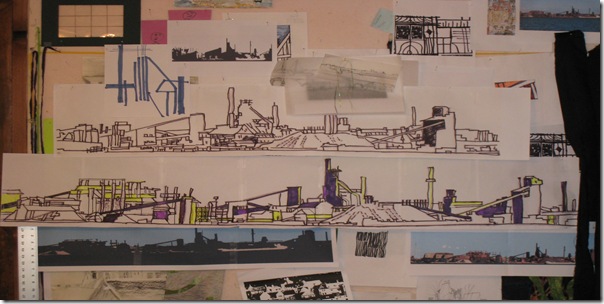
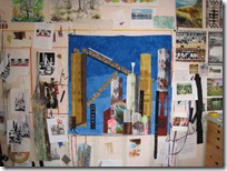
The Wall of Ideas

It’s the same with the colour scheme. I’ll get ideas in the night and scribble them down on a piece of paper. Though I’ve not yet thought this might be the secret to the universe! Remember the man who thought he had the secret when he dreamed at night, so he went to bed with paper and pencil to write the Great Thought down? In the morning, in scratchy writing he read: “Higamus, hogamus woman is monogamous, Hogamus, Higamus, man is polygamous!” (old psych joke!) So often those night ideas are so much Hogamus!!! Last night I thought “aha! the onion fabric with dark red..” AND I got a great title: Onion Towers! So now I have two titles, and no sketches at all, for the next two pieces. But, you know that’s often how it begins. I remember the Beatles would snatch titles from things in their everyday lives: George Harrison opened a romantic novel and read the words “Gently Weeps” and from that wrote a lovely piece. And the famous “Lucy in the Sky with Diamonds” came from a child’s description of a painting.

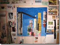
So what is happening in the studio today? I continued to block out the Cement Towers:


IMG_1196 IMG_1202 IMG_1222
As you can see I add, I take away, I add something different, I take that away! all the time I’m working from the sketch, following the values, and taking fabric from the chosen colour scheme. I don’t make templates usually, prefer to simply grid up the elements as one does with a painting. Either method is fine – I think you should use the construction methods you’re most familiar with. I like maps and grids, so visualizing a larger thing from a small sketch on gridded paper is natural for me.

Once I’ve got the different bits all pinned on, I definitely do run a several day quality control check on the piece…looking at it as critically as I can, sneaking up on it, photographing it, bringing in any passing folk to see what they think, etc!

IMG_1224

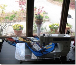
So here I am all pinned together and beginning a narrow satin stitch in a matching colour all round every piece….and all those yellow triangles were a pain!!! but I say to myself: “do 6, then you get a cup of tea!” And that usually works….if anyone has a better method – please let me know!!!

Yes, that’s a cat, (not a rat!), outside the window. This monster likes to live in the fabric stash! sometimes I’m peering in to find a certain colour and there are these green-gold eyes staring at me!!!IMG_1225

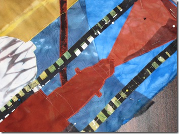
You can get some wonderful ideas for abstract pieces coming in with a close up!!! Isn’t this a neat composition? I’ll have to print it, and put it on The Wall of Ideas (see above) for further consideration. Here you can see some elements satin stitched down, others still just pinned. I do make all my own fabric – there’s some arashi shibori here on the left, the black/white green is double screen printed, the yellow is a clamp shibori, and the silk organza overlay is a low water immersion bath.

And now, I’d best get back to those yellow triangles! After all, I’m ready for a nice cup of tea!!
If you have been, thanks for reading! Elizabeth

Wednesday, April 8, 2009

Pulling It Together

I always used to wonder what it meant when the teacher said “your piece needs to be pulled together more” – I had images of running a thread around the outside edge and gathering it up!!  So (wanting to be a pulled together person!  I think….), I read a lot and looked a lot and I’ve come up with a list of things that help to pull the different elements (shape, line, valued color, texture, direction) into harmony with each other.

floraandferra

1.  Interlocking: the different elements can be interwoven like jigsaw puzzles pieces.  Don’t forget negative spaces when doing this!  They are shapes too and also should be interesting and interlocked with the positive shapes.  In Flora and Ferra (which is now, I’m happy to say, comfortably residing in a collection on the West Coast!), I interwove positive and negative shapes shifting constantly from one to the other:


barewinter


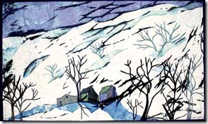
In Midwinter, I interwove the lines of the land with the lines of the tree branches…


nantahala72


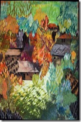
In Nantahala, I interwove the colours, as well as those complex arashi shibori shapes,  across the piece:


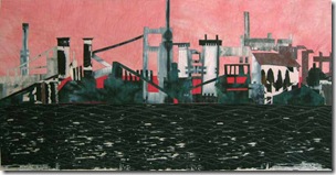
2. Repetition of elements. If you look at Steelyard Frieze, you’ll see the same elements occur throughout the piece:steelyardfrieze especially the short verticals.

what pretty smoke full


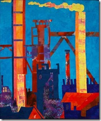
In What Pretty Smoke! I repeated the same colours (warm yellow, rust and purple) throughout the piece – nearly every shape has a little of at least 2 of the colours.    And the smoke shape is echoed by the texture in the purple fabric and the distant chimney.

slidingedge72

3. Rhythm 
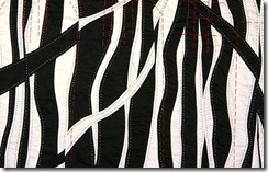
In Sliding Edge I tried to set up a rhythm in the black and white lines that also occurs in the coloured lines in a different “key”.  the rhythms are fairly regular, but with a little syncopation!  remembered lines crop  You can see this again in the detail from Remembered Lines ,  (as yet to be revealed according to quilt National rules!).

4. Omission   - leave out the elements that don’t go with the others – remember those old intelligence questions?  which of the following does not go with the others?  Well leave it out, that will help the other shapes, colours etc to be more of a piece.  I think this is especially true of colours.

5. The whole thing.   Stand back from the design wall and try to consider the “thing” you are picturing as a whole?  Is it all one thing?  or are other “things” or bits of other things intruding? Is everything there?  Everything you want to convey?  Is it a whole piece?  Like a piece of music – you need to have all the parts!

6. Connections.  This is an interesting one – look for lines that you can carry through the piece..a new day 230dpi

In A New Day, I tried to get lines to connect to other lines so that your eye can flow through the piece.  See if you can find them!backstreet72dpi In Back Street, I did the same thing – wherever I could, without being obsessive or boring about it (at least I hope not!) I lined elements up so there was some continuity across the piece.

7. Limit the number of main masses  Don’t have too many warring shapes!  I must admit I’m often guilty of this, but if you can clump some elements together than will help, separating out your shapes will lead to a loss of harmony.first fibre piece

In the piece above, a Very Early Piece – probably around 1970 – you can see I’ve got scattered elements, if I’d clumped these together it would have been a much stronger piece.

I’m sure there are many other ways to “pull it together”, I’d be happy to hear from you!   Bigger pictures and more quilts can be found on my web page….and, if you have been, thanks for reading!!  Elizabeth

Monday, April 6, 2009

Elements and Principles: Design structure


I read a book some time ago about The Hidden Order (Probing the Hidden Order, Marie Roberts)  that underlies most successful compositions and have recommended it in workshops.  It was an inexpensive  paperback at the time, but now seems to be very expensive – I guess it’s out of print…it’s a little esoteric but quite fascinating.  Recently I came across another book ( Barbara Nuss: 14 Formulas (yes it should be formulae I think but I wasn’t asked about the title!) for Painting Fabulous Landscapes).  It’s the same material but explained with good colour pictures of her work from photograph through to the finished piece.

What both books emphasise is the importance of having an underlying overall plan, structure or pattern scheme to your composition - as an architect might build the frame work of a house.  Is it a row house? or a bungalow?  Is it a  house with a central hall for ventilation?, is it split level, is it cantilevered on a hill etc – this should be decided before anything else.  And the same with a composition.  I think many of us do this fairly intuitively, judging “does it look right” – or not! as the case might be.  In the same way that we would notice that a turret looked out of place on a ranch house.     And we’ve all seen those “funny looking” houses!  And, plenty of  “funny looking” quilts.   

Once the overall theme or idea has been decided,it’s helpful when doing  the preliminary sketches to decide upon the design structure .   Once you know the basic structure it really helps you with everything else: the values, the track of vision and focal point, etc and it’s crucial in achieving unity and coherence.

Okay – “so what is it” I hear you saying???  Well, there are different ways of categorizing different design structures (by direction, by letters of the alphabet etc – different books will discuss them a little differently); I suggest you develop a few favorites for yourself and give them your own names.  Roberts characterizes them largely by direction or placement of the large shapes/lines in the piece and has many examples from well known paintings, Nuss characterizes them more by the shapes of letters in the alphabet.

Roberts describes the main design plans as:

triangular (many medieval paintings with Christ in the centre follow this plan), vertical (like a quilt about tree), horizontal ( landscape), diagonal (one of my favorites –e.g.  roof angles ), cantilevered – where a large mass at once side is balanced by a smaller mass further away (think of those gas stations that have a heavy squat building that supports a cantilevered roof over the pumps), circular (radiating out from a central point, either with circles, spiral or rays), meandering (where there is a pathway working its way through a landscape) interwoven shapes or sections (I often think of Milton Avery’s work for this type of design – they’re like a handful of jigsaw puzzles pieces put together).    She also includes designs that are based on dividing up the piece into sections which is very like a traditional block quilt, or having an overall pattern (as in a single shape quilt like tumbling blocks, or a Klee painting). 

Nuss describes the plans (all 14!) in terms more of letters or shapes  but they correspond to most of Roberts’ descriptions.  The advantage of the Roberts’ book is the classical examples from wellknown paintings, the advantage of the Nuss book (apart from the colour which of course as quilters we all respond to!) is her description of how she finds these overall shapes in the landscape.  She shows the development of the diagonal, triangular, radiating, cantilevered, division of shapes, overall pattern etc. designs into a finished painting.

Libraries will have both books and a quick look through will familiarise you with the overall idea – which is omnipresent in Mother Nature (She Almighty!) and good architecture and design.

The design structure usually relates to your subject matter – though it doesn’t have to – e.g. Linda Levin’s architectural pieces often have a more curvilinear plan – what d’you think she might be conveying by that?

Deciding the underlying structure of the design from the outset is crucial to achieving unity.

Here are some examples from my quilts:

AGW affluent drainpipe k cathedral,fin

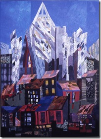
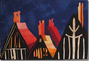
Above, on the left Age Cannot Wither is a radiating design, in the middle Affluent Chimney is vertical, and Cathedral on the right is  triangular.  In Age Cannot Wither I was thinking about memories of the medieval town where I grew up, in Affluent Chimney I was thinking about the ideas of trickle down economics and wastage!  In Cathedral I was thinking about the power of the church – or the economic cathedrals of power in places like NYC.  So, hopefully, the underlying design fits the theme.

Here are three more:

airport wheels brighteratthetop300

In the one on the left: Airport: Wheels, I chose a circular design to emphasise the way an airport is often a hub for many activities…(this is in Gate 29, concourse E, Atlanta airport).  In the quilt on the right, Brighter at the Top I used a diagonal underlying design to fit not only the sense of a steep roof, but the idea that you have to climb to get to the top!  (and yes, it’s all too easy to slide down).

I’ll show more examples in another post, this is getting way too long!  So, if you have been, thanks for reading!

Elizabeth

Friday, April 3, 2009

Construction: 2 forward, 1 back – if you’re lucky!

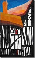
A couple of years ago I remember seeing an old building here in Athens and thought one day I should get back down here and photograph that! At the time I was making quilts about the black and white beams/plaster on medieval houses in England – the black/white contrast is so strong and graphic and the old beams made wonderful wavy lines and curves. I made about a dozen such pieces – you can see them on my website on the Buildings page. The biggest and (possibly?) best is going into Quilt National next month – as per their rules I’ve not yet “exposed” it!!

athens cement works a

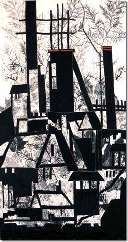
However, after that large piece –( it was about 90” wide at one point though I finally got it cut down to 69”) I felt I was finished with that theme – for a while at least. I then got intrigued by the steel mills in Ontario and have now made 7 pieces based on one trip across the lake to see them! And finally, I remembered the old Cement Works and went back downtown to photograph them. It was a gorgeous day and I took a bunch of photos. this is just one, there are more on the March 23rd blog.

sketches cement works

I made a couple of dozen of different sketches, sizes, arrangements etc. I like to to just play with the images at first, sketching them out, getting used to the shapes thinking how I might simplify them, which details are the most intriguing, which can be left out…where the repetitions and rhythms either occur or could be made to occur. I think it’s really good not to be rushing at this stage.

Plus! If I’m lucky I may come out with more than one idea for a piece.

Having chosen the design I want to work from, I tried several different arrangements of values before picking one and then working out my colour scheme, pulling out fabrics from the stash. I usually work from a complementary scheme with 2 main colours, but lots of values, and a few sparks of other colours!

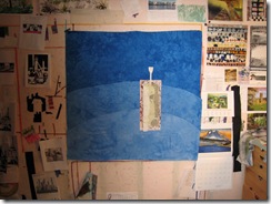
I decided upon the right size and height/width ratio and then marked that out on my design wall – first with strings made from ripped off selvedges. I usually weight the vertical strings so that I can be sure to stay straight, and will check the horizontal ones with a spirit level. Then I choose a background fabric – this can be one piece, or several pieces sewn together. This always takes me ages – it’s important to get the value right even if only small areas will show at the end. Then the placing of the first piece – nope don’t like that – I love the piece of fabric but it has too much depth in itself, it looks almost like a hole in the fabric, try another. Then the second, and the third…then I decided that the third piece (the sort of pale green one) needed a little more contrast on the left hand edge..found white fabric and cut a light reflection and placed it. Then a couple more…
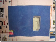
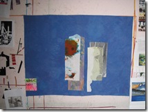
IMG_1188 IMG_1189 IMG_1190

then I decided, no I wanted a bit more depth to the back ground piece, so that needed to be changed. Pull everything off!! start again. I decided to piece the background with the deeper blue arcing around as when I could faintly see when I pushed the contrast on the original photo.
IMG_1191

And so it goes…only a thousand or so more steps to go!! Even though you have the main plan worked out ahead of time, and know all the values and temperatures, it can still take many trials and errors…

there will be another episode!!! so, if you have been, thanks for reading! And do feel free to make comments – I love them!!! Elizabeth

Wednesday, April 1, 2009

Elements and Principles:space: deep or shallow?

Traditional paintings (prior to the late 19th Century) usually portrayed a sense of depth or 3-dimensionality –  foreground, middle ground and background.  Once cameras were invented, painters began to explore ideas other than the reproduction (however beautiful) of a specific person or scene.  Many painters chose to flatten the space in the picture as they wanted to emphasize the idea that a painting was just that: a painting.  It does seem ironic that after the struggles of painters in the Middle Ages and Renaissance to develop depth in their work, just a few centuries later artists would be eschewing such pictorial ideas!!  In fact, some of them even pushing in the other direction with reverse perspective such as David Hockney has played with.

Most traditional quilt patterns don’t involve ideas of depth: their abstract designs were well ahead of abstraction in the fine art world!  (Which, of course, the Whitney eventually realized with their show of the Gees Bend Quilts a few years ago!).   So for art quilt designers today there is a choice – shallow space or deep?  Do we want to convey the illusion of deep space or not?  If we do, there are a number of devices by which this can be done.

  People ask me about perspective; I personally rarely use it to indicate space – but I do, however, think it’s important not to get perspective wrong unintentionally.  Quilts that have a lot of perspective drawing are of a much more controlled style than I am interested in.    If you look at books on linear perspective drawing, all the illustrations look like blueprints rather than art. However I do think it’s worthwhile to read a couple of articles or books on the subject and work a few examples, so you have a sense of the different kinds of perspective (one point, two point etc), how it’s indicated in a reproduction, where the horizon or eyeline is  and what effect that might have upon various 3D objects in your design.

Apart from actually using perspective there are a number of tools you can use to indicate depth - and these are the ones that most artists do use.

Overlapping: if we see a picture of an apple in front of a box…we “know” the apple is in front, we don’t think that the apple is behind the box which has an apple-shaped hole cut in it!  The same for a man in front of a wall. or a tree in front of a lake.  Overlapping is one of the major ways by which we judge depth.  Think about it when you’re driving around town!
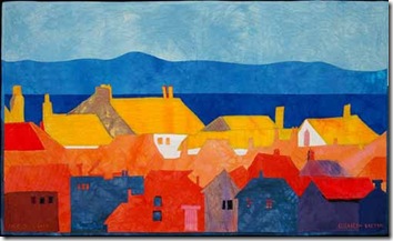
edgeoflight In this quilt, “Edge of Light”, I’ve used overlapping to indicate the rows of cottages being in front of the water and the distant hills. I haven’t really used any other devices as my interest was in the way the far group of cottages caught the light, rather than distance or other concerns.


Size:  if we see a tree in the distance, it actually looks much smaller than a man right in front of us standing on our feet!!  we don’t think we have a giant right next to us and a bonsai in the distance…our brains automatically compute – smaller therefore further away. 

ferry
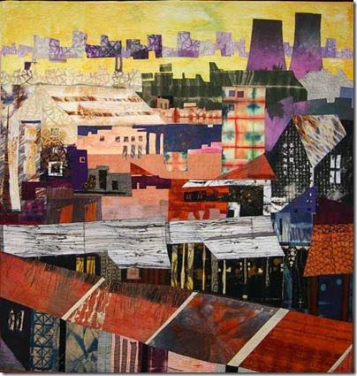
In the quilt on the right, Ferrybridge, I don’t mean to indicate that the terrace houses at the bottom of the quilt are larger than the cooling towers at the top, rather that they are a lot nearer – so they are bigger.

This quilt also uses placement on the picture plane to indicate depth – the lower an item is on the quilt, the nearer it is to us, the higher it is, the more we read it as being further away.

That's obvious, because if something is small and far away it's not going to be visible behind everything anyway.  Our brains soon get used to figuring these things out.

Interestingly, it is the brain's experience that does figure it out - it's not built in.  If your brain was deprived of distant views from infancy, it would be much harder for you to see and understand this kind of depth.

Colour can be described in 4 different ways: hue, value, intensity and temperature.  Each of these can be used to indicate distance or closeness.  Things that are further away tend to be bluer (as we are looking at them through all the moisture and dust in the atmosphere), the colours are less intense, the values are lighter, and the temperature is cooler (towards blue, closer things being toward red).  You can see some of these colour changes in the quilt below (Overlook):
overlook72dpi 


The amount of contrast and detail you put into an area can also indicate distance: more contrast, more detail..nearer the foreground – less contrast, less detail…the background.
greenhouses72
In Greenhouses, the trees in the front  are more detailed.  The foreground of houses and trees is much more detailed and with a lot more contrast, than the middle ground of darker more amorphous shapes, and the distance of soft hills has very little contrast or detail. 


Of course in real life and in designing life, you wouldn’t just choose or use one device alone to assess distance, usually there are combinations.  And, as you can see from above, you don’t always have to follow all the rules!!
If you want to experiment with designing with space – consider foreground, middle ground and background: 3 distinct levels of space. Starting with the furthest point in the landscape and building forwards..developing more contrast etc.

And, if you have been, thanks for reading! Now for some space!
 
Elizabeth