


Don't be bamboozled, but above all, don't be boring!!
In anything!
The first step is to know your craft, whether it's visual art or music.
but the next step is how you interpret....
So looking at the photos above, it would be a mistake to copy any of them LITERALLY, in the same way that it's a mistake to just play the notes one by one, bong, bong, bong...when playing a Chopin nocturne.
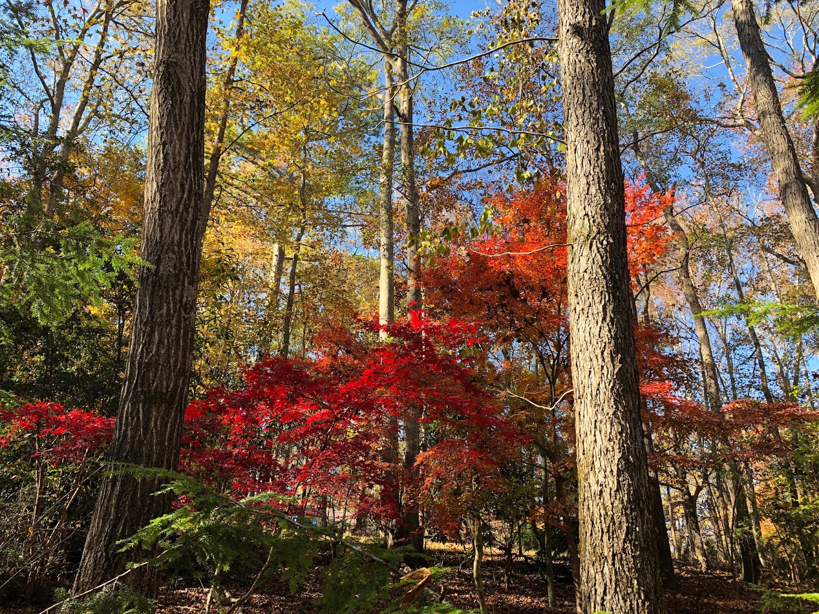
Photos of Fall are gorgeous, especially where maples are involved. almost certainly what attracts is the color - the pop of color against a dark background especially.
The realization is that it's the COLOR!
After all with trees, the shapes are really just verticals...well yes I do like dancing trees, but in these photos it was the color. So then how can you "steal" that color from the photo and use it in your artwork?
Everybody loves color, everyone is seduced by it....everybody uses it...and a lot of people have trouble with it. I remember one of my Dad's aphorisms (he was a mountain of walking aphorisms!!) was "Fire is a good servant but a poor master". Well the same could be said of color: a good servant, but a poor master. Used well and your artwork is stunning, evocative, inspiring and satisfying. Used badly and it destroys the art work...it dies in a blaze of meaningless color! or withers for lack of it...
So when my boss suggested I write a color course, I was immediately energized...filled with ideas on how to help people understand and use color in their work much more effectively and meaningfully.
My color course (starting on Valentine's Day! at the academyofquilting.com) covers a wide ranging of topics related to color but without getting into unnecessary technicalities like wavelengths and so on. Nor do I spend a lot of time on dry theory or the history of discoveries...but I do take a general look at how artists and scientists have used and understood color. I think it's helpful to have a little background knowledge.
I examine the different properties of color - for example how to differentiate between three reds or yellows... why they differ and why you might want to use one rather than another.
I explore several ways of deriving good strong beautiful color schemes. How to create illusions and special effects. How to create an atmosphere....
There's a unit on the meaning of colors, and how they affect (or don't!) us psychologically.
Lots of exercises...like the one illustrated below...for I feel the best way to learn is by DOING!

Isn't it amazing what a difference the background makes? And also how often do you feel like you got the background color wrong?
Questions? happy to answer...just email me
elizabethmasterclass AT gmail.com.....or go to the academy for more info.
And, if you have been, thanks for reading!
Elizabeth
PS Happy color day!!!


