Friday, May 28, 2010

Fine Relationships

Under the cliffs, Farne Islands

I find it’s always helpful to read about things one knows from a slightly different perspective. Dow published his book on Composition well over a century ago and thus talks about the basics of art in unfamiliar ways which make you think more. He defines the study of art as learning how to perceive and then create fine relationships between lines (and shapes), values and colours. The way to learn these is by practice practice practice and by “the influence of good examples”. Understanding what leads to “fine relationships” comes as a result of training in appreciation. Not only by learning to draw, or by copying nature or by gaining knowledge, but also by enabling “the power within”.

Increasing and developing these abilities (like any other muscular development!) comes as the result of exercise. One should begin with simple sketches or designs, then gradually get into more complex compositions. A first step would be drawing a few straight lines with harmony, movement and elegant spacing. As simple as this sounds, to achieve it requires both judgment and appreciation – sense and sensibility. As more lines are added, more skill is necessary to maintain balance, unity and excitement. It’s sort of like a reverse Pic-a-sticks – whereas instead of gradually withdrawing the sticks, you gradually add them. I wish I could go to Nancy Crow’s new show at the Schweinfurth Museum in NY state for I feel that her new Constructions exemplify these principles so elegantly.

Spacing and proportion are the keys to good design. Dow feels that there are, in his opinion, five ways of creating harmony.

  1. The meeting of the lines in opposition – seen in nearly all traditional quilt designs where squares, triangles, squares on point etc are carefully aligned at various meeting points. A tension is created when opposition occurs but there is no harmony where there is no contact.
  2. A third line added to the opposing two (as a curve within a corner) softens the starkness of the meeting – and creates a transition from one shape to another. Thus we learn how to move around a design and flow from one shape to another. You see this in nature all the time: the tree doesn’t just stand up in stark contrast to the ground (well the interesting ones don’t!!), but branches and branches softly enclosing air and sky within its formal lines.
  3. Unity develops when there is a single dominating element which determines the character of the sketch as a whole. Like the continued branching of a tree which pattern is then repeated within the leaf itself. Or in music where a theme continues to reiterate: da da da dah!
  4. Rhythm and repetition – we see this in many textile designs – fabric and carpets, we hear it in music and in the cadences of a poem. Having a constant rhythm brings the different elements together.
  5. Symmetry or balance is the fifth way to create harmony. A lack of balance makes one feel very harmonious!

These principles (and we read them in nearly every art book, though sometimes the terms used are slightly different) are guidelines in good spacing of lines and shapes.

I think it helps to literally cut out some lines and shapes in fabric and play with them on a plain background – Dow would have you draw them of course! But actually fondling the fabric is so much more fun!! Having played at different arrangements, then try cutting bigger pieces and arranging them on a wall. Then look at “good examples” – don’t look at boats and trees and canopies and people eating and drinking! Look at the lines and the shapes…and see how they are spaced, observe their fine relations!

And now I’m going to observe the fine relationship created by tea leaves and hot water! If you have been, thanks for reading! As always, comments are Most Welcome!  Elizabeth

Wednesday, May 26, 2010

Composition: Abstract design is the primer.

moorfarm I’ve often wondered why the representational art quilts seem to be those less favoured by the art quilt cognoscenti.     I’m beginning to think it’s because this type of quilt is often much less well and interestingly composed than an abstract quilt.  With some notable exceptions, many people making more representational work don’t consider the abstract basis for their composition.   In his 1899 book on Composition, Arthur Wesley Dow states that in designing art work based on a real “naturalistic” scene it’s important to consider the elements from an abstract point of view. Don’t think of trees, think of vertical shapes, cows as rectangles, hills and rivers as lines and so on.

Dow feels that it’s crucial NOT to consider making an actual representation of a scene first. This is something I’ve noticed both in workshops and in quilt shows…people want to copy nature and get the most accurate copy of it they can and feel that if they do, the piece will be good. But a faithful copy might not be a good design. (and often isn’t!).

Historically, points out Dow, artists did not aim for a perfect copy of nature. Even portraits were considered firstly from the point of view of the overall composition with “the facts and the truth subordinate to the great idea of the aesthetic structure”. Artists should be trained in the “fundamental principles” of Composition rather than in accurate representation.    However, as “art academies” began to be established  they laid more emphasis on drawing ability – which he descried.  Instead, he stressed, it should be abstract design that is the basic training ground of art. For in abstract mode the principles of Composition are very clear whereas in representational work, they are frequently obscured by the complexities of meaning and detail. The beginning of a picture (or a design for an art quilt) is “a pattern of lines”.

Perhaps this is why so many times (in both the shows and the catalogues that I’ve seen) it seems as if it is the quilts with the abstract designs that are the strongest. Those making representational quilts have possibly focused too much on the representational aspect of the task and not enough on the compositional basics.

There is a feeling in many people that quilts should be abstract, it’s as if the abstract work were seen as purer, and more related to the longstanding tradition of abstract quilt patterns. Nancy Crow blanched when I once suggested I could see a lake and trees in one of her quilts!

However, I think there’s nothing inherently wrong with the idea of making a piece about trees and a lake – but just because you’ve got trees and a lake you cannot forget the importance of a strong composition. And that’s easier to see in abstract mode. Representational and landscape quilts are not weaker because they are representational but rather because the maker has often neglected the importance of the underlying composition. Let us heed the words of Dow: Composition is more important than Representation…begin here! If we do that, then I think representational quilts will become much stronger than many of them are now.

I recommend Dow’s book on Composition – there’s very good information, funky drawings and a challenging vocabulary – very good fodder for our weak little polysyllabic word deprived grey cells!  If you have been, my gratitude for your thoughtful and perspicacious perusal of my cogitations!  Elizabeth

Thursday, May 20, 2010

Neither tepid nor passionless be

It’s wonderful to come across some art criticism that doesn’t pull its punches.  Peter Plagens’ recent review of the Whitney Biennial ( the major New York show that tries to “take a look at the art world in general and see what’s happening now” ) in May’s Art in America describes the show as tepid and vanilla  and “stunningly unromantic”.  His review is anything but tepid and vanilla with tasty little barbs (maybe the change in university art programs is “finally bearing dried fruit”) and spicy acid drops ( art works that exercise “all due artistic license for incompleteness, indeterminacy and superficial effect”).    One of his major concerns is that the show is “passionless” and dim.   His other main complaint is work that is so much focused on technique alone that it “scratches “ your eyeballs.

And how many shows have we seen in the quilt world that fall exactly into these two difficulties?  Many works are quite prosaic and predictable – “ah yes! seen that, seen that”.  Sadly, some of the most able amongst us are some of the most guilty of this.  Art quilters should not be cola drink manufacturers (find a successful formula and stick to it!).  It’s tempting yes, because probably (as Coca Cola found) the profits are higher that way, the public always prefers the familiar even if they don’t know who they’re voting for!

Nor should our work be solely about technique.    Too often it is evident that the artist/quiltmaker’s starting point was a technique  in which they’d just taken a workshop (or many workshops!).  There’s a place for learning technique and showing it – the beginning.

So, I’m excited by the preview images we’ve seen (Terry Jarrard-Dimond’s blog May 19(link in side bar)) of Nancy Crow’s  new work to be seen at the Schweinfurth gallery this summer.  These quilts do not come in vanilla!   Nancy uses supersaturated colour which is concentrated even more  by mixing black and white elements boldly.   The lines and shapes are formidable: firm and uncompromising.   The techniques are quiet and strong, they hold the work without drawing attention to themselves.  

Let’s move forward, avoid passionless predictability, and make all art quilt shows shine with a brighter light than the old stalwarts of the fine art world.  We want no “usual abundance of mediocre work”, pieces that are “not awful, but disappointing”, nor any “intricately silly and surprisingly joyless” work!   I challenge the mid  and mature career art quiltmakers to learn from the fine art world, and prove  that quilts are a strong gutsy medium (not grandmothers’ feminine flim-flam as so many of them think) that can deliver powerful and abiding art.

And now to see if I can follow my own advice!  Do read Plagen’s article – it’s fascinating to see the struggles within the contemporary “fine” art world and to compare them to our art quilt events….and comment! oh yes, please comment!  If you have been, thanks for reading.  Elizabeth.

Monday, May 17, 2010

The Stash in Four Dimensions!

ant jew  rocky shore

I had a very interesting question from Suzanne in Florida wanting to know how I organized my stash – the above picture illustrates!!  Sort of scattered..with some similar elements grouped together!    I do like to keep the bigger bits separate, especially background colours, like the blue sea , or the sky…and then I have boxes with interesting little rock like scraps! 

Thinking about it more, I realized that I organize the fabric in four dimensions – which might account for the apparent confusion!  I organize
1.by type of fabric (silk, mercerized cotton,  cotton sateen and muslin),
2.by size of the piece,
3.by texture (whether or not its patterned, or solid-ish ( I don’t like solid solids and threw them all out)
4.by colour

I am always first concerned with fiber content – do I want it to be translucent?  or do I want to hand stitch on it (impossible with the 130 count mercerized cloth)?  Size is really the next consideration…and then texture.  Patterned pieces (in my case screen printed, painted or tie-dyed) really stand out very strongly and so have to be used either a LOT (as in the piece below), (Semmerwater 54”w, 37”h)

semmerwater from slide

barton what pretty smoke full


or very sparingly..as in this piece:
Oh What Lovely Smoke   (36”w, 43”h)
where the sponge painted texture is only a minor part of the image.


Colour is my very last consideration – as any shape in any quilt could be any colour!  Yes to pink trees! and purple clouds, and orange chimneys and “pretty” yellow smoke!

So where does value come into this?  it’s very important, but is a later stage for me.  (Unlike the old Log Cabin quilters who always divided their fabric scraps into lights and darks…for that was their palette.)

Having got my main inspiration, decided on a sketch and shaded in the values, I then choose a colour scheme.   I generally pull out everything that is the right fabric, the right size and the right amount of texture in the colours I want.  Then I organize the chosen fabrics according to value before I start to cut and sew.

Now I realize why my chef organizes the herbs by frequency of use rather than alphabetically….hmmm!! I must take back several sarky comments!
so…..how are you organized?  Is there a one-dimensional approach to this?

if you have been, thanks for reading!   Elizabeth

Saturday, May 15, 2010

Evaluations: feed back is vital

karen apr 10 026

As a teacher I have found evaluations to be exceeding helpful; I really appreciate the time people take to say what they’d like more of, or less of, what worked ,what didn’t work , what was the best thing, what was the least interesting etc.  It’s not always easy in a real classroom to know what is going on – everyone is generally SO nice!!  You don’t even hear the mutterings in the bathroom (unless you sit there very quietly with unidentifiable shoes!! ) and of course, online, there arn’t any bathrooms!!  Nor facial expressions, vocal nuances, body language etc.  For an online course, therefore, the feedback is even more important.

I must admit, however, that until I started teaching myself, I was usually very bad about giving feedback.  A few times the experience was so awful that I did write a vituperative report ….and then never dared to hand it in.  I remember when I was a critical reviewer for papers to a scientific journal, the editor telling me that he daren’t give the author of the proposed paper my review lest the author commit suicide!  Didn’t want any teachers topping themselves on my account! 

Another problem is that many venues either don’t ask for evaluations at all, or worse yet – recruit them and then don’t share them with the teachers!!!  Every student I ever asked always thought they were writing specifically for the teachers to read their comments…not so!  More than half the places I’ve worked never showed me the evaluations.  Which is absolutely potty!!  But, there it is. One man even patted me on the head and said “don’t worry, dear, you were fine”!!!! So now I’ve taken to asking students to please write me a little note – anonymously if they wish, of course.

It’s important to write an evaluation when your experience is good, as well as bad.  It’s natural to only take the time to write if you are annoyed about something but the teacher needs to hear what worked as well as what didn’t work.

It’s best if the teacher allows a specific time for writing the feedback.  One place I worked specifically asked us to do that and provided a person to pick up the evaluations straight away from the students.    It can be very difficult to judge the overall success of the class if the sample of people responding is too small  to  reflect  the feeling of the whole group.

Sadly, organizers can weight a negative response much more highly than a positive one.    I remember one occasion where one negative response (from a histrionic person who wanted a Lot More attention than everyone else) carried much more weight than it should have against a large number of positive comments.  But you really can’t please everyone, and spending time worrying about it is not productive.  I’ve also learned from experience that it’s better not to respond to that one very difficult person by giving them time that should be given to the rest of the group.  Rather, I’ve just quietly mentioned to the organizers that there is such a person  in the class.  Thank goodness, this is a rare happening, but I’m sure you’ve all been in a class with such an  A.B. (“awkwardbugger”)!!! It can be very helpful in fact to let the organizers know.  In one instance I had a schizophrenic lady who needed to pace; the organizers immediately moved us all to a very large room so that she could pace at one end when she had to and was not marching up and down within inches of everyone else!  In another class, I realized that one of the  students was significantly mentally handicapped; a word to the organizers led to a work study student being assigned to that person which worked out great for everyone.

As to the evaluations, what I find most helpful are very specific comments like: “the example you showed us of negative space was the clearest I’ve seen, perhaps a couple more like that and I’d never forget it”.  Or, a request to write proper names on the chalk board, instead of just rattling them off…and so on.

So, please do let your teachers know the details…it really does only take a moment and your suggests are extremely important and helpful.

And, a big thank you to those who have bothered to write!  I’m reading!! 
By the way, sign ups are already ongoing for my next online course at Quilt University and my next three “real” classes are all full.   However the one in Florida in October has some openings.  Next May I’ll be at Hudson River Valley, and in October, 2011 at Arrowmont, in the beautiful Smoky Mountains.  If I plan any more workshops, I’ll let you know!  As always, thanks for reading….Elizabeth

PS I’m looking for a name for the piece at the top, any ideas?

Wednesday, May 12, 2010

The Alchemy of Synergy

It’s so energizing working with another person, ideas spring back and forth…and you’re  much more inclined to take risks.  Psychologists have studied  the risky shift  in more negative contexts, but in art shifting to taking more risks is a very positive activity. It’s something I’ve often found difficult to do, especially in composition, but when synergised all things can happen.  That’s why it’s so good when you find a friend who has the same interests and energy  so you can get together on both surface design and critiqueing – of one’s own work – and others!! Oh the catalogues that get destroyed then!

  Ken Robinson discusses this alchemy in his book called The Element – one of many ways to get into the Zone…the special creative alpha space where you are flying!    Artists have always found that getting together in groups have lead to leaps forward in ideas, in composition and in technique.  It’s always good too to play with someone who is a little better than you!!  Makes you up your game!  I’ve admired Terry Jarrard-Dimond’s work ever since I saw that Big Red Dog cavorting around quilt shows a year or so ago..this was the boldness I’d like to achieve!

Turns out that I had some skills that Terry was interested in too – viz a lot of knowledge of surface design.  I’ve always been thrilled by the magic of screen printing..scraping back and forth with thickened dye across a screen, then just peeking under the end to see what wonderful thing has happened there!   As a result, we’ve been getting together on an occasional basis  to try to discover the formula for gold!  She’s blogged her screen printing discoveries (we have been exploring techniques from Kerr Grabowksi, Joy Stockdale and yours truly) so I thought I’d show mine too.  

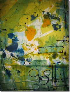
IMG_2152


In this one, I was using a mixture of torn paper resists, and painting on the screen, followed up by directly painting onto the fabric.   Now in the past I would usually have cut a piece like this up to make chimneys or something!!  but I’m thinking of being a bit bolder – that old risky shift may enable me to create more than lead from these ingredients!  I love the sense  of space here, but would definitely like to add some structure….so I’m thinking of taking some of these elements and working on some ideas for supplemental fabrics to go with this.

IMG_2153


In this piece I began with a  pattern of scattered drops of thickened dye and then started adding those more architectural elements.    I’m almost tempted to let this one stand alone as a finished piece…a Very Bold move for me…but that is the effect of synergy!  I have done similar pieces before, but some years ago (see blog of  May 3rd).

IMG_2155


with this piece I drew on the screen with thickened dye, then printed it off onto fabric pre activated with soda ash.   I like the idea, but it’s a bit wimpy….my new synergistic self wants Bold, not quiet polite wimp….so I’m going back to this screen and with a foam brush I’m going to add darks, bold shapes – especially in that middle area.  Then I think I might just print right over the top of this first image…Especially if I can offset it a little…hmmmm that might be rather interesting!!! 

and so…off with the computer! and back down to the dye studio..and if you have been, thanks for reading!  don’t forget to comment!!  Elizabeth

Sunday, May 9, 2010

Cutting up!

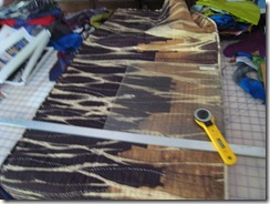
There’s something wild and exciting about taking the rotary cutter to a long finished piece and with a few swipes cropping it down to size!!

T'was a dark and stormy night

Above is a poor unloved piece: “Twas a Dark and Stormy Night” (60”w, 21”h) .
I guess it was the name that put people off!!!  Although I have always loved games like Consequences, I know a lot of people just groan when they are asked to play.  
This piece was based on a photograph I took from the top floor windows of one of the major department stores on Princes’ St in Edinburgh.  Of course it was grey and raining, and so we did what you always do in Scotland when it’s grey and cold and wet… you go and have a nice cuppa tea preferably with  a cream cake! 
As a result,  I always liked the piece because I remembered the company, the cuppa and the cake, but the quilt really didn’t show those! (didn’t show my Main Idea!).

And now I’m 3000 miles west and a good way south of Edinburgh and about to teach a workshop at QSDS and along comes their request for a piece less than 24”. 
If you havn’t got one, make one:

IMG_2135

1.


IMG_2142


                                                                                                                    2

IMG_2143


3


Voila! It’s as easy as 1,2,3!

If you have been, thanks for reading!! Go forth and cut!   Elizabeth

Thursday, May 6, 2010

Getting Started

It can be difficult!  some people put it off for hours and days and weeks with displacement activity (I MUST tidy up before I get started, I can’t work with the blue fabric mixed in with the green, ugh! disgusting!), or blind optimism (if I go away maybe the studio elves will get this thing going), or magical thinking (if you pretend it isn’t there it will go away)  and its opposite (if i pretend it is there, it will appear!).

So, what d’you do to get going?  I find it helps me to have a solid, somewhat ritualistic routine..like the preparation for any performance whether it be the solitary writer, the explorers setting off on their journey, the athlete getting his socks on in the right order and touching things, the stage performer making the “right” gestures.

I’m finishing up some work now (sadly it must be hidden because of The Rules of the Game id est nothing can be revealed if you want to enter it into a specific show! ).  The work is all off the wall, out of the sewing room and onto the “sewthiswhilewatchingtelly” pile.  So now is the time to start again.

I’m always collecting inspirational material, photographs, sketches, notes…I like to pin these up and rearrange them while doing some of the machine stitching assembly work on the ongoing piece.  Such assembly doesn’t require my whole brain, especially not the creative part, so it likes to going wandering around thinking about the sketches up on the wall.  Ever seen a wandering brain?  it’s probably mine!

I do find it helps tremendously to overlap work; I’m always thinking about the next, or the next several pieces, before finishing the current one.  I know writers do this, they write the first sentence or two of the next chapter before going to bed so next morning instead of a blank page they’re greeted with “ His eyes were glued to her heaving bosom ….” (most uncomfortable I would have thought!.

If I’m machine stitching that means I have no handstitching in the telly pile, so then I’ll have sketching materials there.  I usually work better in the play stage of creativity if I’m not too solidly focussed on it; if I can jot down an idea: hmmm I like this arrangement of shapes, let’s just clarify it..now what if I turned it upside down and repeated it, or just took half, or cropped this bit out.  Hmmm I could try adding a couple of vertical lines here….I can play like that while watching a gentle British sitcom (I’m a Doc Martin fan!)..and not be too critical of the drawings.  Thus the overlapping of work at any stage.

So now I have my sketches, or sometimes collages:

IMG_2131 IMG_2132

Above are two typical examples.  The sketch is #9 because I told myself you must make 10 sketches based on this photograph (a complex one of houses in Warwickshire).  Collage from magazines advertisements is fun and can give you unexpected little quirks of colour or shape.  

And the next step for me is to clear and rule out the design wall:

IMG_2129

I read ages ago that the first four lines of any composition are the four outside edges.  It’s amazing how much of a start getting those four edges into place is – and of course you can always shift them a little as the piece develops.  But somehow, clearing the space, and marking the edges (I use all the long strips of selvedges I’ve pulled off fabric.) really sets the scene for me…and then I’m off to deal with the glued eyes and the heaving bosom!

so…what are your starting rituals?  How d’you get moving on the Next Great Work?  Do write and tell me!!   If you have been…thanks for reading!  Elizabeth

Monday, May 3, 2010

Cloth as medium or cloth as subject?

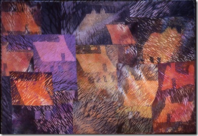
ymcollage2 

y/m collage 2
(collection of the Bascom Center
Highlands, NC)

I was posed an interesting question yesterday: as a person who dyes, paints, prints all the fabric she uses in her quilts, did I view the fabric I made as being art in its own right, or was it merely a medium with which I made other art?
Only a little introspection revealed to me that I usually make fabric just to have fabric..blueish stuff goes into the blue box, red into the red and so on.  Consequently, since I'm not limiting myself to any particular thought, I'm able to be completely free and loose when painting or printing or dripping or (at times throwing!) dye!! I can operate on a purely visceral level - let's have green, how about a dab of white, let's fill in this corner with dots oh how about a lines that snakes through - much like kids running round and discovering a secret garden.  This is too much fun to be work!
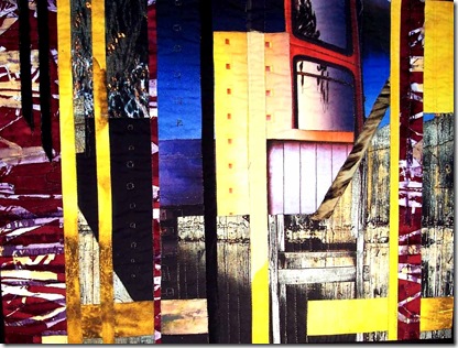
When I make a quilt, however, I invariably start with a specific idea: the piece starts in my head, not in my hands.   Usually.  I have done a few pieces that began with an "interesting" bit of fabric upon which I built an idea. (y/m collage 2 above, Please Handle with Care on the Right and Tenement below)

OLYMPUS DIGITAL CAMERA          
I don't think one approach is better than another.  Both have their advantages and pitfalls.  If one is too tightly trying to follow a carefully worked out large cartoon the work can become very stiff and lifeless; on the other hand, if you just throw gaudy bits of fabric at the design wall you often end up with a gaudy mess!!  And I have seen a lot of those messes out there - which is one reason I've avoided doing that myself and usually made fabric just to have fabric.  I think even the more thoughtful artists whose work is about the fabric tend to fall back into the same compositional solutions time after time.  Choose your favorite one (I'm not naming names here!), and just see if I'm not right!

                          Please handle with Care (in the Hasbrouck collection)


The role of the cloth is an interesting question to consider and the process could be quite efficient (yes efficiency is important for me because time is limited - would I were the young thing with two years to "discover and remake myself" in graduate art school (read recently about an up and coming  artist in AinA). But, I'm not. )

OLYMPUS DIGITAL CAMERA           And so, from hereon out (and let's hope "out" is quite a way ahead!), I think I will make every piece of fabric as if it itself might be the subject of the piece, and if it turns out to NOT be worthy of centre stage, then it will still be fabric! and into the appropriately coloured box it will go!  And, I will stick my recurring themes of landscape (whether it be urban, rural,  industrial or water) as I drip and dip and dabble,  for these are the ideas and thoughts that are important to me.
Having got my "star" however, all additional pieces must support the lead.  Not compete, not just stand there in a row with one glittering a little more than the others, not in some prosaic predictable pattern, but something interesting and intriguing that speaks to the meaning of that piece for me. Hey up! I've got some dyeing to do...
If you have been, thanks for reading!  And do, please comment!! Yes, you!
Elizabeth


Tenement (collection of the City of Atlanta)