Friday, December 31, 2010

a difficult choice

I’m torn between trying to strengthen older pieces or taking a New Year’s leap right into something new and fresh!  It’s always difficult for me to give up on things..I’m the one with the poinsettia with two green leaves left on it in the middle of summer!

When do you give up on something? what are the options?  I’m talking about pieces that never get into any shows or those that I never even think of entering  because there are other pieces that simply stand out more.  For example, I love a grisaille effect, but there’s no chance a nice grey piece will ever get into a show when the jurors’ eyes are dazzled with orange and red and emerald and sapphire!

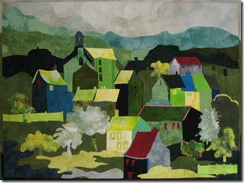
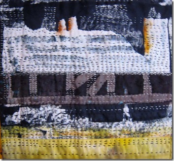
onthelatchhp

cityofmistshp


I’ve had several pieces I considered so boring or too muddy I’ve despatched them straight to the thrift store…I reckon some deserving moggie is welcome to a bit of layered and stitched fabric.    grid light

lavenderlight


Other pieces have really benefited from some judicious surgery -  lopping off an unwanted foreground or background, cropping off unnecessary borders and the like. (as you can see I was even able to flip the one below horizontally! no mean feat!!)

overlook slide overlook230dpi

  Sometimes even complete separation is the only answer as in the  conjoined sextuplets below!

greenhouses72green 1 green 2green 6 green 3 green 5 green 4

Others just don’t seem to have any real focus or structure and will probably be stronger with something added to them.   

emerald city full 300

OLYMPUS DIGITAL CAMERA

The one on the right above was similar to the one on the left, but I went back in and gave it a strong vertical structure….I need to figure out the best way to do this to the one on the left.

I love trading work too, whether for paintings, sculptures, or services rendered!

Of course other pieces are okay, just not Amazing Pieces (well, not even semi- amazing, I don’t think I’ve ever achieved what I’d call a true AP!!  but…there’s still time!).  They are well made, well composed and very liveable with but don’t have a tremendous Zing to them.   Those pieces are really good to use when you’re asked to donate work (as we know artists so often are).

And then there’s the Relatives!!!  Yes! I’ve even done that! No shame at all!!

And so I give away, throw away, add to, delete from, donate and disperse however I can whenever I’m not sure that a piece is even part way to what I had hoped to achieve with it.  I have a secondary wall in the study where I put this work up;  I can gaze at it when “on hold” and try to figure out to which of the above categories it belongs.  I have found that if you really think a piece is good, even though it has been rejected over and over, eventually there will be someone who loves it.  Many of the above pieces have (I’m happy to say!) gone to good homes!!

And so …back to pondering I think if I’ve not figure out a good tonic for the anaemic patients by the end of this year, they’ll be off to a back ward!  

So, if you have been, thanks for reading and thank you for all your time and comments in 2010! Onward and upward!   Elizabeth

P.S.      My blog was nominated (December 29th) for a Making a Mark prize!  Thank you so much to the nominator – I do appreciate it.  I wasn’t chosen for the actual prize because my blog was “too wide” – hmm I’ll have to put the poor thing on a diet!  And also because there were “big blocks of text” – I’m guessing that means not enough nontext!  so I shall endeavour to be skinnier and include more nontext this next year!! 

Tuesday, December 28, 2010

Using photographs as a starting point

old slide whitby alley

westcliffsteps theredgate

I’ve had the impression from some folk that there is a little snobbery about using photographs as a beginning point for an art quilt. Work that comes out of oneself (rather than a photo) is considered somehow purer…hmm well ..there are several responses one could make to that!! (but better not in a public forum!). However, I think the reason that starting with a photo is so looked down upon is because people often do a very bad job of it . They follow the photograph too closely (warts and all) and end up with an overly literal piece that shows the warts very well and not much else. This kind of work often looks exceeding stiff and lifeless. But I don’t think that work that comes from a photo HAS to look that way, and it seems to me it’s just as good an inspiration as any. Wherever you begin, you’re unlikely to come up with the perfect idea or image at the first try. There’s always considerable orchestration, presentation, refining and distilling needed to be able to gain even some semblance of that golden idea floating in your head. Have you got golden ideas floating in your head? I know I have in mine!! Oh! would that I could realize them!

Here are some points I’ve found helpful when starting from a photograph?

1. The best photographs of course are those that you take yourself because you were inspired by a particular scene; there was something about it that made you want to keep a memory of it. If you can, write that down when you take the photo! Even if you don’t use the photo to make a quilt, it will add to your pleasure of the photo itself to read your notes. And if you do make a quilt design, then you can look at your notes and compensate for the distortions that the camera makes, or thing things that it misses: the atmosphere or brightness that you observed but couldn’t quite capture in pixels. So often I find that what entranced me was the light, especially when it suggests some magic place ahead. A sunny corner (or in the South – a shady corner!), a clean fresh meadow full of flowers. The small flowers may not show up on your camera, but if you have your written note, when you make the quilt, you can sprinkle flowers in there, to be observed when people come up close to the work. Just like you might see the meadow from a distance and then, as you come to sit in it, you appreciate all those small wonders.

When you’re looking at the inspiration photo preparatory to sketching out some possible designs, think first what it was that attracted you. Then think “how can I bring this out in my art quilt version of this picture?”. If it was the freshness of the spring day…then it’s unlikely that your photo has captured the freshness very well…but it will have the main shapes and values of the scene and it’s up to you to figure out how to use color or value pattern or texture to indicate that freshness. Think: What colour is fresh? What texture is fresh?

2. The camera photographs everything, it is omnivorous! No discrimination at all!! But you are not…so the next step looking at the photo is “what can I leave out?” And basically that’s anything that doesn’t set the scene or contribute to your feelings about the image and what you want to communicate about it.

Leave out all the extraneous “stuff”. You can always put some back if you need it for balance later on.

3. Next, I like to assess the photo and see if there’s anything that might be better rearranged. You know how you just want to move things around a little on a dining table, or in a bunch of flowers, or the furniture in a room. As a teenager I drove my poor parents wild because I was always seeking the “perfect” arrangement of furniture in my room – with lots of crashing and banging and dings and dents!! It’s a lot easier in a photograph! You can make a photocopy and cut out the relevant bits you want to move, or simply sketch them.

4. Having left out unnecessary stuff and rearranged what’s left, check the value pattern. Just because the actual place happened to have lights and darks in various places, it doesn’t mean you have to have them that way. Nor d’you have to have the direction of light as it actually was. You can choose your direction (or directions – even Rembrandt often had multiple directions of light) purely by what you most want to illuminate.

Also it’s important to remember that a camera tends to overaccentuate the lights and darks – especially the darks, rendering them as a heavy black when in reality they might have been a rich mixture of deep values of several colours.

5. Now for the colour – what are the important colours to include in this piece to best demonstrate your feelings? You might have photographed the scene because it spoke to you of a fresh spring morning, but maybe that was the result of the cool air, the faint scent of blossoms and the warmth of the spring sun on your face. Sadly, the photograph won’t include those, BUT you can bring them out by altering the colours. What colour is cool air? What colour is the warmth of the sun? What color is the smell of flowers? Yes !! you know! You’re thinking of it already!! So add those in…but then check to make sure that you don’t have too many colours, the piece will be stronger if your colours are harmonized. And talking of harmony, it’s good to have harmonized shapes and lines too – even if they don’t occur in the photo.

When you have used a few existing photographs as a starting point for a quilt and made some of the changes described above, it becomes easier to “compose” the photograph as you are actually taking it. I think “fresh” photos are best (like eggs!) because then you can remember your impressions of the scene and why you were photographing it more easily.

Some people think that “copying a photograph” is cheating because it doesn’t involve any input on the part of the artist….but I guess they’ve not read the above suggestions!!! Input is all..the photo is where you start, not where you end up. So please, just smile gently at those who would look down on you as you look through your photographs to see where to begin…you know how much you’re going to add. It’s not the method, or the process or the subject that is important, but how genuine and unique the expression is.

If you have been!...thanks for reading….Elizabeth

Wednesday, December 22, 2010

Dealing with the leftovers!

So what does one do with the leftovers?    An old saw in composition textbooks,  whether applied to wall hangings or garden landscaping is to have odd numbers and various sizes of things: e.g. in values: at least three, with a large amount of one, a medium amount of another and a small amount of a third.  We have (rather scraggly as they don’t like the droughts we suffer from in the SE USA) a little papa/mama/baby family of cypresses either side of our driveway!  But I hadn’t planned on it extending to my quilts!  though this seems to have occurred when I was looking the other way (probably at the online scrabble to which I’m addicted!).  

Years ago I made a little collage out of magazine advertisements; it was an exercise in an art class at the U:

collage 1

I can certainly see why people like fusing because it’s so quick and easy to glue and stick!! at least with paper cut out from advertisements.  anyway this little collage has kicked around the study (yes I’m definitely not on the “best dressed studio list”! we never even got around to calling it more than a study!) for several years now and finally I decided it was time to make a quilt from it.


lavender gothic 2


Of course it came out quite a bit differently as my quilts are wont to do.  The tree looked a bit clunky, the pale pink building in the back ground with the cut out (which probably occurred because I was cutting away some advertising wordage) looked very odd, and the foreground seemed too deep, the right hand didn’t appear to be related at all etc etc .  Plus, I was looking at a painting by a friend and thinking how much I loved the colours in the painting and was following that for my colour scheme.   I wanted a nice spooky feeling despite the lavender – I like the strange contrast of a colour associated with little old ladies and the gothicky hallowe’en feel to the house.  And that determined the title: Lavender Gothic. It’s about 35 by 45, stupidly I didn’t measure it before rolling it up in the quilt store aka the guest bedroom which is now tidied for guests, so they don’t have to sleep under 45 quilts!

But no sooner had Papa LG been made then I started looking at the left over bits and thinking about what could be done with them  Generally I feel the leftovers are often tastier than the original dish but I’m not sure about this one..I think I might have added a little too much sugar to poor Mama LG (Storm Dance – well the trees seemed to take over!):

storm dance

She is smaller: only 18 by 22.  At first I was going to balance that blast of pink with some pink verticals at the bottom left, but then I felt that the trees engaged in their own little dance had enough zest, movement and weight to compensate for the pink.  But they could still be added…so let me know!!


lg baby


And I still have bits left over!   so I’ve pinned up this little fellow (13 x 17), not quite sure whether to finish him or not…the baby of the bunch.  Again comments invited…anything else left over though is straight into the compost!

Hope you all enjoy this season celebrating the winter (or summer!) solstice; I know I will if I can just get that darned Christmas cake made!!

If you have been, thanks for reading!  Elizabeth
PS don’t forget to check out the tabs at the top of the post!

Monday, December 20, 2010

Feeling and structure

I was reading the other day that there are two important things for an art work to be “‘successful”-   however you define success…  and I know we all have different definitions.  Talking of definitions of success, I always have to laugh at those people who consider a successful piece is one that knocks your socks off!! Why losing your hose equates to a wonderful piece I’m not sure.  D’you think it would work backwards?  Maybe if I wave said garments at a piece – or even incorporate them?  I know people have stitched gloves onto quilts…..would it help?
Eniow, to digress back to the main topic…I read that the two important things are
a) that the work    evoke a feeling in you and
b) that the work has a good structural basis to its design. 
Now I’ve written quite a bit about a good structure being important but not so much about the first requirement, so I thought I’d cogitate upon it a   little. I started looking at lots of images of quilts out there in print and pixels and, maybe I’m jaded and cynical,but I’m not seeing much  that does actually trigger  much of an emotional response for me.    Maybe the odd frisson, but hardly ever a gobsmacker!
Please go and look, and see what you find.  I’d love to know what work has really mesmerized and enthralled, blasted off more than a pair of measly socks!! Please comment and tell us!  Which pieces  have touched you? What have you seen in, say, the last five years, that you keep mentally returning to with great pleasure  and feeling?     In the same way that you might listen to a wonderful piece of music with joy in your heart or tears in your eyes, or even a sinking feeling in your guts, or sparks in your biceps!!  Or that triggers this sensation described by Alan Bennett in his fabulous play History Boys:
“The best moments in reading are when you come across something – a thought, a feeling, a way of looking at things – which you had thought special and particular to you.  Now here it is , set down by someone else, a person you have never met, someone even who is long dead.  and it is as if a hand has come out and taken yours.”
I think we already have enough of a history in the art quilt/studio quilt/fiber collage (whatever you like to call it) world for us to see that some of the early work definitely did create a reaction whether it was an oh yes! or an oh no!!  I remember being mesmerized by Nancy crow’s Bittersweet series, having the sensation that Alan Bennet described with  Terry Hancock Mangat’s work and Nancy Halpern’s evocations of New England landscapes.   And I see that the Lincoln, NB quilt museum is holding a retrospective of some of those amazing iconic works; I do hope they put more of them up online.
and now, back to the drawing board…..let’s loosen the socks a little, just in case…
If you have been, thanks for reading!   Elizabeth
PS. I’ve put tabs at the top of the blog so that it’s easier to find the pieces I have for sale, or just read a little about them (medium and larger quilts).  Thanks for looking!

Thursday, December 16, 2010

Sewing and Listening

Decided to do a bit of stitching instead of cogitating…and made this little piece….
I like the way it reminds me of the ranch house in Flame Trees of Thika, a lovely BBC tv series based on the Elspeth Huxley book Memories of an African childhood (her parents planted a coffee farm there before the First World War).
stitched
Sometimes when I’m working on a piece for a while, a book I’m listening to or thinking about gets totally stitched into the piece.  I don’t know if that happens to other people ( do comment!).   This might  be good or bad.  I made one piece listening to Schindler’s List and of course couldn’t stand it after it was finished.  Thank goodness I never told the buyer! Usually, however, more positive messages get stitched into the work!

The piece above (nameless as yet) began life as a large length of screen printed cloth where my emphasis was on buildings disintegrating…as the image disintegrated on the screen, the cloth became more evocative of my intent.   Or so I thought as I romanticized at the time.  But after washing and ironing,  when I looked at a couple of yards of this, it really was dreary and dispiriting!!  Black and white desolation!! Ugh…too nihilistic!
So it took me a lot of looking before I discovered this tiny vignette ( I guess it’ll be about 14” x 15” when I get it faced) in one corner.  I added a bit of that gold ( a lovely strange old dye called Nickel I found lurking in the cupboard at Penland last summer), and also some silk organza to create some depth and shadows.  If you want to you can see a person, but if you don’t, then don’t!!  I do like it when a piece suddenly comes to life and reminds me of some strong visual memory that I couldn’t quite remember at the outset.
I started thinking about visual memories of scenes from the past because of the book I'm currently reading about drawing scenes from memory (David Friend's The Creative Way to Paint) and I think it’s going to be a great exercise to help to sharpen my visual skills.  In drawing from memory, you include only what was really important to you at the time, unnecessary details are forgotten.  So it helps you both in simplification and in deciding what should definitely be included.  With luck the essence is there but the forgetobilia is not!

Okay…back to sewing and listening….
And if you have been, thanks for reading!  Elizabeth

Monday, December 13, 2010

Please don’t heave the bosom!

There were such interesting comments on my last post about visual clichés that my brain whizzed (in the English sense not the American one!) into cogitatory gear right away!!  Some people actually defended the darn things!! :)  Though maybe they were playing devil’s advocate??  hope so!!  To me a cliché is something that is tired out, old, stale, unappealing to every sense one might have and some one might not!  Of course children might like them and the visually uneducated – because they havn’t seen them before.  So for them they are not a cliché  but a simple slick evocation of whatever beast (animal, vegetable, mineral or abstract) they symbolize.  but, for the rest of us…c’mon!! you can’t tell me you actually Like stuff like hearts and flowers twined around the kitten’s neck – unless I suppose they are strangling it in which case it might make an interesting point: that clichés strangle even the undeniably cute!

What is “good” about a cliché is that it makes a quick and easy point; the person using it doesn’t have to think, the person seeing it doesn’t need to set the little grey cells into motion either.  This is good for advertising: people writing advertising copy probably ( I don’t know!) have to produce so many jingles and catch phrases per hour, and the advertisers definitely do not want people seeing the visual and verbal clichés that make up their ad to think!!  “What have the public think just about what we’re showing them?  Oh my lord no…we just want them to rush right to the store!”

So I guess it’s partly my fault in that giving some examples of clichés I might have suggested that all hearts and flowers and kittens were clichés.  No certainly not, but very many of them are.  And herons ankle deep in water, storks on one leg, beige color schemes, south-western color schemes, predictable chord sequences in music (I actually went right off fifths when I was pregnant! most people go off coffee! but I’ve never liked music where you can totally predict the next chord or the next beat) or locked room mysteries where the butler did it and so on.

I think you could definitely explore those kittens and hearts in a very different way (as one commenter suggested) and it would not be a cliché.  It’s the simpering, oh-how-sweet treatment that raises my blood sugar to emetic levels!  But it’s hard to do; it’s very hard to come up with something fresh and natural and interesting and invigorating with a subject or a shape or a color scheme that’s been done a million times before.  Absolutely wonderful if you can do it!  Actually speaking of hearts, I think Robin Schwalb managed a totally fresh approach with her heart card from Full Deck – yes anatomically correct! In fact many of the heart cards from that series were fascinating and intriguing.

June commented that what she found interesting was that “one person's cliché was another person's inspiration.  But for the naive (artist or spectator), cliches sometimes are truly affecting -- they seem to embody something that no one saw before.”  Initially I’m sure this is so.  But once you get beyond the initial beginning level of reading, writing poetry, making art, buying art (need more of those!) then any ability the image had to affect you is completely gone.  And if you bought art like that it would be stale within a month.  If you buy art that is totally fresh and original it will last for years!  I know!  I’ve got some of both kinds!

It is also the treatment of the subject.  Herons per se are not a cliché but a quilt with one gracing a body of water as the “focal point, must have one” are.  So if you are making a quilt about the return of herons to the Pennsylvania mountains make it look like no heron image you ever saw before.  When I look out of my window and see a heron exceeding stealthily creeping toward the fish pond, I am struck by its sleekness,  its stillness and its determination to procure itself a fish dinner.  Now I’m not about to make a heron quilt, but if I were, I’d be looking to get those attributes into the piece. It wouldn’t just be standing there admiring the view!

Verbal clichés can be translated into another language with quite amusing results…if you talk about letting the cat out of the bag in French or Spanish, they’d be looking around their ankles!  The translation definitely renders them a lot more interesting.   But I don’t think you can translate visual images in the same way; I may be wrong (please write and comment if I am, it would be interesting!) but visual images are much more universal than verbal ones.  So much so that people have actually developed little “phrase” cards with symbols for all the things you might want in a foreign land where you don’t speak the language.  Aother good reason for art!  So much more universally comprehended and enjoyed than many other media.  And a good reason for us to spread and share the art of different countries.

June said clichés  are “cultural tags in that they tell you a whole lot in a hurry”.  Some definitely are and therefore have considerable value but I think very often clichés are more like what Bilbo had in his pocket when Gollum questioned him, “a lot and nothing at all”!   Actually,it isn’t so much that they tell you a lot, but that they do it very quickly because they are so easily absorbed – like sugar water – but like sugar water they don’t have any real substance.   And she was definitely right when she described them as therefore not being effective (or affective) in art.  The point about good art is that it slows us down, makes us think, shows us a new way of looking at things.  Moreover, it’s a way we won’t forget and will want more of.

And yes, it is difficult to paint landscapes when so very very many beautiful ones have been painted before.  but the impressionists did it and they had the whole history of hundreds of years of amazing landscape paintings that preceded them.  They did it by taking a whole new approach: paint the light, not the shapes.  So it can be done!  Paint what is in your heart as you look at the landscape, paint what is unique to you. If you paint your memories of a place, be sure to paint them accurately:  the buildings were bigger, the trees higher, the door brighter, the animals more menacing, the stone wall mountainous etc.  In art quilt examples of landscapes, look at Jane Sassaman’s landscapes!  Those sharply defined precise prickly objects are definitely not the Hallmark version of country flowers!

Clichés very definitely exist in the abstract world too; I think the “wall of sound” type of abstract work has had its day (even though several people continue to produce them!), also empty spaces filled with complicated dense machine quilting and then the occasional shape or line, wildly painted or dyed cloth that is randomly cut up and sewn back together, strip piecing for its own sake and so on.

And I agree with Jackie that images are precious to all of us for different reasons, nothing should be automatically ruled out. There is no proscribed list.  This is true, it is the treatment of the specific image that can be the cliché, in the same way that if I was a writer I could use the word  “heaving” in one paragraph and “bosom” in another without being clichéic, but if I put those two images together, I totally destroy any mood I might have created.  so whatever you do with your bosoms, just don’t heave them!

And, if you have been, thanks for reading!! and please do keep commenting!!!  Elizabeth

Monday, December 6, 2010

visual cliches and how to detect them

I’m very familiar with verbal cliches.  I find writing that incorporates a lot of them to be like eating old dried out cakes that have long lost their flavour.  Typical examples would be:

         “[He] put his lips on her neck.  she thought: “Other lips have been there. God, I am in a cage!””
“His eyes roamed across her bosom, as well as his inquiring fingers.”   
“If we all pull together as one man, we’ll discover the answer and then we’ll know everything!”
plate 

“He needs to step up to the plate…….
and get his ducks in a row”


Good fresh writing, like good fresh bread, has lots of interesting little chewy bits, rich flavours and enticing aromas that you can savour.  It can be clean and simple and pure like the best water or lettuce or apples, or it can be quite flowery!  Here are some examples…
“Her mind felt like a mirror: everything in it came from somewhere else”.  (Mark Salzman)
“The silence in the room came alive, like the positive space in a Chinese landscape painting or the words left out of a poem. ” (Mark Salzman)
“It is a drastically interesting country, America is, and you are lucky to get away without regret, loss of tin, or the Spanish clap”. (Sebastian Barry)
“The sun lay in a shaft on the window seat and along the old flowered carpet….At four o’clock she made a cup of tea and carried it back to her shaft of sunlight, as if seeking protection”.  (Anita Brookner)
When one first begins to write The Great Novel or The Memoirs the initial outpourings are stuffed with trite statements and old tired metaphors and phrases and you have to go beyond that, far beyond, to be able to reach something worthwhile , something that is new and genuine and fresh.   That is very evident. (There is also a lot of redundancy that must be cut out!)
But how about visual cliches?  I think one of the problems with many of the quilts we make and see is that we fall right into the same difficulties as the beginning writer and produce stale tired visual cliches.  So what are some typical ones, and how can we spot and eradicate them?  I’m not suggesting for one moment here that I can do this by the way!  But I’m becoming so aware that this is a major problem to be avoided.
a vis cli

Oh yes we do!!  Hunt them out :) !!


Hearts!!!   I don’t care if I never see a heart again!  Especially pink ones  and  oh, the crassness of   I ♥ visual cliches!  
People strolling at the edge of the ocean symbolizing deep thoughts and fine sentiments (there was actually a 9 minute you tube of one of those on Facebook this morning!).
And of course we all know what the crashing waves mean when we cut away from a torrid (oops! cliche!) love scene.
And then there’s the ubiquitous hand shake…the hands meeting across continents or some great divide. Yes! seen it! Please don’t make a quilt about it!! 
Looking through a popular quilt book I came across many examples: tear drops!, irregular edges (when not a necessary part of the content) especially those where a vine or a leaf  hangs from the bottom.    People with blank faces.  Collages of street signs, and text or handwriting on a quilt is getting very stale now too.  Dividing things up with sashes and borders (especially when they appear to be unrelated!), rows of things: flowers, trees, hands….
Images taken from cards (a double cliche!), happy dogs, puppies, kittens and kids  and koi– of course!  Things stuck on top – like leaves!
It is easier to spot cliches in representational work which is why, I think, so many dislike it but abstract work also has its cliches.  I’m afraid that irregular log cabins and irregular squares within a square have also become something of a cliche.  Everyone has done it!  Great the first time, then it was fresh…but now?
And there are cliched colour choices too – predictable groupings of colours, just look through any popular quilting magazine: the South West look for example.  Turquoise and ginger and black.  And so on.   Nauseating rainbow effects.  Or all sweet sugary pastel colours.  Or, cor blimey fabrics created by throwing violent colours on top of each other into some kind of 3,000 calorie dye sundae!   And be careful you bleachers and rust dyers…it’s becoming obvious! 
Anything that is trite, overused, predictable begins to look superficial, tarnished and worn.  As with verbal cliches, it is very hard to get away from visual ones for these are the images we are saturated with and they are the ones that come first to our minds.  But I for one am going to try to Root them Out!  this is why it is often the third or fourth or fifteenth idea about a quilt is better than the first one. 
  Let’s leave the cliches to the advertisements where they belong! Trash with trash!
The first step in quilt making is learning the cutting and  sewing techniques – the equivalent of learning to read and write.  The second step is being able to design good compositions: the equivalent of good grammar. 
Now the next step would be to put our reading/writing/grammar skills to use in a creative writing class….and write and write and be coached, encouraged, evaluated, critiqued over and over to help us reach the truth and eradicate the dross.
If you have been, thanks for reading!!  and please do post examples of visual cliches in the comments!!  I look forward to it!  Elizabeth
PS take a look at the blog store if you're looking for presents ! Scroll down for lots of affordable smaller pieces! Thank you!

Friday, December 3, 2010

Inter and Intra inertia humps – a problem you didn’t realise you had!

april rains 6x3 April Rains
Some of you may be wondering (and others may not give a damn!) why I’ve been blogging less lately. Well of course there are a lot of reasons, but the main one is because I’ve been writing a lot of material for a course at the online quilting classes at “Quilt University” and I find that I can only spend so much time per day sitting at the computer writing!! Plus there are only so many cogitations within my bonce upon which  I can pontificate!  I’ve been teaching an actual workshop called Working in a Series for a while now, and will be teaching it again at the Hudson River Valley fiberart workshops next May (looking forward to that, it’s a great venue!)  and that’s what I’ve been putting into an online course.   While taking an actual workshop is so much better of course, not everyone can manage that for reasons of distance, time and finance and it has been a very interesting process trying to put some of my workshop ideas into a virtual setting.
st ives barton full St Ives
I developed the idea of Working in a Series out of my own studio practice.  Like so many quilters, I love a novel challenge and tended to try one of this and one of that and not be able to wait till a new idea came along that I could have a go at!  But then when I looked at my work as a whole, it looked like a real mish mash and it didn’t seem as if I’d gone deep into anything.  Furthermore, since I generally had lots of ideas about something I would try to get them all into one piece!  With the resulting Gothic, spanish style ranch house with turrets and a picket fence to say nothing of the Victorian garage of a quilt!  I think also that Working in a Series helps you to get over the inertia hump between pieces that inevitably occurs. 
semmerwater from slide Semmerwater
I’ve discovered in fact there are two humps!  This is a dromedary of a problem rather than a camel!  Intrahumps and interhumps. The first  type of  inertia humps or stalling points is  within pieces and the second is between pieces.   Intra inertia is where it is very difficult for you to stay focussed on a piece as you are working on it.  Sure when we’re at the exciting stages of creation it’s easy for that interest to keep us moving,  like choosing the fabric!!  Flinging out great bouquets of glorious color across the floor!  But we all know (though for some reason I see few people admitting to it!  can it really just be me?) that there are long tedious passages, where you are working your way through what seem like endless value studies, or having sewn the piece together then facing the quilting – up and down, up and down, shoulders aching, thread breaking, bobbin running out of thread at crucial places and so on.  What I have found works best for me to overcome these kinds of humps is straight out of my background in behavioural change.  One can reward (and thus increase the rate of) a less attractive behaviour by following (note not preceding!)  it with short periods of a more attractive behaviour.  So when I’m engaged in a tedious task I do it for just as long as I can then when I start to flag, I have a little behavioural reward.  Now this could be any behaviour that seemed to be wanting to entice me away from the sewing machine!!  top of the list at present is online Scrabble!!  Thankfully I have a friend who indulges me in 4 simultaneous games!  So 15 minutes of sewing (maybe even just 10 on a bad day, or 30 on a good one!) is rewarded with a few Scrabble moves.  But my reward could be with a cup of tea, or even 5 minutes of house work.  Housework is usually very low on the list of attractive activities, but you know when you are ploughing away through something truly temper trying and tedious how suddenly dirty lavatories look very enticing!!
rainyrainynight slide Rainy, Rainy Night
Inter inertia is that which occurs between pieces.  Now I deal with this in a number of different ways.  For one thing I’ve discovered it’s much better for me emotionally, mentally and physically if I work on several pieces at once: one in the planning and design stage, another that is being blocked out on the design wall, a third under the sewing machine being stitched together, quilted and finished, and a fourth that is having some handstitching incorporated into it.  Plus I usually have several earlier pieces in some stage of de- and re-construction. If I really hate them, they’re in the thrift store pile.  If there are good bits, they’re been identified and rescued from the morasse!
hostlersrow230pix Hostler’s Row
The second thing that really helps me over my interpiece inertia is working in a series.  I have found it is so much more exciting to plan, imagine, think about a whole series of quilts on a topic that is engaging to me, than it is to put all my hopes onto a single piece.  I always liked whole novels rather than short stories, and in fact when I was a kid I usually chose books from the library based on the number of pages rather than anything else!    Well yes, now I’m a bit more discerning, but I’m sure that’s where it all began!   In Working in a Series, you don’t necessarily need to know everything you’re going to do up front, but you definitely have an overall plan, a backbone of an idea.  And that plot will carry you through chapter after chapter…what will happen next? What aspect of this idea (whether it be the drowned cities or the industrial landscapes, or simply the colour red) can I work on next?!!  I’m not good without direction, but I’ve found that it’s perfectly possible for me to give myself that direction with the idea of being a serial quilter.  And with that dreadful pun (oh how delicious they are!) I will quit for today.  If you have been, thanks for reading! Elizabeth
thearroganceofcalm The Arrogance of Calm
PS I’ve included some images from my Drowned city series: the idea of cities being drowned is a very old one.  There are mentions in the OT  of all cities being under water, there are old myths from Celtic countries about the gods being so pissed off with man’s disregard for nature that they flooded the valleys and drown the whole town.  And there’s also the magical idea of cities under water: Atlantis , of course, and writers who build their plots on old mythical ideas like J.K. Rowling have also used these themes. I leave it up to you to decide whether my pieces are about the negative aspects of drowned cities, the positive ones, or both!! 
All comments gratefully accepted!!  Plus a firm resolution of amendment, I will try to do better with  responses to queries within comments!

Tuesday, November 30, 2010

A refreshing break or how to hide your sins in fluff

Sometimes you just have to do something mindless!  No concept at all, just cut the squares and sew them together and hand over the finished piece to the grateful recipient.

I’ve always liked the idea of recycling, and there is a horrible waste in my normal production methods which involve dyeing or screen printing  yards of  fabric most of which is discarded in the compositional process.  So for once I’ve used old, reclaimed, much loved and worn fabric wrenched from the arms and overflowing closets of the previous owner!  Plus, I must admit, a little polartec for warmth – that stuff sews so nicely  I might just switch to using it for all future work! Ah to hide my sins in brightly colored synthetic fluff!

IMG_2664


And below, the critical acclaim is exceeding positive!  Would that it were always so!                                      


nov 2010 clare with tshirt q


And now, back to the angst ridden “real” (or is it?) work of the art quilt maker….

hmmmmmm….


If you have been, thanks for reading!!!  Elizabeth

Friday, November 26, 2010

It’s all in the stirring!

cityofmists 72 pixels
I’ve seen some discussions recently as to whether abstract  quilts are better than representational and vice versa, or whether “sweet” subject matter is less effective than “sour” but I think such categories are important only to quilt organizations or curators setting out rules for a particular show they wish to exhibit.  The Real Truth (ta dah!) is not what image or style you choose  for your quilt but how well you do it.  It’s all in the mixing and the stirring, the attention to measures (and i don’t mean 1/4” seams, I mean proportions of this colour to that etc)  and the gentle baking – just enough, not too much and not underdone.  I’ve seen both!
The challenge with an abstract quilt, I think, is to make it interesting.  If it can all be seen and understood at one go, then it’s not worth a second glance.  There has to be some tension, something more to look at.  This was why the African American quilts we first saw were so strong: they weren’t as predictable, everything didn’t match up and that caught our attention.   We are hardwired to notice the one element that is a little different from the others.  It’s a genius that takes something that on the face of it sounds extremely predictable but then just tweaks it a little to give you that little surprise or jump!  But clarting a piece up with beads (or the kitchen sink for that matter – I’m sure it’s been tried, they’ve stuck everything else onto a quilt!)  is not new, fresh and surprising!
However there’s a fine line (which has been crossed many times!) between predictability with a bit of a surprise and something that has so many unpredictable elements it’s a complete jumble.  That’s the “Let’s just slap it on and then add a few letters or words to try to resolve it” school of thought!!   It’s important to get the right balance between boring and confusing.
Abstract quilts also have a problem with having a fairly predictable formula.  People can be very tempted by being successful with their first quilt in the formula, but then when they have repeated that same formula over and over, with maybe minor variations, it really becomes deadly. There is no surprise and freshness at all, the life is squeezed out of the damned thing! 
And sadly, formulae that are obvious are easily “stolen” and copies made.  Copies are boring.  BUT, if the maker takes the idea and reworks it in a new and interesting way, adding their own ideas, flair and twist to the piece, then it pushes the idea forward.  We have seen many artists do that – right from the beginning.  Each taking something from the one that went before, adding to it, using it in a new way and moving forward.
Representational quilts appear to have other problems but perhaps there are more similarities than differences in the challenge.   Again it’s in how well it’s done that’s important.  We don’t want Stale!  And it’s a real challenge if you choose a subject like kittens or houses in snow with lamplight or cherry blossom to come up with something fresh and new.  It can be done, but it’s not easy and I think you would have to work through a lot of ideas before coming up with something interesting.  Cats, for example – look at * Edrica Huws’  “Cat on an Ironing board” – now that is one fearsome moggie!! “Inner tension, a hint of disorder being controlled” was the effect she so brilliantly aimed for and achieved.  And I defy anyone who would call this “easy”!    Not a quilt artist, but a painter, Elizabeth Blackadder also has made art about cats that are in no way sweet and soppy.  If you choose a subject that’s been represented a million times before, you need to come up with something special about it.  It’s like the good story teller – he may repeat the story many times, but each time there’s a new little detail, a nuance, something to make you hold your breath.
If you choose a subject that hasn’t been done, people may say – oh! barbecue pits! what could be interesting about them?  Or, toilets, or urinals – how can they be made worth looking at (although, didn’t somebody show us that? :))  Rauschenberg took a tire (how can that be art?) and a stuffed goat he found discarded  - who would think you could make art from that?  Or how could old factories or grey towns and dumpsters ever be made into something I would really want to observe and admire.  But, as we know, if it’s done well – they are.
So please, let’s stop condemning whole categories, but look closer and examine the work.  Is it done well? Does it give me a thrill?  Do I want to keep coming back to it to look at it again?  Is it satisfying to all my senses and delicately and perfectly Right?
If you have been, thanks for reading!  Elizabeth
and, oh yes, Comments much appreciated!  Especially those with a little “inner tension”!!  thank you.
* sadly I failed to embed the link to the u tube video clip; google on Edrica Huws then click on  the videao: edrica huws patchworks 2

Monday, November 22, 2010

We look for Real Criticism, but does it exist?

I’ve been looking around for good examples of art criticism lately since there seems to be a lack of it in the art quilt world. I’m beginning to feel that this deficit is not confined to quilts!  I read a review about the fibre work of artist Orly Genger recently.  She uses rope to crochet mats and amorphous shapes which are then stacked up or leant against the walls of the museum or gallery.  Two things obviously stood out in the reviewer's mind: the scale of the work, and the pain suffered by the artist in creating the work.  It’s both interesting and depressing that no other judgment was given of the value of the  work  other than a basic description of it. There was no (as far as I could see) evaluation of how this was art, or how it added to truth , discovery or beauty within the world, or what it might inspire in others.

This does seem to be a pattern in many of the art "reviews" I've perused recently.  They  focus mainly on a description of the work using words like zine and trope quite frequently (I'm always looking them up and then forgetting what they mean, perhaps I could find a way to incorporated them into my quotidian discourse (2 more favorites). 

Furthermore, when you do find what purport to be actual evaluations of work (other current artists, not Genger)  rather than just plain descriptions, they are extremely generic, being  limited to phrases like:   “her work is uneven”, and “the paintings are competent but uninspired”, the work “feels forced” although there are “witty details”.  You could apply these vague comments to many pieces in any quilt show, they’re so generic.    Here’s one I like: “uncannily pertinent”! Yes, I think I might apply that to some work I’ve seen!!  But, think about it, whenever was pertinence really uncanny? Arn’t they just taking any old adverb and attaching it to any old adjective?     The quilts of Ms Smith were so superbly arrogant in their witty loftiness.   And Mr. Brown’s pieces were seen “ at once to be unabashedly romantic and oddly remote” while at the same time displaying a competent wonder.  If that fails, then one should double up on the adverbs as in: “unexpectedly and unforgettably alien”.

Of course the descriptions could be like those of real estate.    One man’s paintings were described as “sumptuous” – presumably they were over large (or should I say expressionisticly mammoth?)  and  dripped with paint.   Another’s work was considered to be “affecting”.  Probably made you sneeze as you looked at them.   “Strikingly original” (yes another happy adverb adjective combination!) would suggest that as you gazed at the work boxing gloves came out on extending arms and jabbed you in the nose.

Some critics adopt a scatalogical pose (it’s not only little children who delight in this!): “they are exquisitely painted, dignified when they look like a phallus, and morbidly funny when they look like a pile of excrement”.  It really makes you want to rush to the gallery doesn’t it?! To laugh at a pile of shit?  What are we coming to?

And then there’s the Jane Austen school of critics who are much persuaded by the sensibility of the much admired work they view, as they generally accept the tropes of gentle irony.  Oops it’s getting to me.

It’s always good to mention metaphor if all else fails in trying to understand art (and we all know that it’s currently fashionable for artists to say “Oh the interpretation is whatever the viewer wants to make of it”) so you don’t even need to specify the actual metaphor.  Here’s  a phrase that could apply to a lot of work: “the metaphor is massive and crosses boundaries of time, taste, tragedy and stuff a housekeeper won’t touch”!!  though one could always make a guess.   And at the same time be sure to temper any phrase with  a useful “perhaps” as in: “Perhaps the picture represents a spirit rising above death’s reach, a mixed message both ominous and hopeful” – let’s be sure to fall squarely on each side of that one!  Especially  when one is “grappling with the human spirit’s transcendence of the flawed, mortal self”!!  Yes, these are real, and from different critics writing about different artists. I kid you not!

So back to the pain and the size… I was wondering if we might be able to get Art Quilts taken more seriously by the Real Art world (which of course is not in any way to be confused with the Real World!) if we just made our quilts immensely large and in the most painful way possible.  (And we already have the phrases as outlined above for the critical review!).

So how could the size be achieved and the pain more visible?   How can our work be expressively gigantic and painfully rendered?  Perhaps if we got many art quilters together working on one piece?  A quilt that stretched between acres of sewing machines, and we could have arrows sticking out of our shoulders and maybe flames thrusting up from time to time underneath to portray the mental heat involved?  or something else…..

If we did that….and made the subject of the pieces an artistic trope of  elimination and erection, exquisitely and metaphorically rendered…I think we might be ready to call in the critics!  We should of course supply them with two little bags (oh yes, Tim, I think black velvet drawstring ones!) – one would contain arcane adverbs and the other an ambiguous agglomeration of adjectives! Onward and upward! oops I   should say : let us go forward in a surprisingly upward and unforgettably and obscurely onward direction.

And, if you have been, thanks for reading!  and do send any examples of such critical bon mots as you might stumble over!   Elizabeth

Thursday, November 18, 2010

So what is it for? why d’you do it?

stitched piece

Sitting at home stitching and thinking…

Thank you so much to those who commented on my last post – it’s lovely to have a dialogue and also to hear different points of view from one’s own.  I do find that my own point of view gets a bit predictable over time!!

And as a result,  as I stitch away, I have been cogitating upon the question that a couple of folk raised as to why was I making the art quilts in the first place.  And I think the answer is the same as why a person would write a book or compose a piece of music.  The writer writes to be read, read with enjoyment and recognition and ah-ha moments on the part of the reader.  They write for the reader to  say “phew! I’ve felt that but didn’t have the words”, or “oh! that’s a devious twist to the plot took me by surprise” or “yes! I remember that too”  or “Now, I understand”  and so on.  The composer writes music to be heard: if the notes sit only on their little staves and go no further then I do not think the composer would feel very fulfilled.  My father once wrote a little guitar piece and it was one of the most joyous moments of his life when John Williams (yes, the  John Williams!) played the piece for him.     The visual artist (whatever the medium) makes art to be seen.  The goal is that people should look at it, with pleasure or horror or surprise or deep recognition or some other emotion.  Up until that point, I think, all the effort and time one puts into the work (whether it be a novel, a poem, a concerto, a film, a sculpture, a choreography, an architectural plan) is done in order to learn the skills necessary to make The Piece  which is launched out into the world to stand on its own (remember I do love Mixed metaphors – the best kind!).  The momma bird does not produce baby birds with all the skill, care and attention she can manage in order to have them clutter up the cupboards in her nest!

Actually I’m pretty good kicking out stuff from my nest’s cupboards! If the darn things won’t fly, let them crash to the ground say I.  Perhaps they will fertilize some interesting crops of weeds down there.

So, tell me, am I wrong here?  Are most creative people making things for the sheer pleasure of doing? then when they have made them just cramming  them  into storage?  We all know that making anything isn’t that easy; it’s hard work.  It’s a lot easier to read a book, or play a game on the computer, or wander round the garden with a cup of tea – not that these arn’t very legitimate activities! (they must be since I practice them all daily!).  And I do concede that sometimes when you’re making art you can really get into the zone and time flies past as you exercise your skill, but there’s always another hill or hole in the ground ahead of you to be climbed over or dug through.  If it was known that from here on out everything you made would never ever be enjoyed by anyone else, would you be able to continue?

So, think on! and let me know!!  And, if you have been, thanks for reading!   Elizabeth

Sunday, November 14, 2010

A Dilemma of Balance

Okay, so I made a new piece: All that Glitters is not Gold.

L2-figure_87_allthatglitters

It’s not very big: about 40” wide.   I really like the strange giraffe-like shapes of the oil pumps you see in the fields in Louisiana – and I’m sure further west, but I’ve not been there.  And having made several quilts about steel works and cement works, I feel  I want to continue with the industrial theme.   And also with the larger theme of the effect of industry on nature, and the ambivalence of our desires portrayed by these creations. 

   I chose the colours I used carefully.  The marshy green reflects both the colour of oil (that I have seen! it probably comes in lots of different colours!) but is also a colour often seen in Nature.  The black is the colour of dead plants, of sump oil and machinery.  The golden beige represents both dead dry leaves, but also our golden hopes for what this energy source will bring us.  In other words – nicely ambivalent colours!  And I’ve quilted the piece with a golden thread – of course.
But the few people I’ve shown the piece to, have objected to it because they didn’t like the colours.   They think of wall hangings as decorative items (whether they have a meaning beyond decor or not) and therefore should be in decorative, attractive colours.
So – what d’you think?  Should I array my oil pumps in Solomon’s glorious colours? 
Was it a mistake to use more literal shades? 

How important is the colour balance of the Meaning of the quilt versus the Acceptability of the piece?

And now, back to the dye-pot!  If you have been, thanks for reading!   Elizabeth
I’m really looking forward to comments!  Much appreciated!!

Wednesday, November 10, 2010

No Tender Visions

I was fascinated to read Emil Zola’s writings in the middle of the 19th century about what good art should be. It reminded me of certain discussions going on today! Emile Zola was a successful writer of both articles and novels in France (apparently earning more than Victor Hugo!), a close friend of Cezanne and often writing about art.

For Zola, there were two important elements in any work of art: the inspiration for the piece (generally some aspect of nature in the mid C19) and the eye of the artist. He felt that while the inspiration was the same for everyone who observed and admired the landscape, it was the eye and mind of the artist that varied. If this were not so, then all art about any particular inspiration would be identical. Like a photograph. The crucial thing in a work of art, he felt, was that the artist created not only an image of the inspirational scene or object but also his own personal feelings and sensations in response to it:

“A work of art is a corner of creation seen through a temperament”.

He felt that it was extremely unfortunate that both the jurors of the day and the visiting public were much less interested in the eye of the artist, in his/her personal view, than in how well or accurately the landscape was depicted. And also in how well the painting conformed to the current conventions within the medium. Doesn’t this sound familiar?

The public and the jurors, he complained, rewarded art that followed the fashionable and accepted style and rejected much more individual approaches and points of view. He pointed out that “the crowd” (think about it! Viewer’s Choice – the Worst prize you can get in an art quilt show!) always preferred art that was either easily digested and pleasing, or that gave rise to cheap thrills.

“The crowd sees in a painting a subject that seizes it by the neck or the heart, and it asks nothing more from the artist than a tear or a smile.”

Whereas : “What I ask for from an artist is not to give me tender visions or terrifying nightmares; it is to deliver himself, flesh and blood, and to affirm loudly a powerful and particular intelligence, a personality that takes nature broadly in hand and sets it down in front of us, just as he sees it”.

Of course this same phenomenon occurs today – and not only in art and art quilts, but also in music, television and books. Big business has taken over our reading – all you can get at many airports now are “the New York Times bestseller list” which of course is only the books that the publishers hype and they are – yes – either “tender visions or terrifying nightmares”! And are they written with a fresh view and individual language? No way ! trite clichés and predictable plots from start to finish. Should we therefore be surprised that art quilts also are guilty of this? We want Man Booker prize, Pulitzer prize  or Nobel prize quilts, not New York Times bestsellers! I asked my librarian daughter why do libraries buy such crap – she said “it’s what the people want to read”.

Zola’s views were very heavily criticized at the time (as Michael James is being criticized now for very similar views, and as he was when he juried Visions some years ago – such that he swore he’d never be a sole juror of a show again).

The cause of individuality as emphasized by Zola being the key thing that an artist can bring to the easel or the design wall is further discouraged by quilt shows where quiltmakers are instructed to respond to a challenge given by some external source, however charismatic. Just as novels do not improve when writers write to a given formula, however big the advance. No formulae please!

On the other hand, we all know that quilt shows, like the NYT bestsellers, are big business and in many ways big business has benefited quilters – with numerous books, magazines, shows, seminars and various venues to say nothing of providing incomes for many (thank you!). These don’t lead to great art, but there’s a lot of fun and relaxation and diversion from the horrible problems of today (created I may add by non-artists and non-quilters!). Let’s just not mix the two up and think that a fun hobby that can be engaged in for a few hours a week is going to result in Great Art. It takes much more (research suggests 10,000 hours to reach the highest levels) to get from a most obvious (and therefore probably rather shallow and commonplace and trite) exposition of a particular inspiration to a very personal, fresh, clear and mind-catching response. Zola recommended that Cezanne study and practice art for 9 hours a day for years beginning from his early student days. Nearly every great artist began with the awkward, trite and commonplace, let’s see that as a stage on the journey – some wish to go further, some don’t. That’s fine. We can only start from where we are and go as far as we can and want. But let’s be clear headed about where we are going, and where we are right now. No inflated grades, please!

If you have been, thanks for reading! And I look forward to comments! Elizabeth

Friday, November 5, 2010

Categories: Poodles vs dachshunds

One of the problems of dividing art up into categories like abstract versus representational is that one woman’s abstract is another’s representation!

To be strictly correct (or even loosely correct for that matter), “abstract” as a term comes from “abstracting” – i.e. taking something out of something (usually some kind of scene) and making a piece about it. The correct term for something that has been created from no obvious concrete inspiration is non-representational.

warmlight A quilt, therefore, which strove to totally recreate a specific scene or photograph would be representational, one which took some elements from a scene and modified them would be abstract and one which had no reference whatsoever to anything in real life would be non-representational.

The most appropriate category for a given piece would probably be best decided by the intention of the artist. I once had the temerity to compliment Nancy Crow on the quilt she had made about “the lake in the woods”, and the poor woman nearly had a fit! Her aim is to make work that is totally non-referential and here was this backwoods blithering idiot seeing ponds in it!


      Poodle #3


Maybe there is a point to the artist’s statement after all? (although I doubt it!) .   I do think that titles are both important and meaningful. If you intend that your  work  be totally non-rep then the title should reflect that. Most of Ms Crow’s titles do (being simply numbers), though I was very puzzled by some of her recent titles that appeared to refer to some inner angst. Are those titles referring to the quilts? To her mood as she made the quilt? Or to her impatience later on with people requiring titles? That aside: it seems to me that if you intend your piece to be totally non-representational i.e. being about the basic building blocks of 2D art and your arrangement of their relationships to one another, then the title should totally indicate that. The titles should relate to what drove you to make the piece. I like to stitch the title right onto the front of the quilt: it is a clue to what the piece is about. But I’m not going to spell it out any more than that. Unless you are greeting me with a large check and rosette of course! Then I’ll probably say anything!

waterlilies

Dachshund #2

The real reason, however, for an art quilt to be chosen for an exhibition of excellent work should be simply that: its excellence regardless of the category into which it might fall.

Having categories is a big problem especially with shows that divide entries up into categories (sometimes arbitrarily from what I hear). Obviously then if you are competitive and want to get in you simply make a quilt for the category that has the lowest number of entries. The marketplace, right? Supply and demand. And I’ve actually heard that from jurors: “oh we had so many good pieces about poodles this year that even though your dear little poodle was so much better than all the miserable dachshunds we had three dachshund prizes to give out..so sorry…”

bluebeard's castle

I do think the category problem is compounded by having 3 dachshund (or poodle) owners as jurors but that is a whole other issue.

And let us not kid ourselves about impartiality, there’s plenty of psychological research (to say nothing of the US Supreme Court) that shows that idea to be a myth!

If you have been, thanks for reading! From a devoted mongrel lover, Elizabeth


                                                                                             Mongrel #47

Wednesday, November 3, 2010

The Relativity of Pink


I’m often asked to critique other people’s work and it’s quite a responsibility.  It’s one I both enjoy and at the same time worry about feeling like an imposter.  What if I say the one wrong thing? And miss the most important thing?    I think it’s important to keep this in mind and make it clear to the person that what I (as the one doing the critique) say is not the Absolute Truth so much as what I personally see on this particular day with the experience I have had to date.  I have found that people can take one too seriously and too literally: “you said you didn’t like pink and so I’ve gotten rid of all my pink fabric!”  Well what I probably said was: "I wonder if the pink is working there as it’s not a very deep value".   So I think it’s helpful to put all remarks into that kind of context.  It’s always relative!
When the person first shows you the quilt (or the photograph of the quilt) you can practically hear them stop breathing and I think it’s very important to be very encouraging at this point.  There’s always something good that can be said.  And when I mention difficulties, I always try to help the person think up ways of overcoming those difficulties so that they go away with a sense of what Can Be Done, not defeat.
One thing I’ve found from workshops is that it’s very helpful for me to have a sense of what else that person has made.  So I usually ask people to bring a few pictures of previous work with them. From these pictures I can see how serious they are, what areas they have been trying to improve in and what might be a persistent difficulty for them.    If a person is serious about improving their art they will try the same idea a few times, each time trying to improve upon it.  It’s rare we get things perfect the first time – I know I never have!   If I see someone repeatedly trying to work with the same idea, I can ask “what was it that you were working on in these few pieces?”.  The answer will help me to see how knowledgeable they are and how much insight into their own process they have.  If they tend to be always very tight, then I can suggest the possibility of loosening a little - but not too much because that tightness is clearly part of their style - and vice versa of course.
Seeing repeated difficulties- for example a tendency to use all mid range values, or to have a big black hole in the middle of a piece (something I find very disturbing – reminds me too much of the movie Train Spotting!)- is very telling.  You don’t always spot a problem in one piece, but if you have 4 pieces with the same problem it’s very clear.  Also it’s easier for the quiltmaker to see the difficulty if there are several example.  I find if there’s just one piece we’re looking at and I say, “oh the balance seems to be a bit off, was that something you intended?”  they may be able to rationalize it.  But if we’re looking at several pieces and in each one there seems to be much more visual weight on one side than another, it’s quite clear.  And it is SO much easier to improve when you have a definite diagnosis!!  It’s so hard when you feel there’s something wrong with a piece but you don’t know what it is and therefore you don’t know what to do about it.  At that point I’ve seen many people just give up.
 It’s helpful if I can ask the person what they wanted to communicate with the quilt.  If they say one thing, but I see something completely different then their communication (or possibly my reception!) isn’t very clear.   For example one lady told me her piece was about a calm and happy day…when I looked at it I saw dull colours, downward lines and awkward nervous angles.   Then we were able to have a conversation about what I saw and what that might mean to another person.
If they tell me that the piece is about the freshness of spring, and I do see a little pale yellow shoot here and there, but only in a very timid way, then I can suggest she push that aspect of the piece.
I think it’s always helpful too to spot a person’s “signature”.  I look for the strengths that I see repeated across the work they’re showing me.  It is easy to lose the baby with the bathwater, especially if the baby is small and there’s a lot of water!!  And you do want to nurture that baby!
Also when you’re working on a piece yourself you don’t always see something completely obvious – it’s likely to be a small section you’ve had in place for ages and you’ve got really used to it and see it as part of the piece.  But when a person looks at the quilt for the first time it’s a glaring odd spot!  A wart on the witch’s nose!
I always try to be as precise as I can because when I’ve asked others for critiques and they’ve given me vague cloudy responses like “it’s not well resolved”  or “something’s not working” , then I’m no further forward.  When I'm the one in the critiqueing position, I try to say something like “You know I really love all the blues and greens you have in here, but without a little contrast of a dab of warm colour they can dull each other down”.  Being precise like this immediately leads one into problem solving.  Active problem solving is a positive activity – at that point you and the person whose work is being critiqued are on the same side working together to solve the mystery. 
And now, I must go and look for someone to spot my warts!
If you have been, thanks for reading!  And do write and tell me how you respond when asked to critique another’s work….I’m always ready to have more helpful things I can do in this situation.  Elizabeth