Saturday, December 5, 2020

New Website

My new website is live! A few months ago I noticed the old website was frozen, couldn't update it. Several phone calls later to the provider revealed that they had completely redone the whole website creation program and I had to totally rebuild! since I made the previous one at least 20 years ago, maybe more! I was in considerable trepidation.....but..."with a little bit of help from my friends" (the Beatles always had the right lines!) I made it. Sure there is lots of polishing to do...but it's up!

Please go and visit...then come back here and tell me what you think!!! Try this link: https://www.elizabethbarton.com

I have made about 300 quilts, obviously too boring for me and for you!! to upload them all, so I put up some of the ones I still have for sale, and several of my long time favorites, most of which are long gone! I hope they are someone else's favorites now!

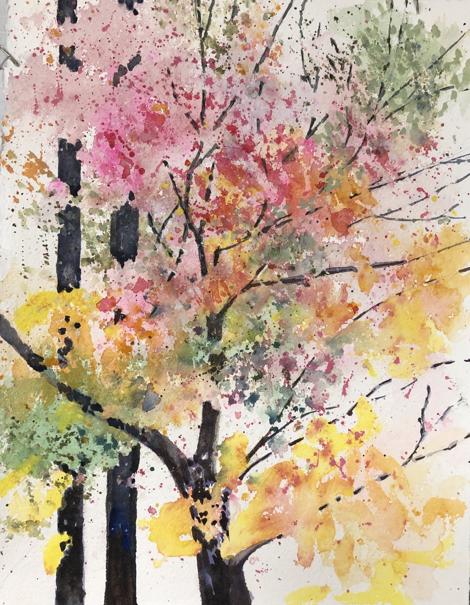
I've also put up many watercolors...since I am spending more time on that these days... I've always made art work based on my daily life, and currently it's all about nature. Like everyone else, I'm not travelling to cities...but out in the park and the garden exploring nature. Watercolor is a medium exquisitely appropriate for nature being so uncontrollable!!! S

o please look...and feel free to make critical comments too...especially if you have the solution!!!!

If you have been, thanks for reading. Elizabeth

Wednesday, November 25, 2020

Social isolation getting to you??? But there are so many things to do!!!

Social isolation getting to you??? I know it is to a lot of people, I've had emails from all over the world....but in a weird way I'm kinda enjoying this time. No social obligations! No trying to decide between this restaurant and that, whether or not to go to a concert, or a dance. or join a group. Instead...looking around at home and finding that... .... there are so many things to do!!! Like many people, I thought this is a wonderful opportunity to do some cleaning, sorting, throwing away. But first...being now "free" to do it, as it were (!), I thought I'll wash all my bras at once!! Something you can only do when you don't have to go out - and don't expect "company"!!
Then I started looking through my clothes and fabrics to see what could go to the thrift store....I used to live in an area that produced a lot of textiles especially the wonderful Liberty of London fabric...and it's definitely "too good to throw away" !!!! don't you just remember your mother telling you that??? so I gathered a big pile of old Liberty cotton lawn clothes:
I cut them apart, ironed the pieces of fabric, and started cutting simple shapes...then got a bit carried away!!! changing this and that and generally just having fun... like all creative people I'm plagued with the wotifitis! Now what if I cut this this way...or what if I rearrange things that way....or what if I add this other fabric.... and so I cut and sewed....and arranged...and then discovered I had enough for a nice quilt for the piano!! (or a bed!). The quilt looked so pretty...interesting AND intriguing...so I retraced some of my steps to make several short videos and put those together into a little class to upload to the Academy of Quilting, a great website that hosts all my online classes (for individual coaching apply direcly to me personally at elizabethmasterclass AT gmail.com). The new class will be available very soon, but you can sign up now if you've a mind to! It's short and inexpensive. The main thing is...take this time to look around you and become more aware of all the wonderful things that we DO have: all of nature...and all our own innate creativity. Begin by asking....What if I......? And do write and tell me where that led you!!! If you have been, thanks for reading.... Elizabeth

Tuesday, November 3, 2020

Being creative in uncreative times

You know, being isolated and at home a LOT more! gives one time to sort things out and look back at old work. I came across the quilt above that I made years and years ago, quite possibly in another century! I decided that it needed a little improvement! so using photoshop elements (could have used GIMP a free download and very good, or any of a number of photo imaging programs, but just happened to have PSE and be familiar with it - the key!), I decided it looked a little murky, so upped the color saturation. also increased the contrast. Then I felt that it was really the wrong shape...I love horizontal views of trees...like you see out of clerestory windows....so I altered the shape too. and came up with this:
Those 3 little alternations make ALL the difference in how it looks. I don't think it needs any more. Though...it would be interesting to see it in black and white...like birch trees in a winter forest:
hmm!!! I'm quite inspired!!! you know it's impossible to be creative looking at a blank sheet of paper/screen/design wall! Start with something from way way in the past...and just play with the image as I have. I didn't get into extracting details, that would be another interesting step...hmm...now I think I might just make a cuppa tea and then see what details I can find.... And, of you have been! Thanks for reading...and remember, there's a wealth of possibility sitting right there in your photo album. Comments!!! please!!! thank you! Elizabeth

Saturday, October 17, 2020

Value studies can be fun!

Value studies - the easy way I really like making several different value studies when I have decided upon a sketch, but I must admit it is a little tedious to shade them in by hand. So, I like to do them on the computer..... First you have to have a nice clean copy where all the lines join up (no gaps! the colors would bleed through) Then scan this sketch into your computer. Here's a series of steps from a simple sketch through to variations. I open the sketch into Photoshop Elements (this is a fairly inexpensive photo imaging program that many people like). There is also GIMP, a free download. And I'm sure several others that I don't know - but if you do and can recommend! please...write a comment! Then I click on the two little squares right down at the bottom on the left hand side that show the foreground and background colors, and I select a dark value. I don't care what color is it, I usually get as close as I can to a neutral grey. I find it easier to begin with the darkest value, and I never use more than 4 different values: 3 is fine too: white, black and one or two greys. Then I click on the little paint bucket - it's about 6 little icons up from the bottom of that left hand side group of tools. Then over to the sketch with my bucket now full of black paint! and I click where I want the image to be dark: Hmmm or would it look more interesting if I inverted (Ctrl-I, command-I) those values: Actually that does look pretty sharp...but I'll save it and maybe even print it out to look at more later...but I think I'll go back to where I was and add some medium lights: .....and then some medium darks.... .... maybe more? No, I think I went too far...let's try again...hmm quite like this one!
See how addictive it is??? and how much fun....and a perfect way to design a quilt, not only in values...but easily translated into color too. My Dyeing to Design class (academyofquilting.com) begins by explaining how to dye a greyscale...and then make a small quilt just using values from white to black. The assignment teaches so much about the importance of value. The class also covers low water immersion dyeing, gradation dyeing, arashi shibori and several different kinds of screen printing. The class is organized around the five elements of design that we use in art quilts: value, color, texture, shape and line. Love to have comments!!! Do please step in with your favorite way of shading your value studies. And, if you have been, thanks for reading......Elizabeth

Monday, October 5, 2020

Space in Quilts

. Space? Not outer space! Space in your quilt designs. It's fascinating how using deep space versus shallow space can vastly alter the image. Many 20th century painters explored varying space...David Hockney in particular enjoyed flattening and deepening and even reversing! Traditional paintings (prior to the late 19th Century) usually portrayed a sense of depth or 3-dimensionality – foreground, middle ground and background. Once cameras were invented, painters began to explore ideas other than the reproduction (however beautiful) of a specific person or scene. Many painters chose to flatten the space in the picture as they wanted to emphasize the idea that a painting was just that: a painting. It does seem ironic that after the struggles of painters in the Middle Ages and Renaissance to develop depth in their work, just a few centuries later artists would be eschewing such pictorial ideas!! In fact, some of them even pushing in the other direction with reverse perspective such as David Hockney has played with. Most traditional quilt patterns don’t involve ideas of depth: their abstract designs were well ahead of abstraction in the fine art world! (Which, of course, the Whitney eventually realized with their show of the Gees Bend Quilts a few years ago!). So for art quilt designers today there is a choice – shallow space or deep? Do we want to convey the illusion of deep space or not? If we do, there are a number of devices by which this can be done. People ask me about perspective; I personally rarely use it to indicate space – but I do, however, think it’s important not to get perspective wrong unintentionally. Quilts that have a lot of perspective drawing are of a much more controlled style than I am interested in. If you look at books on linear perspective drawing, all the illustrations look like blueprints rather than art. However I do think it’s worthwhile to read a couple of articles or books on the subject and work a few examples, so you have a sense of the different kinds of perspective (one point, two point etc), how it’s indicated in a reproduction, where the horizon or eyeline is and what effect that might have upon various 3D objects in your design. Apart from actually using perspective there are a number of tools you can use to indicate depth - and these are the ones that most artists do use. Overlapping: if we see a picture of an apple in front of a box…we “know” the apple is in front, we don’t think that the apple is behind the box which has an apple-shaped hole cut in it! The same for a man in front of a wall. or a tree in front of a lake. Overlapping is one of the major ways by which we judge depth. Think about it when you’re driving around town!
Edge of Light In this quilt, “Edge of Light”, I’ve used overlapping to indicate the rows of cottages being in front of the water and the distant hills. I haven’t really used any other devices as my interest was in the way the far group of cottages caught the light, rather than distance or other concerns. Size: if we see a tree in the distance, it actually looks much smaller than a man right in front of us standing on our feet!! we don’t think we have a giant right next to us and a bonsai in the distance…our brains automatically compute – smaller therefore further away.
Ferry Bridge In the quilt on the right, Ferrybridge, I don’t mean to indicate that the terrace houses at the bottom of the quilt are larger than the cooling towers at the top, rather that they are a lot nearer – so they are bigger. This quilt also uses placement on the picture plane to indicate depth – the lower an item is on the quilt, the nearer it is to us, the higher it is, the more we read it as being further away. That's obvious, because if something is small and far away it's not going to be visible behind everything anyway. Our brains soon get used to figuring these things out. Interestingly, it is the brain's experience that does figure it out - it's not built in. If your brain was deprived of distant views from infancy, it would be much harder for you to see and understand this kind of depth. Colour can be described in 4 different ways: hue, value, intensity and temperature. Each of these can be used to indicate distance or closeness. Things that are further away tend to be bluer (as we are looking at them through all the moisture and dust in the atmosphere), the colours are less intense, the values are lighter, and the temperature is cooler (towards blue, closer things being toward red). You can see some of these colour changes in the quilt below (Overlook):
The amount of contrast and detail you put into an area can also indicate distance: more contrast, more detail..nearer the foreground – less contrast, less detail…the background.
In Greenhouses, the trees in the front are more detailed. The foreground of houses and trees is much more detailed and with a lot more contrast, than the middle ground of darker more amorphous shapes, and the distance of soft hills has very little contrast or detail. Of course in real life and in designing life, you wouldn’t just choose or use one device alone to assess distance, usually there are combinations. And, as you can see from above, you don’t always have to follow all the rules!! If you want to experiment with designing with space – consider foreground, middle ground and background: 3 distinct levels of space. Starting with the furthest point in the landscape and building forwards..developing more contrast etc. And, if you have been, thanks for reading! Now for some space! Elizabeth

Thursday, September 17, 2020

There ARE advantages!! Finding joy.


Life is very different right now...and it can be very frustrating...especially if you listen/watch/read the news!!! Between the virus, elections and climate change it seems hard to find joy.

Therefore, I suggest you turn your eyes away from those topics! And consider the huge amount that can be learned online.  I found a lovely little tutorial on a piano piece I'm struggling to learn by myself:

https://www.youtube.com/watch?v=5MCQ5hpkQZM

And there are you tubes on just about Everything!!

Here's one based on a lecture I gave at the local library:

https://www.youtube.com/watch?v=ihQDn9f-Qqw

and one on that very pleasant activity - ironing!

https://youtu.be/-kUEGpEHAYQ

I'm using a program called Filmic Pro to make the videos for my online classes - and there are some really neat little videos about how to use it.  

But you know...there are actual advantages to being so restricted in one's life!!!

Both my daughters had horrible commutes to work (one in New York, one in Atlanta - cities notorious for traffic) -  and now they're working from home and have two extra hours to the day...as well as less stress.

Cities are realizing that outdoor dining is much safer than indoor...and very popular! anyone who's visited Paris know that the outdoor cafes are immensely popular and busy everywhere...and so much better for people watching.

I used to work in a big health Center, they built a new one..I said make sure the windows open - oh no ,they said, the architects don't like that!!!  much better to have controlled air!! ha!! now they know that the safest air of all is....outside air!  

Another advantage: we're eating much more healthily, we get local produce (including mushrooms) delivered from local farms. Fast food is DEATH!!!  And as a Vegan I could rarely find anything palatable at the local restaurants anyway.  


Even the mushrooms are Socially distanced in the park!


I really missed dancing...but then discovered it is perfectly possible to dance at home.  Plus I get to choose the music!  No more hackneyed Country and Western for me, I never have to listen to that awful Possum song again!!  No more tired swing tunes from the 40s - you can swing to anything!

In fact, I've discovered the very best music to dance to is........ Bach.  Try it!!!  

I was missing people....so I took my Bach to the Park!  and a group of us...8 feet apart...now dance to Bach every wednesday morning - you are welcome to come and join us!  If you hold your breath and ask them to hold theirs...you can even get a quick hug too!  Bach and hugs!!! This is bliss!

I have ten online classes right now with www.academyofquilting.com  - I asked the Dean to make them all available, you don't have to wait to join a class. 

Also, while playing around with the fabric I had at home (although I did sin a bit with online ordering from Mood fabrics in New York!) I came up with a really neat idea for a bed quilt.  Ever so easy, but..it also illustrates all the basic design principles.  I'm filming it now...will let ya'll know when it's done.  It will just be a short fun class, maybe 3 lessons.

So very many ways to find joy.

Please write and tell me what you have discovered...the positive side of our trying times.

And, if you have been, thanks for reading!!

Elizabeth


Friday, September 4, 2020

decluttering in the time of the plague

 oh my Lord are you fed up with decluttering??? I know I am!

at first i thought...stay home and stay safe ...what a wonderful chance to do the death cleaning I've always wanted to achieve!

BUT that was before I tried to tackle the clutter in a house where 4-6 people have lived and collected and collected and stored and stored for 31 years!!  A house with not only at least two large closets in every room, but also masses of roof space!!

However, sometimes amidst the clutter you come across things you'd forgotten about!

i found all the antique quilt tops I'd collected many years ago...I do want to finish one of them!  it's a raucous orange!!  which will look wonderful in my blue North facing bedroom...

the best way to judge the age of an old quilt top is by the fabric...I think this one will be mid 20th century


.but that leaves me with about 5 I'd like to sell...plus a couple of dozen feed sacks...and a stack of blocks!!!

Making clothes and quilts from feed sacks became popular in the depression era...here's a good article about it: https://slate.com/human-interest/2017/07/how-depression-era-women-made-dresses-out-of-chicken-feed.html

The top below, however, is made from old shirts cut up...another way for women to be creative even though their resources were extremely limited...

I like the little funky mixes of fabric.


The tops are laid out on a queen size bed by the way...my new air bed!!! LOVE air beds!  I shall never buy a mattress again...apart from anything else you can move these so easily.  and about a tenth of the cost...however..don't invite your daughter and her partner and her large dog to play and sleep on one all together!!!! pffffffffffff..........


An old grandmother's flower garden pattern...many of the flowers are feed sack material...these are hand stitched...


Here's another really lively one...I love the way the rather severe blocks seem to float on the flowers!!!


The one below is small but very elegant in its crispness...probably a little older.just one little hole though...


And this one never got finished!!  it would have been huge!  but I kinda like the fact that the center is now off center!!!!


So if you're interested, contact me at elizabethyork100 AT yahoo dot com...
but also please comment on what you have done with these fascinating old tops..and also if you know what the feedsacks and old blocks actually sell for right now....I'd be most curious.
and what you found when you were at home de-cluttering thanks to the virus!!

and so...back to death cleaning!!!!not that I'm planning on dying imminently!

and, if you have been, thanks for reading...
take care!!  but remember to have fun too....
Elizabeth