I received an email from Ritamary in Dublin asking me to write about how I used colour in my quilts. I love getting a question as a starting point for a post…so please do!
Colour: When I first started making art quilts I used every colour I could – I blasted them all in – after all we were not allowed to do this in traditional quilts - you were only were supposed to use 4 fabrics I was told!! Along with a bunch of other useless “rules” long broken and forgotten.
Here is a very early quilt I made in the Nancy Crow class I took in 1993; I used as many colours as I could!
I’m glad to say that I do appear at least to have a dominant colour (blue)! plus a strong complementary red. I do really like that combination and used it again in a more recent piece:

While my very first theme was windows and I’ve pretty much stuck to some aspect of architecture since, my work is a lot more organized now. I found Nancy Crow’s improvisational approach extremely exciting and seductive but I found it difficult to control without a fairly obvious grid (as above). I did not want to copy Nancy’s own solutions to the problem of how to arrange what she later came to call motifs. So I chose the buildings that I had grown up in in a medieval town as a way to compose my windows.
But back to colour. It was always important to me to get the impression of light into the quilt. I think this was because I grew up in a town in the north of England, little light, a lot of grey…and the windows were always so important. So whatever colour scheme I choose, I use a wide range of values to depict that light/dark contrast.
Here’s a slightly later piece…I deliberately worked with the sandstone colour that was my starting point…my theme was that of Petra, the “rose-red city” but I took only the colour of the stone. Then chose other colours to relate to it…I feel I controlled the range of colours much better here by choosing a dominant colour from the outset. 
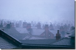
This is a picture of the town where I went to university (Leeds) – again I loved this combination of greys…so I made a series of pieces all using grey. Again I was choosing only the colour from my inspiration theme: Below is City of Mists.
At one point I was filled with anger at some political upheavals at work that led to the ruin of a perfectly good operating system and the resignation of several key people. Furthermore while we were wrangling in interminable meetings about procedure, work that should have been done was left undone. I saw red!! And made a series of red quilts as a result: 
So in answer to Ritamary’s question – I often choose the colour first, inspired by a particular scene, or quality of light, or the mood I’m in, or for its graphic quality: currently I’m totally intrigued by black and white.
I could show many many other examples…but this post would get too lengthy! So please make comments or ask questions….if there’s more you wish to know, or say! Meanwhile, if you have been, thanks for reading!
Elizabeth


3 comments:
Thank you for showing examples of your early work along with current pieces. As a beginning quilt artist it is helpful to me to see early pieces from other artists.
Your quilts are beautiful and thanks for giving us an insight on how your use of color has evolved.
Love how you interpret real life to art! Beautiful quilts.
Post a Comment