
I love to go and see MFA exit shows - see what the young folk are getting up to! Are any of them using fiber, and, if so, in any innovative way? It's great to see energy in art work, unabashed vigor, boldness (to the point of leaping of cliffs!) and freshness. Of course there is always plenty of angst too! I remember one workshop I taught where half the class were young scholarship students instead of a full class of mature ladies - and I thought oh great! there'll be energy and unbridled excitement! Well the excitement was pretty much all in the mature ladies, and the young folk were full of agony and self involvement. Of course that was just a couple of weeks and the MFA students have a couple of years and several professors to encourage them to look outward.
The local art museum where the show is held has had a multi-million dollar expansion in the last couple of years and is really a fun place to visit with a lot to see - and Art is for Everyone!

There were a lot of paintings and nothing was subdued or timid about them! Christine Roman's fabric (scraps from family clothing) and
paint collages are complex and exciting. She describes them as joyful with menacing overtones! Variety and tension! She considers people capable of both cruelty and compassion and with a mixture of structure (she writes about a grid underlying the composition) and intuition hopes to reveal it.
The circular motifs occur throughout the piece in lots of different sizes and contrast with the strange black beetley things...the whole parcel is wrapped up with the skinny black lines. She conveys joy well with the lifting up feeling created by the large balloon shape, but you're definitely aware of the black beyond!

Stacey Elder's work has a similar appearance to Roman's - perhaps they worked side by side? I don't see that happening in the week long workshops I teach, but two years in the same program must inevitably lead to some connectiveness. I read all the time abut how artists influence each other greatly - I wish as art quilters we all had the amount of time, opportunity and energy these graduate students have!! Of course - without the angst! No more sturm und drang!
Stacey describes her work as a fun and spontaneous abstraction - but she also has the same dark space beyond and we're carefully led towards it - with towering cliffs around us! She states that "stacks of fabric generate the repetition of pattern and color" but I'm not sure if these fabrics are literally stacked onto the painting as a collage (though one can see some polka dots in the top left hand corner), or were more of an inspiration. As she layers on the fabric and the paint she aims towards an organized composition at each point in her additive process. She feels that in this way the final result will be balanced and resolved..
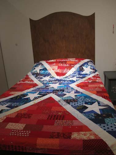
Onto the next gallery! and there I found more fibre. Two quilts made by Mae Ling Cann from North Carolina. (sorry I cannot persuade blogger to line them up!)Cann feels that the "traditions of heritage quilts bring to light questions of personal heritage in contrast to popular history and the irreconcilable differences that can exist between the two". I read this statement several times and still could not grasp the meaning! The quilts are very powerful (though would have been more powerful had they had traditional craftsmanship - surely an art education should encourage Technique as well as content?) Also I didn't see how the images referred to the artist statement. However I did appreciate the shock value and the sense of getting into bed with the enemy, accepting bigotry and repression as a cozy bed partner. There are many metaphorical layers of meaning that you could read into the images. I don't remember exactly what the words on the headboards said, I remember feeling they were unnecessary and were better edited out.

.
Jamie Bull's Lady Beasts dominate the last gallery. They are intended to exude power, sexuality and aggression, warning those who would limit the feminine perspective!
( I included the guard so you can see how huge these beasts are!

Overall a great show!! and there were other pieces too well deserving of study - but not so connected with fiber. I did wonder if these pieces would be juried into Quilt National - I do think it's time we shook up some of the old conceptions!! what do you think?
And, if you have been, thanks for reading! Elizabeth
PS - the head board close up explains the dualistic nature of the swastika symbol:


4 comments:
I read an online article about Mai Ling Cann, and in it she says she is "biracial" (her words), since her mother is from Taiwan. She discovered as a child that the swastika is a Buddhist symbol of hope. I think that she was referring to this symbol when she says that her personal heritage (Buddhism in Taiwan) has a different meaning than symbols from the "popular history" of the West. I wonder if the Stars and Bars of the Confederate battle flag have a similar dual meaning. Thanks to your good photo, I was able to pick out the words "Buddhist" and "racist" on the headboard, and figured it out. Compelling images on beds, and definitely conveying "getting in bed with the enemy" to most of us. --Connie in AL
Ah thank you, anonymous, that definitely make more sense - it's the symbols that have conflicting meanings rather than quilt images per se. though I do believe there is an old old quilt pATTern that looks like a swastika. I'll see if I can bring out the headboard more clearly and add that.
You can change the orientation of the photo, not in blogger but in the place blogger stores them - the associated picasa web album. Open the photo there, then choose "Edit in creative kit". When that opens you will often find that it displays the photo correctly anyway, but if it doesn't you can rotate it there. Once it is the way you want it, choose "Save to my album", and it will (hopefully) save the correct way up. then it will magically be the right way up on your blog, too. It's a lot of messing around, but it works this way for me. Good luck!
Her name is Mei Ling Cann. Not Mai Ling, not Mae Ling, but Mei Ling.
Post a Comment