Am I stuck in a rut? I ask myself, as yet again I am inspired by an old building or industrial site. Why is it that the marks of time or overuse or misuse are so appealing to me? Perhaps it’s because as I age myself I’m trying to discover some beauty in the marks of time?! I had a nice compliment the other day - though I didn’t think so at first…. “I love your wrinkles”, the woman began (I’m thinking “bloody hell are they that obvious” and “how rude of her to mention them”.. almost as bad as “How entrancing that wart is on your nose!”) but she went on – “they’re all smile lines, you have no frown lines!” I don’t know about my own personal lines and marks, but I do love those on buildings. Steps worn away, rooflines sagging, strange patterns of broken windows in old mills, smoke on chimneys all of these strike a rich harmonious chord that no shiny clean unbroken bright plastic interior ever could.
And so I was thrilled by a picture of a burnt out building in our town – I’m sure the owner and the insurance company were not! But the old theater building’s inside walls and ceilings and roof were completely burned and demolished leaving the outside walls with shadowy remnants of their old life, criss-crossing beams and girders. I’m old enough to remember bomb sites and burned and bombed buildings with the amazing voyeuristic feeling of suddenly seeing a building in its underwear – or less! Stripped to the bare bones but with shreds and shards of history hanging on. Layers of meaning.
So, anyway, that’s what I’ve been working on. I decided to keep this to a fairly small piece so it’s only about 30 by 40 – at present – but sometimes these things grow! One fascinating photograph in the local newspaper yields inspiration for months!
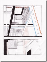
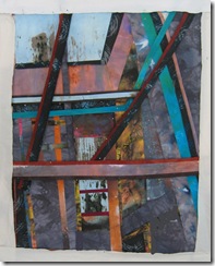
Here are some of my “in progress” pictures….first a rough sketch, actually of only part of the building. If I like the quilt at the end, I may go back and abstract other views. Second, the value sketch and a rough indication of some of the key colours. The whole piece is tilted off 90 degrees very slightly because I want the viewer to get the sense of looking up through the burnt memory walls to the sky. Oh yes! all very meaningful!!
The sequence is like one of those children’s puzzles: what details differ in these pictures? Well, the way I work is to slowly build the piece on the design wall – these are all scraps of fabric just pinned on (hence the dots if you look closely). I like to get the main lines down but then begin to adjust all the details. One thing I think is really important and that is to work slowly. Once your sketch is done and evaluated for all those nice, but very intellectual, compositional principles, then I think it’s a good idea to work in a more relaxed, less obsessive and conscious way. I work out my colour scheme and have a pile of fabric from which I’m going to make the piece; I assess the pile pretty strictly. Not too many colours?? ( like most people my natural instinct is to pull too many), good value range? good textural range and intensity range?. However, once the sketch and the fabric pile are done, then I tell that old left brain to take a tea break. Now I pull and cut and place fabric shapes at a saunter….until my first four lines (the outside edges) marked on the design wall are covered. This may take days. Usually does. I’m not one of those who can whip out pieces, especially not in workshops – I do not know how people can ever do that! Once the demarcated area is covered …then cogitation begins again.
So in the top three photos I’m assessing the weight of the right hand girder: what value should it be? do I need it anyway?
In the bottom two I start getting rid of things – a key job! I don’t need the T shape in yellow on the bottom right hand side, find it very distracting. There are still several other problems to solve but I know what they are: the horizontal grey also on the bottom right is unnecessary and breaks the upward flow of the eye, but also I need to get all those angles going up just right..and then I’ve got to sew it together – which will definitely alter many of the relationships as various bits skinny down! but that’s for tomorrow…
If you have been, thanks for reading! Elizabeth
PS All comments very gratefully received (even about my wrinkles!).


7 comments:
Thank you for so generously sharing your process. I too am a slow worker and can't get much finished in workshops. About wrinkles, having a disease that will realistically most probably finish me off before old age has given me new perspective. Love and embrace aging - especially if your wrinkles are all laugh lines - I can't think of a better testament to a life well-lived. This is not meant to be dramatic or self-pitying - I have come to terms with my future. It's a message I want to share, enjoy every phase and stage of life. Life is beautiful.
Dear Jane - first I must say that Jane is one of my two favorite names and I called my daughter Jane..
second, thank you for your comment and I will definitely take your message to heart. As I have had several contemporaries die far too young I know I must strive to minimize my groans and aches and enjoy the beauty and opportunity of every single day...may you have many more than you expect.
Love this. The fabrics chosen add to the feelings of deterioration, decay and mystery. I'm always downtown taking photos of old buildings, deserted railyards, broken windows, etc. Imagining the history of those places just draws me in. There was a great art installation show I attended that was held in an old waterworks building. A great idea that drew both the art and architecture crowds. Can't wait to see your piece finished.
hmmmmm... so many ways to interpret a sketch, right? when i read your "corrections," i had to go back and study the original image to see why you thought you needed to get rid of what I was seeing as the focal point. I see your reasons, but I am thinking it will look quite different after the changes.
Curious. Please keep showing this piece.
In thinking on future blogs where you might talk about your work, I am always fascinated by your color palette and fabric choices. Do you buy fabric for a project? Or when do you (if you do) acquire new fabric? Or do you dye your own?
You work in fabrics that I'm not sure would speak to me, and yet they always look picture perfect in your quilts.
I know your source material is a burned out building, but there's something in the color palette that is saying "stormy skies" to me. Very appealing.
some great questions Cyn, thanks! I'll build my next blog around them.
You're not stuck in a rut; you've found your passion. Structure...structure interacting with time. The beauty and impermanence of structure...
Mary
Thank you for posting about your poricess and the details which go into your work. At first I could only see the difference in the bracing, then gradually as I read through your comments I saw what you did. As someone who thinks more than working seeing how you think through tiny aspects which make a difference was very helpful.
Post a Comment