Wednesday, September 30, 2009

Don’t be so Literal! Tell it Slant.

Emily Dickinson wrote: Tell all the Truth but Tell it Slant.  This is usually interpreted to mean that truth can be so shattering it should be revealed gently…however that doesn’t make much sense to me…and I hate it when a salesman dances around telling you the price of something because he wants to soften you up! Or even worse, when the doctor says “D’you want the bad news or the good news?”

The idea that the Truth of something is to be seen by examining it in many different ways, not necessarily head on, is a much more interesting.  Therefore when I want to make a piece about a particular memory or scene I try to think of all the different ways that memory or landscape intrigued me.   I don’t want to make a quilt that is a full frontal photograph relating every minute literal biological detail…I want to show the complexity of form, or the twisted pipes, or the glowing viridian green.  I want to look at the idea from every angle I can, I want to slant myself around it!!!

One of the reasons that some major art quilters automatically dismiss representational pieces is because the maker has put too many mind boggling pettifogging annoying proliferating obfuscating redundant twiddly bits into it! If the work is based on a real place or object then it isn’t necessarily weak – it’s all in the telling of the tale.    I want to defend the poor old representational art quilt because I think often the abstract piece is preferred simply because it is abstract.  And I’ve seen some bloody awful knock off abstracts get into shows.  It’s harder in a way to make a good representational piece, it’s so easy to become too literal, or sentimental  or trite.  These approaches have to be avoided very consciously but it can be done if you’re aware of why you are making the piece.

If it was the colour and verticality of a place that struck you dumb, then reveal those!!! But you don’t have to include everything else.    If it was a sense of height, but the actual colour was immaterial, then think what colour  (or lack thereof) might give that sense of height.  D’you know I practically have to fight with some people to prevent them from using “ that green fabric the  exact shade the grass is in the photo”!!  Oh no you don’t!!  At least not unless it was that shade that just grabbed your heart and soul!!

Of course this is exactly what the Impressionists were doing. It’s wonderful to look at some of their paintings and see their Slant on Truth!   Monet. Yes! the light, the light!  Or Picasso,  I like this angle of the lady, or would that angle be better, and what about those boobs??!! Let’s put it all in…and nothing else!

So…tell the Truth, but the Truth that is in your mind, your own reaction to the scene, your sideways, upside down, inside out view of it…then I think the piece will be fresh and real and wonderful.  And now, I’ll go and try and follow my own advice!  Or maybe, make a nice cup of tea…..If you have been, thanks for reading!

Elizabeth

Monday, September 28, 2009

Rejected? So what can you DO about it?

I noticed some discussion on the ‘net about rejections from shows and I started thinking about what you can do….not what you feel. Of course one thing you can do is use those unwanted missives as wallpaper: I had a friend who papered her loo with them!! She had some great ones, interesting reading while sitting on the throne!
So, what to do when the slim envelope arrives? While there seems to be some agreement that you shouldn’t worry about being rejected… I think you should worry! At least in so far as worry might lead you to figure out why you were rejected.

Let’s look at possible reasons for rejection and the actions you could take as a result.

  1. Volume. Too many good pieces were entered for the jurors to accept all of them –the jurors’ statements (read carefully!) often indicate this. If your chances of getting in are 1 in 5 or less then volume is at least part of the reason the piece didn’t get in. Now you’ve got three options: enter less popular shows, make better work so you really stand out, or enter more shows! But don’t let the Gambler’s Fallacy catch you out! Don’t assume that just because you enter a show 10 times you’ll have a ten times greater chance of getting in!!! Would it were so!!
  2. Fit. You may have entered a show where they were looking for different kind of work. Always read carefully what they are looking for, and, if you can, look over previous acceptances to that particular show and any statements the juror(s) made about the instructions they were given. Seek a show that fits your work, or (if it’s important to you) make your work to fit a particular show.
  3. Photography. Was your work presented as well as it might have been? This is a difficult one for many of us without easy access to affordable photography – look for the best solution you can. Jurors continually describe throwing out a significant number of entries because of poor photography. My solution was to get a good support wall and the flood lights and then look for a friend with a great camera.
  4. Value and subtlety. Certain types of work, very subtle work or soft mid value colours simply aren’t going to stand out well in a photograph. If you want to get into a particular show make and enter work that photographs well. And make your detail shots really work for you.
  5. The Jurors. There is no doubt that jurors have biases. If you talk to them and they are honest you usually hear that they agreed immediately on about 10-20% of the work as being great. They also agree on the work that definitely does not meet requirements. That leaves a huge grey area in the middle where bias is going to work. Consciously or unconsciously!! Some jurors respond to bright colours, others to very graphic bold work, others to more innovative pieces, others prefer abstract and hate anything representational. One person who has been a juror said to me “your work is good for what it is, but I hate that kind of work!” So if I see she’s a solo juror, I know my chances are going to be slim and I can choose to enter or not with that in mind.
  6. Choice of entered pieces. There is definitely a consensus that entering 3 pieces that are related is going to have much more impact than 3 totally unrelated pieces, or a single piece. There’s a show I currently wish to enter – I had 2 related pieces that I think will appeal to the particular jurors, but I needed a third. Guess what I’ve been making? (night and day!!)
  7. Quality. Is your work as strong as the standard the show accepts? Go and see the show, look at the catalogues, look at successful people’s websites – most accepted pieces can now be found on a website or blog. Take a long hard look – is your piece as good as theirs? This is particularly important if your work is not very innovative (which is fine – it just means you have to work harder because there’s more competition!). If it’s not as strong, why not? What does your piece lack that the other piece has? Don’t just give in and say, “it’s no good, I’m crap!” That’s a poor excuse. Research has shown many times that it is the amount of time and effort you put into learning your trade/craft/skill etc that really makes the difference. Pure innate talent plays only a small part. While, luck and networking are important in business and politics, in the art quilt world (thank goodness! they feature little. So, think! And Make Work.
  8. Enter More Shows. "making more work is what makes you better and if entering shows gets you to make more work, then you should enter a lot! Your quilts will get better. I guarantee it!" Carol Taylor
  9. The X factor: there are always those mystery decisions that will forever puzzle us:

wherebongtreesgrow

I still can’t understand why the same show rejected one of my best pieces (Where Bong Trees Grow, see left) and, in a different year, accepted something very weak!!! However, both are now long gone…and I never look back!

Please comment on any other reasons (and solutions) that you think are pertinent! I’ll revise the blog and add them (with attribution!).

And, if you have been, thanks for reading! Elizabeth

Friday, September 25, 2009

The Perfect Artist and the Secondary Easel

I used to long for the day when everything I made turned out exactly as I had hoped!  I felt sure that this would be the benchmark from which point I could finally think of myself as an “artist”.  An artist is someone who sits down and makes something perfect and beautiful Every Time!!!

Then of course I started reading about Real Artists and discovered that the only ones who think they they make perfect work every time are fooling themselves!!

I was very interested, therefore, by Robert Genn’s newsletter (which I thoroughly recommend) this morning as he wrote about established artists being extremely critical of their work.  He feels that they do this as part of a quality control check.  Artists who don’t look at their work in this way may be deluded!!  He talks about a primary easel and a secondary easel.  I like this idea…I think if one has the space it would be good to have a Design Wall where you allow yourself freedom to follow your sketch and/or deviate as the piece evolves and “what if” ideas spring to mind.    But then you should also have a “Critique Wall” where you examine the piece closely to spot the strong areas and the weak areas, literally saying What is Strong….and what is Weak?   I have a rough checklist on my secondary wall on which I have pinned up questions like “does it hang together?, is everything part of the whole?, is there excitement  -  mystery??  can I get rid of anything? ”etc.  If I read a critical review in an art magazine I look for further questions I could ask about on ongoing piece.  >                                                                       
>Being an artist means thinking, imagining, making and Improving.
I hope to never let a piece go without thinking how I could improve it – sometimes my improvement ideas are so radical that they can’t be accomplished within the piece, though I have been so drastic as to dump the whole lot in a dye bath, or to cut a piece up into six long columns and rearrange them, or to cut out all the weak areas and end up with something just one sixth of its former size!!!     What can be improved?  What cannot?  Before I’ve even finished the first piece, if I’m thinking how I could have made that piece better, or differently….I set to work on the next piece…as a result I am usually working on at least 3 pieces at once.

So before I completely finish a piece, before everything is totally done, I submit it to The Critique Wall.   There are usually a lot of changes at this point.  After it’s finished, I hang it in my living room until another piece is done.  This could be weeks, or even months.  The day to day living with the piece is the best test of all – does the quilt look fresh and satisfying Every Day??? or does one awkward element become more and more obvious?
It’s fascinating how the good bits become better and the weak bits become worse as it matures!!!  Just like people!                                  
                                                          
Lest we despair that we’ll never become really good, Robert Genn reminds us of Thomas Merton’s thoughts: 

  "Paradoxically, I have found peace because I have always been  dissatisfied. My moments of depression and despair turn out to be  renewals, new beginnings. ...  this dissatisfaction which sometimes used to worry me ….. has helped me  to move  freely and even gaily with the stream of life."     

And, if you have been, thanks for reading!  Elizabeth

Thursday, September 24, 2009

Georgia: a great place to dye!

So , yesterday I decided to have a few friends (Cleo, Deb and Terry)  over for a last dyeing day of summer!  Deb brought some soy wax and some gentleman’s shaving brushes and we all lathered up!!!   don’t have my “experiment” washed out yet…maybe later!! check back!IMG_1756 It’s always fun to watch how other people play…even more so to be invited to join in!


I reckon I must have been thinking about

IMG_1723

the beach as I dye painted this length of fabric!!!

It’s been a good summer!

And now to figure out how to use my fabric thoughtfully!!

If you have been, thanks for reading!   Elizabeth

Monday, September 21, 2009

How d’you make the boring, interesting?

I’m always intrigued when I see a picture of the actual scene that an artist has used as inspiration.  It’s amazing how a how good artist can make something quite mundane, even boring, into an exciting piece.  So, how do they do that?   When I visit an art gallery I first of all choose my favorite pieces – the three (or so) I want to take home with me.  You never know One Lucky Person might be invited to do that one day!!   I walk around muttering to myself, and laughing at how astonished I will be when the head Curator comes up and says “OK, take your pick!”…..usually I’m being trailed by at least one guard at this point!    Having chosen my pieces, I revisit each one to figure out how that artist has caught my attention.    What did they actually do that created my slobbering, muttering acquisitive desire?

The first thing is usually colour….either the intensity is great, or the contrast remarkable, or the combination irresistible.       april 09 spring bar h, NYC,wc 027

There’s a painting by Larry Rivers in the Brooklyn museum (detail to the left) that has a certain yellow green that always draws me in.  You could sell me anything this colour  - I find it so evocative and refreshing.  This colour scheme would be a great starting point for a piece for me.   I love it so much I can taste it!


The second thing that these artists do is omit anything boring and unnecessary.

okeefeblackdoorsnow

Everything in a piece should be important…if all the important stuff is in, then the rest can just be a beautifully hazy background…I have to remind myself of this constantly!!  I don’t want to see every window in the house, or every pane of every window – if the important thing is the way the windows reflect the light, then that’s all I want to see.  I love the spareness of some of Georgia O’Keefe’s watercolours (see right), or Arthur Dove’s…because they show you only the key elements.  the pattern of the snowflakes against the door and side wall of the house says it all.  Interestingly, I noticed they used this same idea in one of the scenes in the Lifetime Georgia O’Keefe film on Saturday night!


The third thing, I notice is that the artist will increase the contrast (from the original scene)…scan a picture of a quilt you made into Photoshop.  Now increase the contrast…(Image, Adjust, Brightness/contrast)….doesn’t it make it more vibrant?  Now, print out those pictures and put them up on your design wall to remind you!!

barton cityofwillows detail

photoshopped

april 09 spring bar h, NYC,wc 002

contrast


Also in the photo above (the Botanical Gardens in Athens, GA)….one would want to omit the poles on the left….they are an annoying feature irrelevant to the scene. 

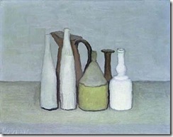
The paintings or quilts that make a boring scene interesting also work by pulling out interesting shapes from the scene.  If the tree is a little awkward, improve it!!  If the shadow plus the edge of the house makes an interesting shape exaggerate it.  This is something that Morandi does with his bottles – if you notice they never stand like soldiers on parade but make interesting curving shapes within and between themselves.

If I was making a landscape quilt from the photo above I would pull out some of the curves that lead toward that dark corner…which would also serve to lead me into the garden.

I’m also always drawn into a piece that has depth and mystery…I like to be invited to enter the piece…like Alice climbing up onto the mantelpiece to get through the mirror!

So!! today….off to the nearest gallery or museum!  Then (avoiding those guards!) choose the pieces you want to take home and analyze just how the artist encouraged you to crime! Remember, you can steal the techniques even if you can’t steal the picture!

If you have been, thanks for reading!  Elizabeth

Friday, September 18, 2009

sometimes ah cogitates…

and sometimes ah actually does something!
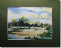
These last two weeks I’ve been framing up some watercolours for a show at a local Athens (GA) gallery: Aurum on Clayton.  I began  watercolour painting  in order to learn more about such theoretical concepts as composition, and colour theory…but then got seduced by the medium itself.  It’s such a different way of working from quilts.  Although like watercolour, with quilts you do work in stages: background, middle ground, foreground etc…unlike watercolour, where it is close to impossible to move or change anything, with a quilt you can try this, try that, and the other…ad infinitum…well to the limits of one’s patience and fabric stack at least! 
Watercolours are more like acting in a stage play, quilts more like making a film.  In a play you have one shot at the performance and it’s bad or good – but the next day you get another try at it (assuming the play isn’t taken off!).  With a film,  you can cut out the good bits and stitch them together taking scenes that aren’t quite right and so on.
So for me,  watercolour painting has been a great change of pace ……and you do learn about composition and color and all those things.  Plus,  if you don’t get it right, you’ve got another shot the next day.  And there are lots of luscious books and lots of advice available.
So here are a few of my watercolours – I apologize for the photography, I nearly always didn’t remember to take the picture until I’d got the frame and the glass on!
aurm 4 inverie, knoydart aurum 2 lighthouse, Mull aurum 1 iona 1
aurum 5 north beach, ionaaurum 11 rocky shore aurum 8 sky over knoydart 
 aurum 6 marsh aurum 7 sunset over purple mountain aurum 9 across the pond
Most of them are based on studies/photographs from my trip to Scotland in the spring.
I’m also going to show some quilts – I’ve now made 3 based on a local  unused factory:
cement works IMG_1754
I really enjoy giving myself the challenge of doing several pieces based on the same image – that’s something I’ve learned from trying watercolour…have another go at it…see what else you can make of it!
The opening at Aurum Gallery is October 8th, 5.30-8.30 – I know the wine, nibblies and company will be good!!  See you there! 
And, if you have been, thanks for reading.   Elizabeth

Wednesday, September 16, 2009

Self evaluation

Some people are lucky enough to be in a critique group, but most of us have to try to evaluate our own work. Though I’m not too sure about the value of critique groups anyway since I recently heard of one that had to be disbanded because everyone was too nice!! they would never truly criticize another’s work! So how and when d’you stand back and critique what you’ve done?

The creative phase
I don’t think you can create and critique simultaneously – they’re two very different activities and we know from recent studies that multi-tasking isn’t something the brain actually does. We switch rapidly from one activity to another rather than doing them at the same time. People with ADHD probably switch faster than others and so may seem as if they can multi-task more easily!! When you’re creating you want to open your mind to possibilities, to trying all the “what if”s and “how if I….”s and “I wonder about…” . I think it’s good at this stage to capture those ideas…but not to evaluate them. How to capture them? well you can make a “note to self” - if I start springing out different possibilities, I’ll write on scraps of paper and attach them to the design wall – “try cutting in two”, or “work upside down” or “reverse values”….or if I’m trying out different pieces of fabric I drop them into one pile – never put fabric away while you’re working on a piece!!! For one thing if you find yourself tidying up when you‘re supposed to be building the piece, you’re actually engaged in displacement activity!! there’s a problem and you’re avoiding trying to solve it! Another way to capture the different ideas is to photograph the different possibilities as you go along. I must admit I use the camera, the scanner, Photoshop and the computer a great deal when designing a piece.

The evaluation phase
So when the creativity has yielded a something on the design wall, there comes a time to stand back and evaluate. A good time, I think, is the next morning…give yourself time away from the piece and then come back and try to look at it with fresh eyes. How does it look? Does it fit the idea you wanted to communicate? some people don’t begin with an idea ( I find it hard to do that!) but at some point there must be something that begins to emerge…if not, frankly I would ask myself does this piece actually have any point?
Look at the piece in a mirror – that helps to give distance…two mirrors at angles gives even more distance! photographing and looking at it on the computer gives distance…looking from a distance too!

It’s not easy to critique the piece…and I think that’s why people often avoid it. They fear that they may have done “all this for nothing”…not so!!! With everything you do, something is learned. I used to say to my kids “not a mistake, a learning opportunity!” (Oh, Mom don’t act the psychologist with us!). If you’re engaged in displacement activities like tidying up, making a cup of tea, checking emails etc, ask yourself what you’re doing?!! Instead of telling yourself how much work has gone into it so far that can’t be undone, or that you’ve already cut into a special piece of fabric, or that it’s the size you had in mind and can’t be changed, that you have to finish it by Thursday and that allows for no alterations, that you really like the top right hand corner and nothing’s going to shift that! that you’ve spent several days piecing together the middle section and you don’t want that time wasted, that you can’t consider using navy blue fabric because you don’t have any…..steel yourself to the task of cold clear critique. I think the two main questions are: Does it communicate? Does it work as a composition?

And how d’you answer those questions? I always do listen to gut reaction at first – though I know I’m one of those people who tends to hate everything they do until weeks or months later and then I think, hmm that wasn’t too bad… alternatively some people’s guts are friendlier than mine and they tell them everything is ok when it’s not. so I think a little more thoughtful analysis is more helpful than just the gut. It’s not always the site of your clearest thoughts! Move up the body and get another organ engaged in the process!! preferably the one on top! Now is the time for all good artists to get the left brain in gear.

Does it communicate? To answer that question look to the original idea – if it was “fresh, glowing tomatoes tumbling from a basket”…is that what you’ve got? If it was “the serenity of the hills” – are your lines serene? What is a serene line in fact? How would you define it? If your idea was much more abstract e.g. “the beauty of lines crossing in harmony”…then can that be seen?

Does it work? When I first began to try to make art I was very puzzled by this question. I had no idea what it meant. Did the question mean did the piece actually go? or Work as what? Now I think that the phrase actually should be: Does it work as a composition with all that we want a composition to be. Phrasing is that way is a lot more helpful because there are many books out there giving guidance as to what a composition should be, what attributes it should have etc. And you can even take workshops on it!! (I’m giving one at the end of October at Hudson River Valley addressing these exact points (plus (I’m told!) amazing food!)).

Imagine your favorite teacher critiqueing the piece - what might he/she notice? Imagine the most critical person you know looking at it, and how would they respond? Always remember that they're talking about the work, not about you!

So now instead of gazing vaguely at the piece and wondering about it, do the hard work of going through the steps – does it have this, and that..does it do this and that (balance, harmony, tension etc). Be willing to do this, even though it’s irksome and even though it means you might have to abandon a section of the piece. without this, no real progress can be made. And like you, the main thing I want is to improve. So I must clearly see what needs improvement – and act!

If you have been, thanks for reading!! sorry about the rant!! Go forth, create and then evaluate!! Elizabeth.

Monday, September 14, 2009

Why were they put to death?

I’ve heard so many people say: “I finished piecing (appliquéing, fusing etc) and then I quilted it to death!”
And I wonder….why??  To Death?!!!

As I looked through a recent catalogue from a prestigious show I was both surprised and saddened by the number of pieces that were overworked.  Too much color, too many layers, too many bits, too many focal points, too much stitching, too many things added on and on until the whole piece is drowning.

One of the biggest problems in many art forms is not knowing when to stop..my husband loves to garden, he plants one of everything and since the plants arrive small – he plants them too close together as well!! Needless to say that, now, after 20 years of such planting, we’re living in a jungle!  No sightlines, no places to rest the eye, nowhere to breathe and look around..plus when the hort prof brought his class from the U, he described the garden as a “horticultural zoo”! 

Anybody who has tried watercolour painting has seen the same effect:  one beautiful stroke of colour, ahh! so luscious….and another and another….and then they all swirl together into mud.  Or think about a chef designing a meal (yes I’ve watched those cooking shows!) – too many ingredients and the palate is confused.  Then ,on top of that, too many rich course and nowhere for the palate to rest and cleanse…to say nothing of the stomach!

I’m not saying there isn’t a place at times for density – if that is the  theme of the piece.  If you want to make a piece about cloying overindulgence,  and egregious , excessive, overabundant superfluity then go ahead, slap on everything you can!  But if you want to make a quilt that celebrates the beauty of a blossom, think about the gorgeous clean spaces within those petals.  Look into the flower and imagine you are a tiny insect exploring that subtly shifting glowing room.  That’s what Georgia O’Keefe showed us.  If you want to make a piece about trees, don’t show us every leaf.  I love the way Barbara Watler reduces her trees to the positive/negative black/white shapes;  because there is so much detail in the shapes, she pulls back strongly on the other elements and thus focuses us on the intricate variety of the edges.

I think it’s important to have some simple areas to contrast with the very detailed ones, each helps the other to be more interesting and satisfying to look at.  It gives the denser areas much more impact if there are quiet areas around them.  You’re soon lost if everything has equal emphasis.  It’s like someone giving a booming blasting loud speech – you just tune out after a while….but if they  vary the volume, the pitch and the pace….then your attention is drawn in.

I also like to know what I’m looking it – a whirling miasma of shapes and colours that lead apparently nowhere just makes me remember my misspent youth!!

Of course not everyone feels the same way about mud as I do  - as shown by the old Flanders and Swann song: “Mud! mud…glorious mud!  Nothing quite like it for cooling the blood!..”

So, if you have been, thanks for reading!!! and comments are not egregious!! go for it! 
Elizabeth

Friday, September 11, 2009

Read Art!

I’ve been asked to write a book about quilts and composition at least a  couple of times but I think it would be totally superfluous.  All the information we need to know is right there in the many books that have been written on art.  If we want quilts to be accepted as art, then we should be reading art books, right?!!
Just dipping into a few fairly ordinary books on beginning painting the other day, I found some interesting tips and ideas.    I’ve translated and added to them somewhat…but the initial information was from painting books.
Many authors advocate making  what they call thumbnail sketches.  These are small rough drawings and are very helpful in planning the arrangement of shapes, values and ideas in your piece before you begin to cut out the fabric .  I think working on unlined 3 by 5 index cards would help to keep it simple.   Or cut up old holiday cards,  they often have at least one blank side, they’re small and it’s a great way to recycle!    Look at the scene (if working from a photo) or into your imagination and locate no more than  5 to 6 major shapes.    To find the major shapes in a scene, go by value rather than by object – i.e. if a boat and its shadow are both the same dark value then consider them one shape – it would certainly be an interesting one! 
  Move the shapes around to get the most interesting arrangement – remember Nature doesn’t always get it right, and man made elements are rarely perfectly arranged in real life.   You can always alter the value of certain areas to if that would yield a more interesting shape.  3cm429
Look at paintings – like those of Milton Avery – where the painter is pulling out interlocking shapes from a scene – and see if you can find similar shapes.
Here’s one of his pictures from the Neuberger Museum of Art: see how he’s simplified the people into 2 or 3 main shapes?


Gior
Or how about Giorgio Morandi?  Here’s one of his pictures from Bologna Incoming.  Someone suggested I look at these when I next compose a piece about vertical storage tanks!   Below is the one I just made…it would be very interesting to try again with Morandi in mind….

Back to the index cards and shapes: It’s fun to try different arrangements: e.g. if you’re working on a landscape, try both a high and a low horizon line – don’t put it slap bang in the middle that tends to cut things in half.
 
If you are the kind of person who likes to cut shapes from fabric and arrange them directly on the wall….then cut or tear shapes from paper (you don’t need multiple colours, 3 or 4 values would be sufficient) and arrange them onto the card.   When you have an arrangement you like – glue them down.  The great thing is you can do this with your feet up watching telly and a glass of wine at your elbow!!
Don’t bother with details…but do have an idea where your focal area will be – it helps if that is where there is a significant contrast in value.
So, get down to the public library (they need support, especially here in the US) and take out an armload of painting books!!!  It’s all in there!!!  And, if you have been, thanks for reading!   Elizabeth

Wednesday, September 9, 2009

An Invitation

pc f

pc b

Y’all come, y'hear!!!

Elizabeth……………………

Monday, September 7, 2009

A perfect workshop

What makes a perfect workshop?  I’ve been trying to figure it out because I’d surely like to be able to teach it!
Looking back over workshops I’ve taken, I’ve drawn up a list of good and bad – but I’d really like to hear from everyone about their experiences and their list of ingredients you want, and those you don’t!

Ingredients I want:
1. Content:  I definitely want to go away feeling that I know something new.
2. Inspiration: I want to leave filled with new ideas and energy to get to work.
3. Time to experiment and feedback: I do like to have time to explore the new ideas/techniques/processes etc in the classroom with instant advice and/or feedback available.
4. Demos: I love seeing the teacher actually doing something.
5. Structure: I like a timetable for the duration of the workshop with a clear list of everything we’ll cover.
6. General discussion:  there’s so much to be learned from other people in the class that a discussion time that everyone can share in (not just private little groups) is invaluable.
7. Question and answer:  I do like the teacher to be very open about their subject and willing to answer questions;  you feel really awkward if they respond “oh that’s something I’ll never reveal”. People with secrets should not live in glass houses!  I want a teacher whose brains I can pick!
8. Humour: there should always be some humour!
9.  A wider view:  I like a teacher who can relate what we’re working on to the wider world of art, and who can give references, or names of artists to look up.  People who can’t see beyond their own sewing machine are so limited.  I need a frame of reference and context for what I’m learning.
10.  I don’t need to make a finished piece – I know that some workshop organizations like the students to have something  to “show” at the end of the workshop, but I find I never do my best work when in a group of people, so ideas, samples and good beginnings and lots of notes and things to follow up on are what works best for me.

What I don’t like:
1.  I dislike a teacher who wastes my time with pointless exercises – in the worst class I ever took (at a prestigious quilt conference I may add), the teacher began with a much duplicated  handout listing 24 Art 101 exercises in drawing and paper collage which took all week.  In a machine quilting class, the teacher had us draw out and attempt to stitch traditional quilting patterns that were completely unsuitable to machine stitching. 
2. I don’t like being given “rules” with no reason for the rules. I always want to know why!
3.  I dislike not having any feedback from the teacher – if I attempt something new, I want to know how well I’ve done it, I don’t want vacuous smiles and simpering glazed eye reassurance!  Give me feedback I can get my teeth into!
4.  I want the teacher to be present all the time during class hours, and not locked into a corner with his/her cronies and groupies.
5.  I don’t like a teacher who insists I do something (not related to the class material) his/her way without giving me a good reason why.
6.  I don’t like a teacher who is unprepared, scattered and unsure of his/her knowledge.
7.  I don’t like to have a long and expensive supply list and we never get to use the items on it, but I also don’t like having to buy something from the teacher – I like the option of being able to get it elsewhere for myself.
8.  I once went to a workshop where there were 6 tables for the students and 6 tables where the teacher laid out the merchandise she had for sale  - I felt like I’d paid to shop!!
0. I hate being pressured to produce something so that the organization can advertise – I want to work at my own pace and determine what I want to do in the workshop.

so…let me know what your perfect workshop would look like! 

And, if you have been, thanks for reading!  Elizabeth

Friday, September 4, 2009

Using Surface Designed Fabrics Thoughtfully

Since I started making (i.e. dyeing, printing, painting etc) my own fabric, I have come to realize this puts more responsibility on me to use the fabric well.  No longer can I make pretty patterns with little calicoes because I have the excuse that was all that I could buy.  Nor are my quilts limited by the used scraps of clothing or string rags that were all that were available to many of our predecessors.  Many of the embroderie perse Tree of Life patterns were the result of the imported “Persian” style fabrics fashionable at the time – the fabric was dictating the design.  But now our fabric can be ANYTHING, any color, any textured pattern, any graphic lines, shapes, dots, any images..and so we must choose the fabric to suit the piece with considerable intention to our reason for making in the first place.

Art can be made for many different reasons:  there are at least 8 different kinds of design:

Descriptive or realistic : quilts can be more realistic like Cynthia England’s stunning landscapes, or more impressionistic like the cityscapes that I and Linda Levin (see below her City footnotes quilt) make.City_Footnotes_III_med
narrative: I think Susan Shie’s quilts are wonderful examples of narrative quilts…they tell the stories of her life and times. Faith Ringgold’s pieces are amazing narratives.
emotive: to evoke a mood (Guernica is an obvious example from painting) or Ghada Amer’s stunning embroideries.
abstract: many traditional patterns are abstract; the quilts of Liz Axford (see below for her Mumbo Jumbo piece), Carol Taylor  and Nancy Crow are largely abstract.  They are explorations of shapes, balance and value.

axford mumbo full  
utilitarian: a practical function, like the design of a computer or salt and pepper pots – so many of us began with the basic bed quilt..well designed to keep us warm!  I made two for every bed in the house before I discovered art quilts!
decorative: formal design where the elements (line, shape, value, color, texture) are arranged creatively. Paula Nadelstern’s quilts take decorative design to incredible levels – as witnessed by her current solo show at the Museum of American Folk Art in New York.
Surrealistic: Linda Macdonald’s quilts show us what the world will be like if we don’t begin to care for the environment in a surrealistic fantastical way that is viciously attention-getting. 
conceptual:   Perhaps the most well known conceptual quilt piece  is the one used by Robert Rauschenberg where he took a log cabin quilt, and a pillow….fastened them to a canvas and painted over them.  (Sorry I can’t find a picture.)   One of my first quilts was a very conceptual piece:  not00142

It is called This is Not a Real Quilt and it’s made from paper and had an image of a homeless man sleeping covered with cardboard. (I’d love to know why the Revere collection and Penny Nii have this quilt on their website!!  They don’t own it – it’s gathering dust in my store room…and shedding shreds!)

 Amy Orr makes very thoughtful well conceived conceptual work – making quilts from recycled materials like the metal twist ties from plastic bags…fascinating…from a distance you see a quilt..but as you get closer, you’re in for a surprise!

Though many of the examples above could fall into two or even three categories, usually the quilter has one particular reason in mind.  If my intent is to make a emotive piece, for example, then I would want to determine very clearly the mood I wanted to convey:  anger, gaiety, calm, comfort, awe, sorrow etc.  Sherri Wood makes quilts about loved ones that have died…allowing people to put all their feelings about that person into a quilt – both loss and sorrow, and comfort.  So the fabric she chooses to use are those clothes that that person wore daily, fabric that conveys their essence.

If I have something I want to communicate then I feel I should make fabric to support that e.g. a couple of years ago I was very intrigued by the myths of drowned cities.  There are many stories about cities being drowned, like Ys in Brittany, because the inhabitants angered the gods by their wastefulness, sloth and greed.  Greed being the deadliest sin of all.  And also there is also some romanticism to the stories, the idea that you can hear the church bells chiming beneath the water….even Harry Potter visited a city under the water! So…what fabric should I use?  How could I achieve that watery look?  Shibori!!  particularly arashi shibori where the fabric is tied to look like ripples…. see several examples from that series of quilts on my water city scapes page.

redmorning72


Red Morning (oh yes! thoughtfully titled too!)

On a visit to Scotland I was fascinated by the abstract yet geometric jumble of objects in my brother in law’s “shed” (actually more of a warehouse!) – I took photographs and then painted screens with the lines/shapes etc in the photos printed them up and made several quilts about the scene….

geoffsshed

pleasehandle

on the left: Geoff’s Shed


                      on the right: Please Handle with Care


Dominie Nash makes quilts about everyday domestic still life patterns (and their extraordinary unexpected beauty) – she prints her fabric from impressions of tomato baskets etc – textures that occur in the home.

Linda Levin is fascinated by the many grids that occur in cityscapes – she searches for grids from which she can print her fabric.

I feel that whatever my intent, the fabric I  make for a specific quilt should be totally integrated with the meaning of that  piece.    And now, I’m off to make a cup of tea!  If you have been, thanks for reading!   Elizabeth

Wednesday, September 2, 2009

Technique shouldn’t be first!

Brain storming is good! Especially in a creative field….that’s what creativity is about isn’t it?  I’m always amazed by people who hold back from sketching out or even thinking about a fascinating idea because they don’t know how to make it.   First envisage your mountain, then plan how you will scale it!!!  but if you can’t see it in the first place, you will almost certainly end up in the same old rut! (forgive my mixed metaphor addiction!).

I NEVER think “how will I make this?” until I have at least the basics of my design idea pretty much worked out.  It’s the composition that’s important first, second and third.  Craftsmanship in execution is necessary but it should be driven by the idea, not vice versa.

Okay – so how do I proceed?  First I think about my idea, what does it mean to me?  what do I see, hear, feel, sense?  What aspects of the particular scene, emotion or abstract problem are intriguing to me?

Second, I make a lot of sketches…..often whole walls full!
Third, I decide where my main values will be and assess the value sketch for balance, interest, focal point etc.
Fourth, I pick out a colour scheme….
Fifth, well you know fifth! – time for a cup of tea!

And now I’m ready to tackle the design …..I don’t like my sketches to be very big..I do like to keep the possibility of serendipity!  also I don’t need it that big to know where the main shapes and values are.  So my sketches are usually about 5” by 8” or 6” by 6” or something of that order, depending on the shape. I draw a grid on them and determine the scale: 1” = 5” ,or whatever.

Then to the design wall…working from back to front I block out the piece on the wall i.e.I cut out (using the gridded sketch as a guide) the background piece and then the biggest shapes and put them up on the wall.  Now I check for balance and interest.  Do these shapes relate to one another?  Are the proportions correct? Are both the positive and negative spaces intriguing?  As I add on more and more shapes I continue to check for the key elements of a strong composition: harmony, tension, rhythm and movement, proportion and balance.
When I have the last piece on, then I look to see what can be removed with no loss to the strength of the design.   Simplicity, economy!

IMG_1189 IMG_1190  IMG_1191 IMG_1192

So above are 4 of the first 400 steps  (I’m not kidding!! there’s a lot of toing and froing)  in blocking out Cement Works. (third one scrolling down).

The last step is to figure how I’ll stitch all this together.  It is good to have an excellent working knowledge of many possible techniques…then I think you should use the ones you are most skilled at.  If I can piece anything I will – it’s simple, effective and neat.  If I can turn under long straight edges and applique, I will.  If it’s a raw edge applique, I’ll probably use a narrow zigzag in as close a color as I can get – unless I want to emphasize the edge..in which case I’ll contrast.   I’ll make the piece as well as I can….but the composition will have come first!

And now for a nice cup of tea!  if you have been, thanks for reading!  Elizabeth