….well perhaps not instant…and maybe not success either…..but certainly a step in the right direction!
A couple of things that I think really help work to stand out are
a strong colour scheme and
a good range of values.
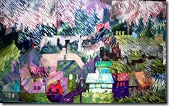
I like to plan both out ahead of time….I nearly always envisage a particular colour scheme for a piece quite early on in the planning stage…sometimes it’s the very first thing. Like desiring chocolate!! I can just taste certain colours at times (and no, I’m not pregnant! nor are any miracles expected. which is what it would take!)…but sometimes I just feel a need for Many shades of green…
on the left – Green Mansions, long ago sold to a mysterious buyer who popped into the gallery while her nails dried (she was having a manicure next door!)…and on the right: Green Houses which is entered into a local art show and I hope will hold up against the oil paintings!
One of the colours I’ve most desired is Red and I’m embarrassed by all the Red somethingorothers that I’ve made over the years!! abstract ones like: Red Shift 1:
red ones made when I was flaming mad over a re-organization at work that effectively put two well functioning departments together into one totally dysfunctional one: 
but oh how satisfying it was to handstitch pieces of red cloth together! stabbing into the fabric with fervour!!
and then of course there was the Red Gate, Red Chimney, Red Morning and Red Abandon!! I’ll let you check out the website to see those!!
When in calmer and more contemplative mood, I’ve also desired blue:
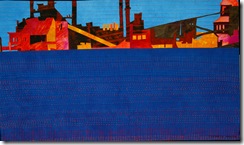
great beautiful swathes of it… here it is on the left in Rusty Answer and
I see I’ve used it again in Brighter at the Top: (below right) 
and here it is again in Strange Beauty: (below left)
Adding some red or orange just makes that blue a lot bluer..arn’t those colours just scrumptious?

and value….i.e. the light, medium and dark of it (regardless of colour) – a good way to asses the importance of value in making a quilt really zing is to scan it into Photoshop and then increase the contrast (Image, Adjustments, Contrast).
so let’s look at The Memory of Water – the quilt no longer exists as such by the way – I chopped out the best bits!
on the left in its original values…
on the right with only the values increased…I should have done this when picking out my fabric at the outset. Doesn’t it have much more zip? Actually as well as expanding the value range, I’ve also increased the saturation of a couple of those key colours…and that too brings a piece to life – as long as you don’t go overboard and drown the whole thing!
Hue, value and intensity – the keys to success!! (as well as all the other things of course…)
and now back to work! if you have been, thanks for reading! Elizabeth


2 comments:
Thanks to you, for your sharing valuable thoughts!
Thank you for stimulating thought yet again. I am impressed with how few colors you often use in a piece. Lots of values certainly but the number of colors isn't great and one doesn't need large swaths of the accent color, just accents! Thank you, thank you!
Post a Comment