Saturday, February 26, 2011

Learning from artists

More cogitations upon the David Humphrey lecture I attended this last week. 
We can learn so much from artists; it’s a major part of an art education.  In my last blog I wrote about how David Humphrey had gone through a phase of “quoting” from other painters’ work and then commenting upon their work visually in the same way that a writer might quote a sentence, or even a paragraph from another work in his writing.  Humphrey said it was amazing to him how much easier it was for him to comment like this in a visual fashion. He felt that copying like this was a kind of a relationship, a “ whatyoumight call un-cooperative collaberation”!  It’s an interesting idea!!  Though many people get upset if you show a picture of a quilt on your blog without permission, how would it be to make a quilt about their piece?  Not just copying, but a piece that comments upon their quilt.  Take an abstract piece and with a few little additions show how it’s not really abstract at all!  Or vice versa…you could take a representational piece and whittle it down to its abstracted skeleton.    “Stealing” a section like this happens in music too, and of course Shakespeare took many of his stories from well known legends.  Film makers “remake” films.  Could one take a piece by Famous Quilter X or Y and remake it?? Changing the mood, adding characters, developing certain areas and minimizing others.  It’s a fascinating thought!  Though art quilts  are yet a young art and, I think,  it takes several generations of work before it starts to feed on itself this way.

Humphrey told us that he has also done co-operative collaborative work.  This of course is something that quiltmakers discovered many years ago..in fact from the outset quilts have been made collaboratively – sometimes to good effect, sometimes not.  Certainly in terms of social discourse and personal relationships collaboration has been very positive, though the pieces themselves often look like cow-horses.  Humphrey worked with Amy Sillman and Elliot Green under the name of  TEAM SHAG.  Each painter would begin several paintings, then pass them onto another, and then after that person worked on them to the third.   Once it was felt that the piece was beginning to come together they would meet to discuss them. 

Humphrey described these paintings as “curious hybrid things” and in fact when I first saw some example of his work I thought he painted like a cross between Sillman and a surrealist!  I asked him why they had done the collaberation,  he replied:

“to create disorientation and consolidation by navigating unfamiliar challenges. Our work is a mix of abstract and figurative. Everybody got to be first/second/third. We somehow got through it but it was fraught and the second time we did it it was more fraught!”

Oh, to have been a fly on the wall of the studio at those meetings!!

Here is a quote from Sillman that reflects the aim of setting oneself such a challenge:
"I'm trying to get to something that feels outside the boundaries of explanation, so I have to work with some kind of estrangement. If you start to know what you are doing too well, you become a craftsperson. That's not interesting."

The artists consider that “studio practice is like a conversation”.  If one is alone and working, it’s conversing with oneself and you have control over the direction of the self discussion, but if you’re conversing with others, anything could happen!  Any topic could be introduced.   So, in the same way that Humphrey wanted to “write” about other people’s working by painting about it, he and his friends also wished to paint about their “conversation”   It’s a natural way for  artists to  have  a  visual conversation with one another, if you think about it.  Improvising jazz musicians do this all the time, we’ve heard that!   This isn’t the idea that you take a photograph and cut it into pieces and each member of the group makes a certain section and then you put the cow-horse-pig-duck together.  Nor is it the kind of collaboration where you all agree ahead of time as to what the piece will look like.  This is a group of friends conversing visually and getting into each other’s heads as they do it.  No wonder it was fraught!   It also demanded that they find common ground, an agreement that suited all (we know how politicians grapple with that (and largely fail, alas)).   There are other benefits to the exercise: it gives one the chance to try out a new way of working, and also to make changes to work started by friends.

How I would love to pick three well known quilt artists who have made great work but are becoming almost copyists of themselves and force them into some collaborative work!!  and film it of course!!  What might welearn about creative process, analysis and adjustment of work! How curious and fascinating the completed piece would be!  I doubt they’ll be queuing up for me to organize this of course!!

Humphrey has worked in a number of different styles and feels that one can, as it were, “help oneself” into collaborative work by trying to combine those styles.  I’m sure this would be less fraught, but many of the benefits and challenges of working with others would be lost.  In a residential setting a small group of us once worked on a collab piece.  We certainly had a lot of fun, but I think the final outcome was a little too compromised and pallid with none of our individual strengths really being evident.  Perhaps we were too nice!

And if you have been, thanks for reading!!  the lecture gave me so much to think and write about…so there’ll be one more blog on this and then I’ll cogitate elsewhere!  Elizabeth
PS do comment!  And let me know if you’ve tried such a collaboration as the ones described here (you can find many examples of their paintings by Googling on TEAM SHAG)  Of course the name is an acronym, but you do wonder about the other meanings!!!  After all they did rather get into bed together, in a painterly fashion!

Thursday, February 24, 2011

David Humphrey Lecture

Many university art departments have visiting artists, they spend a few days with the students, bring work and often give a public lecture.  Attending such lectures is a great way to get a free art education!  Also: no grades, no registration, no hassle!  Can’t be beat.  So check out your local college art department.  Such talks always give me much food for cogitation!

This week we had David Humphrey in town.  He brought several paintings – alas the university locked them up (for insurance reasons – how many things we are now blocked from due to insurance.  Insurance companies are part of the big They that control us so much) – but David had very good images and was very open about explaining his work.

He began by talking about the relationship between a work of art and the viewer.  How the art is silent until the viewer interacts with it but, he feels,  it’s a loquacious muteness.   He speculated that his talking about his art would  alter that relationship.  I’ve noticed this in workshops when we have the final critique.  We go round the room, each person says a few things about their work as they stand by it.  But is this really a good thing?  It does alter significantly what the people think about the work.  As a result, I now don’t allow the designer/maker to say anything about the work until the end of the workshop.  As we go through preliminary critiques, the maker must stay quiet.  I want the viewers to interact with the piece, or the sketches  and  talk about how that relationship is working.  Sometimes, however,  it’s difficult to keep the artist quiet!!!

IMG_2738 This is the first photograph I took; since I’m using a point/shoot in a darkened auditorium I’d really recommend going to David’s website for clearer images and truer colours.

This painting, he  said, was about telling stories and picturing relationships. The relationship between the Painter and her palette.  I don’t know if art quilters feel as if their fabric presents itself arse upwards!!  I do sometimes want to spank mine though!   But it’s interesting to think about the relationship that we have with fabric.  I think it’s closer than with many other mediums.  Quilters just love fabric, they stroke it , smell it, cuddle it and pet it and love it just for itself!  I’ve never seen a painter get that involved with his paint!!  We’re already ahead of the game on this one!

IMG_2739


This painting is about the relationship between the chocolate cat and the woman!   I don’t know if we go quite this far with our fabric, or that many quilters actually lick it, but it is definitely a close relationship that affects both parties!


 IMG_2740

One of the painting practices that David talked about was an interest in working from other people’s paintings, literally copying certain elements from them.  This painting is about Eisenhower and Winston Churchill.  Churchill was a fervent and fairly successful amateur painter (painting for the love of it and for relaxation in a very stressful job).  He recommended that Ike do the same thing.  Eisenhower tended to paint rather predictable paintings….David Humphrey copied some of his “hallmark” backbrounds and then added elements, making comments about the painting.  How much fun it would be to do this with art quilts!!  I’m almost tempted to try!!  David is making a statement by painting variations or interpretations of paintings found online or in flea markets. Paintings that are “rhetorically modest, hyper banal and idiosyncratic”.    There are certainly plenty of quilts that fall into that category!!  I like the idea of the idiosyncratic ones!  something to think about.  Painters of course have a very long history of painting and after a while it would be inevitable that there be paintings about painting and paintings.  As there are books about books.  I do predict though, that there will be, sometime in the future, when the art form is perhaps older and more cynical, quilts about quilts and quilting.

I think that’s enough for today, I need to go and lick my fabric!  I will report more in my next post, especially about his collaborative work which is quite fascinating.   If you have been, thanks for reading!  Go check out the local lectures!  And all comments very gratefully received, love to hear your voices.    Elizabeth

Monday, February 21, 2011

From watercolour to quilt: a transfer of learning

I’m learning some things in trying to paint watercolours that I want to apply to my quilts.  Even though several folk commented that dye/cloth is a very different medium from paper/pigment,  I think there are many goals and techniques that will transfer from one medium to the other.  

Since at present it’s very difficult to sell work, and no one is currently begging me to do a solo or even a two-person show (though please feel free to commence such pleas  - I’d be delighted!), the inventory is piling up.  No point just  making work.  And so I thought this is a good time for more experimentation, for some slowing down and looking at both process and design.

One of the attributes I love in watercolours is transparency and  the sense of mystery that this conveys.   Transparency is (relatively!) easily achieved in watercolour painting,

gatheringstorm72dpi    and I think it should be possible in quilting too.  I used a lot of transparent elements in Gathering Storm (on the left)


and also in this detail from Electric Fields:

electricfields

I do love dyeing and screen printing and have the stash to prove it!  I find screen printing especially magic, as you lift up the screen, you have really little idea (well, I have little idea!) as to what amazing image I will reveal!

I particularly like to overlay prints and also have developed some ways of printing with various cut out shapes sticking on the screen, then picking them off  full of dye, reversing them and printing with another colour.  All very messy and so much fun!!  The more imperfect the print, the happier I am!

IMG_2737

This is a detail of the screen printed base layer of the piece I’m about to start work on;  I’m thinking of layering more with organza, and maybe some opaque elements too.  We’ll see where it goes!  I’ve got some good rich saturated colour for the focal area, and need to achieve a greater range of lights and darks..sticking with my urban theme.


overture72


One of the other things I just love in watercolours is the use of white.  I’ve not often used white much in quilts – apart from the black and white series I did a couple of years ago (example on right).

  It’s a great colour and I don’t know why I’ve ignored it.   So that’s on my list too. 

I’m also trying to develop a greater awareness of the negative space and the quiet areas so important in a painting so I can incorporate them as well.    And I’m going through my stash getting rid of all muddy looking fabric – mud is something that it is important to avoid in watercolour and I’m not going to be precious about a few yards of fabric!   Onto the thrift store pile with them!!

  I’ll report on my progress!!  The piece may well end up in the Sally Army pile, but nothing ventured……

And so…. What are you up to??  Is anyone else so foolish as to try to apply learning from one medium to another?    How well did it work?

And, if you have been, thanks for reading…………………Elizabeth

Thursday, February 17, 2011

“tight before loose”

watching Well, I suppose that would be easy with a few drinks, right?
  But no, this was the comment the painting teacher made last night when she asked my goals. 
“Loose”, I said, “Loose!”
Her reply: “You’ve got to get tight before you can be loose”.man

Tight is easy, been there for years; there are rules to being tight! Being loose (but controlled, not just a sloppy mess, easily obtainable by yours truly in many areas!), controlled loose is very difficult.  It’s the loose of Rubenstein’s rubato or that of a gifted, experienced dancer or painter or racing car driver.  Those people who do glorious things where you simply can’t see the practice, the technique and all the structure underneath …but it’s truly there.  The difference between just plain loose, and loose with expert delicate control is not only huge but very detectable.   It’s rare that art quilters/ fibre collagers show their muses, but I happened to look at a site today where the person showed the painting that inspired her.  Her work was good, but the painting was heart stopping.  When I went back to her piece, it just look so humdrum next to the real thing.

boys So we can see it, but how to get there…to that far away mountain of looseness!!  Yes it’s practice, and doing lots of work but I must admit I get a bit tired of people saying: “just do more, you’ll get there!” Is this actually true? What have you found?

woman

Reading about theories on the development of new inventions and ideas, it is clear (as mud!) that this is a very murky, little understood, process , somewhat akin to the beginning of galaxies!  Elements whirl around being stewed and stewed and then at some point begin to gel and coalesce and some form and clarity appear.  Can be this be directed or hurried?  How much of what we do to learn is relevant?  How much  is irrelevant and time-wasting?

For the moment, however, the dance goes: loose, loose, tight tight, loose!!
Any ideas???      And if you have been, thanks for reading!   Elizabeth

Monday, February 14, 2011

But I can't draw

st ives crop
So often I hear people saying , “but I can’t draw”. Well, I can’t draw “naturally” or “intuitively” either! In my life I’ve only met one or two people who appeared to be able to “just do it” but even with them, on further enquiry, it was usually the case that they had been drawing for years and  also had had access to some instruction, however informal. For most of us, therefore, drawing is a skill that we can learn in the same way that we learned how to cut quarter square triangles and half square triangles and decided which we needed for any given quilt pattern. Like anything else, being able to draw involves a series of basic steps and a lot of practice. Furthermore, as I’m rapidly discovering, it requires constant practice to even maintain what little skill level one can attain!
However, I do think it is very helpful in any type of visual two dimensional art to be able to draw, not brilliantly, but adequately i.e. good enough to be able to use one’s drawing as a guide for making a quilt, or a fiber collage or a textile work (however you like to call it!).
So, here are some steps and tips I have found helpful from both books and a few drawing lessons:
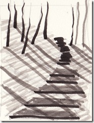
black steps YSP
1. What?
The first step is to decide what you are going to draw! What is the best way of finding your composition? I think it’s helpful to use a Viewfinder or crop tools. You can actually buy cardboard frames with clear plastic in divided into 4 or 9…or you can make one – with or without the plastic..or you can simply cut two L shapes from card. I find the Ls easier when working from photographs because you can adjust the frame size. If you are working live, whether outside or in, then a Viewfinder you can hold with one hand is easier: simply move the frame (usually a rectangle, but whatever you want the shape of the piece to be) nearer or further from you. Most of us are used to doing this with a camera, so we already have helpful experience of this step. Sometimes I’ll take out my camera and just look through the lens to find an interesting composition.
2. Beginning.
On a piece of paper draw in the first four lines: the outside edges, in the same shape and ratio of sides to top/bottom as your view finder or crop tools. Then, very faintly, indicate the “horizon” line, the line that is level with your eyes as you sit or stand. For example if you’re looking at a sea scene, the level of the sea against the sky is the horizon line, the end of the street in a street scene and so on.
3. The edge connections.
Then make little marks (dashes or dots!) where the objects within the scene, whether trees or bottles or kittens,  intersect with those first four lines. This makes sure that you get everything into the drawing that you have selected in your view finder or crop tools. I know if I don’t do this I invariably run out of space!! It’s easy to see the half way mark on the view finder (vf) and the half way mark on the scene. For example if I like through the vf and see the edge of a roof. Where does that edge intersect with the frame of the vf? Is it half way up the left hand side? A quarter of the way from the top? As quilters we’re used to eyeballing these kinds of distances.
So if the roof line intersects with the vf on the left hand side, at ¼ of the way down from its top edge then I make a little mark on my paper at the same point i.e. 1/4 of the way down from the top edge.
A tip. Make sure you always hold the vf in the same place by lining it up with something. I find it easier to spot, for example, a chimney in the top right hand corner, and a Stop sign in the bottom left hand corner.
Of course it’s easier working on a flat photograph with the L shapes and that’s what nearly everyone does!! In that case I usually make a photocopy of my photograph so that I can draw on it exactly where I positioned my L shapes.
I actually use this exact same procedure of looking for half way points, intersection points etc, in cutting out shapes freehand for a piece when I assemble a quilt.
4. Two dimensions is easier than three.
If you’re working from an actual scene as opposed to a 2-d photograph, it helps to reduce the 3 dimensional scene to only two. How d’you do that? By closing one eye. Before you do that, look at an object in front of you first with just your left, then just with your right eye. See how the object jumps?? That makes it very difficult to draw, because your drawing is only in 2 dimensions. So close one eye if you find that everything keeps jumping around!! Which one to close? Your less dominant one. Actually I have found it helpful to simply wear an eye patch than to squint up at the drawing, but most people squint! You can choose!!  As an aside I used to drive down to the pub  for lunch when I was working in Easingwold, UK with a one eyed doctor in an antique car!  It was hair rising, for he had no depth vision, and no cares!!
5. Look at what you’re drawing.
As you draw, look frequently at the object you are drawing if you want it to be accurate. Though one teacher (can’t remember if it was Hans Hoffman, someone of that ilk) – used to make his students look at an object in one room for 5 minutes, then sprint back to the adjacent room to actually draw it!! He felt that that improved visual memory!! It certainly would improve one’s level of exercise!
6. Continuous assessment.
Continually assess whether you have drawn the major lines correctly…it’s like piecing a traditional quilt, if you get one triangle in backwards it throws everything off.
7. Elements (line and shape) only.
As you draw the contour lines, don’t think “boat” or “roof” or “bottle”, think instead “this line goes from ¼ of the way down the left hand side across to a point about halfway across and 3/4 of t he way down the rectangle (or square). Just think about lines going from point A to point B. Like little trails on a map.
Sometimes it’s easier to think about drawing the negative shapes – i.e. the spaces behind things, while focusing on them you are less likely to be distracted by the actuality of the object.
roofs connected 8. Angles
If the lines are angled, the easiest thing to do is to hold up your pencil against the view or the photograph and line it up with the angle…then, holding it carefully in the same position, mark that angle on the page. If that doesn’t work for you, then you could use a protractor. I like the nice big ones. Or…when working from a photograph, you can line up (i.e. make sure that the verticals and horizontals on both photo and sketch paper are all exactly vertical and horizontal!) the photograph adjacent to your sketch paper and put a long ruler on the angle on the photograph, such that it protrudes beyond and onto the correct place on the paper. I use this for cutting out correct angles too. I simply line up the sketch with my fabric and continue the angle out from my drawing to the cloth. Try it, it works!!
9. Major shapes first.
Get the big shapes and the longest lines in place first. Details are far less important, don’t even think about them until all the big stuff is in place!!! No you can’t mess about putting in all those little windows yet! This is also Very True in designing quilts. And don’t think about shading or colour yet either!
10. Light and Dark.
Before you start shading, decide where the light is coming from ….if you’re inside, set up a single light source, if working plein air the most interesting times to go out and draw are early or late on a sunny day – because of the nice long shadows! Having shadows creates depth and adds to the value range. If you take a picture of nearly any quilt, scan into photoshop and increase the contrast (Image-adjustments-contrast), it will improve it. Why? Because you increased the value range. What increases the range? Light!
If you are working from a photograph, look to see where the darkest darks and lightest lights are. What was the direction of light in the scene? You don’t have to necessarily follow this (Rembrandt didn’t always) but it’s better if you use light and shadow thoughtfully.
It’s easiest to spot the very darkest values first, so start with those. I think it’s helpful to have a little value scale (even if it’s just 5 values: light, med light, med, med dark, dark) drawn out on the side of the paper to refer to. Do the darkest darks, note where the lightest lights are and reserve those. I often put a little pencil dot in them so I know “don’t shade this!”. Then look for the mediums. Do make sure you have a good range of values. If you look at our very best art quilters you will see that in all their major works, there is a great range. And remember the Photoshop experiment!! Push the light values lighter (if you’re using a pencil simply erase) and the dark values darker.
11.Maturing on the wall.
Finally, when you feel you’ve finished the drawing, pin it up on the design wall to mature for a few days or weeks…if there’s anything untoward it will make itself known! Believe me!
So why should we bother to learn to draw? Because it is a basic skill that underlies many art mediums. If you can’t accurately put down in a pencil sketch what you want to have in your final quilt, then you have no good plan or map to follow. Without direction, no progress.
If you have been, thanks for reading! Now, sharpen up the pencils and GO! Elizabeth
and I look forward to the comments!!! Is anyone out there??!!  ;)

Thursday, February 10, 2011

Oh quilt! Doff but thy name!

Juliet:
'Tis but thy name that is my enemy;
Thou art thyself, though not a Montague.
What's Montague? it is nor hand, nor foot,
Nor arm, nor face, nor any other part
Belonging to a man. O, be some other name!
What's in a name? that which we call a rose
By any other name would smell as sweet;
So Romeo would, were he not Romeo call'd,
Retain that dear perfection which he owes
Without that title. Romeo, doff thy name,
And for that name which is no part of thee
Take all myself.”

Jane Dunnewold:
“Would we be willing to re-characterize work as mixed media construction in order to help it go mainstream? Is the resistance semantic?”

A couple of years ago I was awarded a solo gallery show in a college. The person who awarded me the show then retired and it was some time later than I was contacted by her successor, the head of the art department, who was obviously very leery of putting on a “quilt” show. “Can you bring your (gulp) quilts to the gallery on the 1st of next month ”? he said on the phone, trepidation in his voice. He had to fulfill the obligation but obviously this was not his sort of thing! The previous show had been photographs blown up huge, glued to the gallery walls and then smeared and dribbled with house paint!

However, when I got there, he looked at the pieces and said “But, these aren’t quilts, they’re fiber collages!”.

I think that the word “quilt” has a rich and wide meaning for those of us who work with fiber, but a very different meaning for the world at large. And, if we want to communicate with a non-quilter, it does make sense to talk their language. I don’t think we have to deny our quilt origins but simply clarifying the term for the non-aficionado might help, as in “fiber collages/ art quilts”
I really don’t think this is any big deal. But then coming from an English English speaking background and now living in an American English country, I have learned that words can miscommunicate as well as communicate. We’ve all heard the “knocked up” difference! As in “wake up in the morning” (UK) versus “get pregnant” (US) , but there are so may more. One of my favorites was when we boarded the plane to come to the USA and the pilot announced “we will be in the air momentarily!”…the Americans looked pleased, the British looked worried. For the US citizens the word momentarily meant “soon”, for the UK ones it meant “for a short time only”!!

So, a little education and clarification all round definitely helps!

I can’t beat old Bill, so will leave it there!  If you have been, thanks for reading.   Elizabeth

PS all comments most gratefully accepted, especially those in blank verse!

Monday, February 7, 2011

In the Museum

I’ve heard some art quilters wonder why their work is not shown in  or collected by  museums.  But have you looked to see what the museums of contemporary art are actually showing now?  Videos and  installations seem to be the norm.  I have many friends who are wonderful painters and their work isn’t in museums either.

A better question might be why are the galleries not showing quilts?

And definitely some are…but galleries show what sells.  In my experience quilts sell mainly to two groups: quilters, and commercial venues like health centers or offices.   The purchase of art work by commercial areas has, in many states, completely dried up with the recession.    More and more we are  approached by local health centers and commercial venues to loan them work; they present this as being an opportunity to show our work!  and it’s not just quilters, by the way..but painters and other artists too.

The big galleries always prefer to work with “known” names.  To get into them requires a number of things of which luck and whom you know loom large.  I remember Polly Apfelbaum saying that she would not have had the recognition she has had, and the shows she had were it not for her husband’s position in the art world.  The  book I bought Andy Warhol  by Richard Polsky is a pretty scary picture of Big Art:  it’s all about name recognition and nothing to do with Truth and Beauty!!    Various reviews of the book testify to its authenticity:

Having  been a dealer/collector on a comparatively modest scale for many years, I found many of the traits of the (people described) to be recognizable.    Only someone who has been there knows that the pursuit of a deal or hopeful investment is as important (sometimes more so) than any admiration you may have for the object of your pursuit. “

“[Polsky’s] accounts of the bizarre world of art dealing are true to a fault. … If you have ever bought a piece of art for more than $1000 or think you will at some time in the future, [the] book is must reading.” 

The art world is  both territorial and also follows its own traditional business practices.  Even within the quilting art world, I have heard of at least two major collectors who limit their purchases according to some specific prerequisite.  Not quite as bad as only buying work from artists whose name begins with a particular letter or who were wearing red knickers when they made the piece, but not far off!

Quilters are very good at purchasing quilts and are a great support, but it’s very rare that someone who is not involved with the medium actually buys an art quilt as something to beautify their home.  Is this because they are prejudiced against quilts?  I think it’s more likely that it’s because they don’t buy ANY art.  Go into the average home and see how much real art is on the walls.  Very little.   It’s really sad.

And if you did want an art work, in the decorating shows on television, the interior “designers” often show you how to “make” an art work for yourself: “stretch a piece of fabric on bars, take some house paint and throw it on, and bingo!! you have a work of art!”.    They buy a $6000 sofa and add a home made daub on the wall above it.

So: if you want to get into a museum..make a video about making a quilt, preferably with a lot of slow motion close-ups and then show it upside down, or mix it with images of abused women.  Another possibility would be to make an installation that was all quilts, that had some point other than “how wonderful these quilts are”.  So I suggest that the quilts  first be dragged behind a truck for 200 miles to represent how women and art are both badly treated in many nations, then hang the tatters and strew them on the floor.  You might throw a few used condoms around too, indicative of the prevention of creativity in our educational systems.

If only I were joking….

And, if you have been, thanks for reading.   Elizabeth

Thursday, February 3, 2011

The practice of value and the value of practice

I decided to take a painting class in my quest for self improvement.   During a recession when both goods and services are in much less demand, one way of using the extra time is to improve at what you do.   While I’m a great believer in learning from books, all the evidence is that two things are necessary for improvement: 10,000 hours of practice and a good teacher.    Very often the teacher is a father (Mozart, Tiger Woods are often mentioned in this regard), or in countries like the China of former times, one apprenticed oneself to a teacher.  It is difficult to find the right teacher, but I think one can learn something from anyone who has practiced a skill a lot. The importance of a good teacher or coach is really evident if one reads any athlete’s biography: Andre Agassi’s book Open describes the difficulties involved with poor teachers, recent discussion re Andy Murray’s loss in the Australian Open finals suggests that one factor that was that his coach was not there in the Final. 

cityofmistshp

Scientists in different parts of the world have studied the “genius” phenomenon and all have concluded that it takes a tremendous amount of time on task to improve.   Neurologist Daniel Levitin stated: "It seems it takes the brain this long to assimilate all it needs to know to achieve true mastery.”    The Beatles apparently played  at least 1200 concerts in Berlin (more than many other bands play ever), playing at least 8 hours a day 7 days a week,  before being acclaimed as a new wonder band, an “overnight success”.  

Much of the controlled research both with the British scientists studying violinists in Berlin and the scientists from the University of Florida has been done on musicians.  However, the fact that an incredible amount of practice  is necessary for excellence in any field  is revealed over and over again:  in writing, in scientific discovery, in sports, in complex games like chess and many other fields.  Interestingly, I don’t know of any particular research in the field of art, but if you read any artist’s biography you’ll see that often they were drawing on the walls of their nursery from babyhood and simply never stopped!   Well I don’t know if I’ve got 10,000 hours left in me!! At a modest rate of 4 hours a day (probably about all most of us can manage in this complicated age), that’s about 7 years.  OLYMPUS DIGITAL CAMERA         Well.. possibly!! hmm…let’s try!

And it is the amount of practice that  makes the difference between  good and  brilliant. Top performers, by the time they celebrated their 20th birthday, reached 10,000 hours of practice, but those who simply showed good results achieved the amount of 8,000 hours.   I’d be happy with being “simply good”!!

And of course it is important  that the practice be guided, encouraged, even dictated.  Sadly (or perhaps just as well!) most of us don’t have a father like Mozart’s standing over us, so  I think taking a class helps one to focus on  doing more with the added benefit of the outside coach.  Even if the coach is saying stuff you know very well, it needs to be applied over and over.  I’m also interested, too, in how a different teacher approaches a task.  In what order should things be addressed?  Well last night’s teacher began with value studies – we only have to do one.  But being an over achiever I’m going to try to do a LOT.  And instead of taking the first one I like, I’m going to do as many as I can, pin them up on the design wall and live with them.

onthelatchhp So why bother with value studies anyway?  Because research has revealed that taking apart the steps involved in any complex task and become a mastery at each one of them, practicing over and over until the brain can do it automatically, is what is  required for improvement.  One of the most important things to get right in composition and design is a mastery over value. 

Okay, so how do I get from being fairly good to being very good? (forget genius!! I’ll accept “very good”!).  Obviously lots of practice, but it doesn’t have to be the same thing over and over.  There are lots of different ways of doing value studies which I think that will help to keep it interesting. 

1.  I think the very first step is to focus only  on value.  Pure value with no other distractions.  Pencil and paper is the simplest of all.  I shall practice drawing a scale with as many values as I  think I can discriminate.  The goal is to get to ten: from white to black, each time adding 10% more grey to white, hmm I guess that’s actually eleven!! (thinking of how many telegraph poles you need at 10 yards apart for 100 yards!).   We are all used to working with three: light, medium, dark.  It’s a case of working up from there.   Actually this kind of shading practice can be done in many different situations – in waiting rooms, while on hold, in those dreadful staff meetings I retired to avoid!milltown

2.  I can also focus on value with fabric – since most fabric is colored and not just grey, this will add a level of complexity(but if not sure I can always photocopy in black/white a scrap of the fabric in question).   I’ll first sort into three values (light, medium dark), then try four (light, medium light, medium dark and dark)  and keep increasing the number of values and see how far I can get.  I don’t know about you but it helps me to put a name to the shade: so 5 values would be: light, medium light, medium, medium dark and dark and so on.

3.  I can try this on my daily walk:  okay is the pavement lighter than the grass?  is this tree darker than that?  and how do they compare to some absolute grey scale?

3. I can do this with snippets of grey cut from magazine advertisements.

4.And with shades of grey in Photoshop.  If I scan in an outline sketch, I can choose many values of grey from any of the colour charts and fill (using Paint Bucket) in the different areas of my sketch.

5.  I could even get out my paints!  It is after all a painting class.

So, have you any other ideas as to how one could develop mastery over value??  And – keep it interesting?  I’d be happy to learn!!  I shall set myself a goal of 100 little value studies of all these different kinds and hope that some improvement will then be evident!  A little encouragement and direction goes a long way…..

And, if you have been, thanks for reading!!  AND commenting!!  that’s the good bit!  The marzipan on the cake! (forget the icing, it was the marzipan I always loved).

Elizabeth

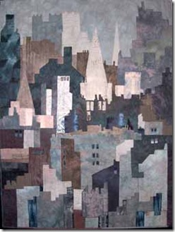
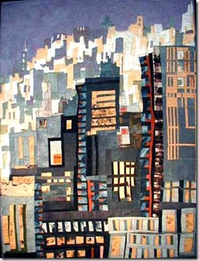
PS  The quilts are from my “grey” period!