Friday, July 30, 2010

Making it More Interesting

I don’t know about you but I worry that my quilts might be boring. I know by the time I’m done fussing over them, I’m often very tired of them. So often ,when I look at the finished work  instead of seeing all the elusive moods, sensibilities and nuances that were in my head at the start of the piece, I see the tussles I had!

I usually just have to put the quilt away for a few  months like a cheese and hope that it improves as it matures! I used to think that this happened because I was just a beginning artist, but the more I read the more I see that even experienced artists struggle with these same things.

So I’m always interested in learning about ways to improve a piece, especially ways to make it more interesting. When I look at quilts online and in print, I see two things that I want to avoid. One is work I can make no sense of, work that looks like my nephew’s basement pad! He can make sense of it, but I can’t and I have to retreat Very Quickly! The other thing, which is probably worse because it leads to me moving on even more quickly than a chaotic mess, is work that is totally boring, dull, torpid, predictable, pedestrian, dreary, dry, dull, humdrum, monotonous, stuffy and tedious! Like this sentence.

So, what makes an art quilt boring? We know from old wartime psychological studies on habituation, that if things are very predictable, after a while we just don’t see them. They don’t attract our attention. Or, in musical terms, a steady dull beat ( like in those 60s pop songs that some of us whose husbands never grew beyond the stage have to put up with!) can lead to a pretty melody withering on the vine. (Oh, love those mixed metaphors!) No synocopation, no alternating rhythms, no two hands playing to a different time lead to unobserved tedium.

In visual terms, shapes are boring that repeat in a dull 4/4 time – equally sized and equally shaped, and, what’s more, with equal negative spaces between them. Although we’re not initially aware of the negative spaces in a piece (the space between the edges of things…within and without shapes, or between a shape and the edge of the quilt), it is often an interesting negative space, or the rhythm of such spaces that support the work and keep you involved with it and attracted to it.

Let’s look at quilts where I think I was able to create some rhythms in the spaces.

petergate

Between the rooflines and the top edge of the quilt is a negative space.  Each side is different – one has 4 steps to descend, one has two – I could have balanced the steps on each side and lined up the places where the steps occur but that would have been less interesting.  I’ve repeated the same idea at the bottom of the quilt – with one side having more steps away from the bottom edge than the other, and each of the steps being slightly different.


Petergate

aorist


In Aorist, a small piece I made for the Kiss Challenge that Rachel Roggel organized years and years ago (and I’ve no idea where this quilt is now), I made the negative spaces create the meaning of the piece.  Of course I was playing on the idea of the old image of two faces vs a vase that you see in psych textbooks!  But I put a little different rhythm on the left side from the right to make it more interesting.


assembly

In Assembly, I wanted to create an intriguing negative space for the sky area, but I also wanted to repeat that idea (with somewhat different rhythms) within the larger shapes lower in the quilt.   I also played with the negative and positive shapes changing places at times!


barton what pretty smoke full


In Oh What Pretty Smoke, there are a lot of vertical elements which are similar in shape..so in order to make it more interesting, I varied the width of each shape, and the height, and the spaces between the shapes, and the surface texture of the shapes…while at the same time holding the idea of the shape constant so that you know they are related to one another.  That they belong in the same song.

I usually block out my quilts on the design wall before sewing them together, and in my last evaluation check before stitching, I check the spaces between and within the shapes, and between the main shapes and the 4 straight edges of the quilt.  Looking at the quilt above, I think it would have been good to have had a little more space on one of the sides, to emphasize the difference…I’ll try to remember for next time!

If you have been, thanks for reading!  And do please comment….also I must apologize for somewhat long negative spaces between posts this summer – too much travelling!  and I have one more long trip to go: to England for the Festival of Quilts next month where I’ll be showing Oh What Pretty Smoke and about eleven other quilts based on industrial landscapes.

I look forward to hearing from you!!  and maybe even meeting some of you at FOQ.  Elizabeth

Saturday, July 24, 2010

Dyeing colours in different temperatures: a brief note

Still laptopping from Ontario where, yes, it is hot too!  Everybody at Niagara Falls yesterday was basking in the spray instead of avoiding it!
I had some questions sent me re dyeing colours and colour temperatures and thought my response might be worthy of a brief note.

My basic MX dyes (Prochem names, but Dharma has the same dyes under different names) are Sun Yellow, Strong Orange, Fuchsia, Turquoise, Basic Blue (or sometimes Sapphire) and one of the Blacks.
Sun Yellow is a very cool yellow - i.e. on the colour wheel it is the yellow that is near the yellow green which is next to green.  It is a yellow with a cool hint of green to it.
If you add Strong Orange to Sun yellow, you're basically adding a red (plus a yellow) and that makes a beautiful warm yellow. 
A warm yellow is nearer to orange on the colour wheel - it is a yellow with a warm hint of red in it.

Fuchsia is a very cool red - the red that's leaning towards violet on the wheel, red with a little hint of blue in it.  If you add Strong Orange to Fuchsia (about 2:1) then you get a gorgeous rich warm red - a red with undertones of orange, and nearer to orange than blue on the wheel.

The blues are different - it's difficult to add warm or cool other colours to blue without getting either mud or purple or worse...purple mud!  So I use two blues: Turquoise is a cool blue..it has hints of green and is nearer to green on the wheel.   I use Basic Blue or Sapphire as a warm blue - blue with a little hint of red in it.  I wish there were an Ultramarine dye but I've never seen one!  So let me know if you have!

Black, of course, is a mix of a whole bunch of colours and dye companies have several blacks that lean towards blue or green or purple.  Black is a great dye for gradations, especially if you just pour the dye onto the cloth (in a container!) gently and let the different colours migrate through the fabric at different rates..all sorts of little surprises appear!  Two other mixtures that are fun are Nickel and Tobacco Brown - but I'm sure there are many more.
The mixtures are fun, but for a basic palette which will yield practically every colour except navy start with Sun Yellow, Strong Orange, Fuchsia, Turquoise and Basic Blue.

I think it's good to experiment with just a few colours and really get to know them and how they interact with each other...you don't need to buy up a whole shelful of stuff!

Some basic dyeing instructions include just 3 colours e.g. sun yellow, fuchsia,  and turquoise  or  golden yellow, mixing red,  and intense blue.  But I have found that the mix of colours with either set of just 3 is a little too limited and frustrating so I recommend 5.   Please do comment if you've found a better grouping!

Somone asked if you need  or can have both warm and cool colours in a composition (or decor) and if so how much of each.  Firstly - you can always have anything you want!  Secondly, I think it's helpful to decide if you want the overall mood of the piece to be cool or warm and then as a rule of thumb (not a strict rule, just a starting point) go with mainly one temperature and a smidge of the other.
A little bit of the contrasting temperature will enhance the overall mood.  So a little hint of a warm red will make your cool greens and blues seem cooler.
  Some books give actual amounts like 2/3 warm and 1/3 cool.  But I think that only works if you are holding the intensity or saturation constant...a small amount of a very intense colour is at least as strong as a very greyed larger amount.  Beware any rule that is a nice round number - like that idea of One Hundred brushes of the hair!!    or the physical therapist's Three sets of Ten!!!

And if you find this idea of temperature difficult then pull out just one colour - like blue...and divide into warm blues (a smidge of red in the mix) and cool blues (a smidge of green in the mix).  Cornflowers are usually a warm blue...the ocean is usually a cool blue.
And remember - it's all relative!  While blue overall is seen as a cool colour, some blues are cooler than others.

And today I hope to be a cooler rather than a warmer sailor!!  See you on the lake!
If you have been, thanks for reading!  Elizabeth

Tuesday, July 20, 2010

What are the compositional questions that bedevil you?


I'm laptopping from Canada where I'm enjoying cooler air...and sailing on Lake Ontario....but still thinking about how to make better quilts..
If we take the composition of a quilt apart we see that it is composed of only a few elements, but like any chemical composition those few elements can be designed into an immense variety of arrangements.

One of the main elements is color and I’ve noticed that a lot of people struggle with colour:
 some are addicted :
“Colour is why I make quilts, colour is totally what attracts me….”
They use so much colour their quilts sound like a brass band 2 feet away – everything blaring at the same time..  Yes it sure does knock your socks off…and everything else too!

Some are very uncertain and play too safe, often resulting in pastel mud!
“ I always make mistakes with colour, I’m never quite happy that I have the colours right”.

Others keep using the same palette over and over and the colour is too predictable – it is good to have a little unexpected taste in there mix!

A common problem is only to think about hue…and not consider the other properties of colour: value, intensity and temperature.  This is a little like thinking only about size and colour of a meal.  A quarter of a plate of green, a quarter orange a quarter brown and a quarter white!!  Yes, I’ve noticed that’s the plan most airlines use….!

Many people cannot see the difference between a warm yellow and a cool one, or a warm red and a cool one.  To them, the concept of temperature within colour is as strange as thinking of hot ice, or cool fire.
You are losing a dimension if you can’t use all the properties.  It’s like having a machine and only using it for one thing – sadly, of course, machines now come with so many twiddly bits and add on functions  that require a mathematical equation to figure out that I fear we have become used to ignoring anything other than one or two possibilities.  Give yourself time to explore it all!!!

And, Sadly, too many people allow themselves to be limited by what they have in their stash.  I think the answer is to be more purposeful when dyeing, or purchasing fabric.  Don’t be seduced by pretty patterns!  (unless you want to make a quilt about pretty patterns of course!! In which case go ahead!!)  But you’ll have less problems if you Think about your palette!

And I do think it would be hard to have full control  over colour if you can’t dye your own fabric – especially trying to get good gradations in value.  If you are not in a situation to dye fabric at home, check out your local art center’s facilities..many have an art room with large sinks, etc.   Working only with purchased fabric is a bit like making a meal from only packaged prepared foods.

Other common problems involve contrast:  too much or too little between adjacent colours.  It’s important to be sensitive about the effect one colour has upon another: a tiny smidge of this or that can often make all the difference.

I’ve only covered a few of the common problems with colour…and I’ve written enough for one post!  So please comment and tell me what difficulties you run into when composing a piece – whether you do it on paper first, or directly onto the design wall.  What are the battles you fight with colour, with value, with shape and line?  What gradations and proportional puzzles haunt your dreams?  Describe your unsolved crimes and mysteries and let’s see what we can figure out!!  I love a good conundrum.
And…  If you have been, thanks for reading!  Elizabeth


Wednesday, July 14, 2010

Why do people buy quilts to hang on the wall?

karen apr 10 044
Painters ask themselves why people buy their work and I thought it would be interesting  to think about this question  in relation to  art quilts. For the truth of “Many admire,  few buy”  seems to hold even more strongly for quilts than for paintings. Quilts are very accessible and when you have a show you get lots of oos and ahhs and how lovelys….people never walk around with a silent puzzled look on their faces!   So why isn’t the work rushing off the walls? What are the reasons to buy and own a piece, and what are the reasons that people actually don't do this?

Many people just don't even consider owning a piece of art though they will definitely fork out a goodly sum for flat screen tvs and cell (mobile) phone bills. Their homes don't even contain a velvet Elvis!  There may be a few school or wedding photos, a calendar or two and that's it.  A work of art you love and have carried around with you through the years, makes a home instantly when you move to a new place.  The first thing I did when I moved (well the second one! the first was make a cup of tea...except for the memorable move when there was a power outage and the movers couldn't get the king sized bed up the narrow stairs and had to hoist it on a ladder through the bedroom window...we encouraged them and ourselves with several large Scotches - that's what it takes to get a couple of men on a ladder with a large bed!)..the next thing after tea was to decide where the art work was going to go and then it felt like home.  A much loved work of art not only beautifies a home, it can be a home.

Some people of course just plain don't have the money - though I think if you add up entertainment and splurge shopping and eating out for a year, you'd be surprised what the amount came to.  If you'd bought a piece of art you'd have something beautiful or fascinating for ever -  instead of extra inches on the waistline, forgettable movies seen that were a waste of time, and clothes you no longer like.    And a work of art can be saved for before you choose, or paid for in installments...

Why is a work of art not considered for a major anniversary gift or to mark a very special occasion?  Why do people buy their children jewelry or a car when they come of age?  I bought paintings!  Cars wear out, jewelry only comes out on special occasions, art is there beautifying your home every day. And it never gets a flat battery!

Some think (their husbands think!) if they had they time they could make something similar so why should they buy?!  But actually it's very difficult to copy another's work - I've seen several attempts - believe or not people have proudly shown me their copies of my quilts! - but the copies never have the elan, the freshness, the zest and the harmony of the original work.  I think it's even harder to copy an art quilt than a painting.  The mark of the hand is so much more evident.  Plus  the amount time it takes one to learn the trade, develop the skills, design the work and make the piece is usually vastly underestimated. 

What is different about those who do buy? They are the people who value beauty - and the expression of feeling.  For them to buy a piece, the work has to speak to them very personally, intrigue them, pull them back to look time and again.  And having been fascinated in this way, they have to believe that it would be good to actually own this piece, that it would then be theirs to enjoy each day. It's important to learn that art can be savored, it never gets used up! 

It's great to have original art at home, it's even more of a life-savor at work!  I can think of several ex-colleagues I might have done in were it not for the peace and beauty of my art-filled, door-close office!

My good painter friend, Mary Porter, says: “It’s really all about energy. (A work of art) is about energy. A good (art piece) gives you energy, feeds you spiritually. It tells you things—something new every time you experience it. Not in words, but on a deeper level. But you have to quiet your mind and observe.” Listen, feel, think….and consider!

It helps to begin by collecting small works (as in water dipping toes)..in fact many of my first art pieces were traded, then I bought small "within-budget" works.  After this introduction, you move to the stage of knowing the pleasures of owning and you actively begin to look for work.
  If you've never owned anything beautiful you don't know quite how much fun it is!
So...think about it: if you buy, why do you?  And if you don't, why not?
Let me know in the comments!!!  and, by the way, if you have been...thanks for reading!  Elizabeth

Monday, July 12, 2010

More images from the Penland class

IMG_2274

Above is a view across the studio with the great big windows looking out onto the meadow and distant mountains.  A beautiful spot!  I think the ladies on the far left got so excited they lost their heads! (and arms!).

There were just 12 folk in the class (I posted six 2 days ago), and here are the pieces made by the other six.

IMG_2273


Here is Michelle crouched over her sewing machine, she had never made a quilt before, never done free motion quilting….but she loves bugs!  She was absolutely determined to take home a completely finishing piece – and she did!!    Isn’t her quilt stunning?  She took a couple of elements from her original inspiration picture and placed them on a grid.  All the fabric in all the quilts was hand dyed during the class; students brought only white fabric with them.

IMG_2277

IMG_2265

Many were inspired by nature:
  Donna’s inspiration pictures were some wonderful photographs she had taken of the North Carolina mountain forests in the fall.  For this piece she used the design manipulations of cutting, rearranging and overlaying.  Hand dyed, shibori dyed and screen printed fabric. Donna’s use of values made this quilt glow with light from across the room – just like the light glows almost white on leaves – looking, really looking,  is key to coming up with a piece that is fresh and personal.                                                                                                                                  

IMG_2256

Roz is inspired by butterflies and moths particularly their complex gorgeously marked wings.   Her dynamic cropping gives us a sense of movement and speed which subtly relates to the theme – great use of direction.

IMG_2270


Pam is also a nature lover – she surprised us by very quickly whipping out this little gem of an abstract piece based on dandelions in a meadow.  Pam also used texture to convey her meaning…fluffing up the deliberately exposed raw edges to symbolize the thistledown!  Pam became so enamoured of the dye process, she called a carpenter to convert a room in her house to a dye studio!!


IMG_2268

IMG_2269


These are just two of the 5 quilts that Janet made!  And she also arranged and made two lovely gift boxes of fabric for the Penland auction! A demon worker!  Can you see that the piece on the right is based on a small detail of the piece on the left?   The dark street was heavily textured with quilting – sorry it doesn’t  show in this photo… Janet’s piece was an elegant representation of an entire picture, with all unnecessary elements omitted.  The curving lines of the tree beautifully echo the curves on the road.

Caitlin worked on portraits:

IMG_2271

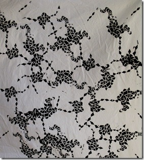
She tried two totally different techniques.  On the left the original photograph was reduced to two values only and sewn through both layers then cut away.  On the right, the values were not reduced and the image gradually built up from tiny scraps of fabric.  Everything was sewn – I’m not mad keen on f**ing in my classes!!!  Caitlin’s faces are also reveal just how much can be gained by losing the edges of the shapes…these were amazing!  Then I introduced the class to screen printing with dye and we lost Caitlin to the dye room of the Textile Studio for the rest of the session – here’s one of her gorgeous screen printed fabrics:

IMG_2266  As you can see this was a super class, brimming with talent and energy – we covered a lot of ground and had time for plenty of fun!!

Roll on my next trip to Penland!   And, if you have been, thanks for reading!  Elizabeth

Saturday, July 10, 2010

Back Home

I’m back home after spending two solid weeks focussing on nothing but teaching art quilts, in both real and virtual classes. No chores, no shopping, cooking, cleaning, watering, mowing, no tv, newspapers, internet surfing or blogging etc etc…so now I’ve a lot of catching up to do.  I had hoped to work a little on some new pieces for myself, but found I wanted to stay strictly in teaching mode.

IMG_2250

The real setting was Penland School of Craft, situated in the Blue Ridge Mountains of Western North Carolina.  This was the view from the studio early in the morning, three hours before class began, working on my online class, watching the mists gradually clear and the mountains come into view….

IMG_2251

and later with the sun up fully…sadly I had thought it would be cool in the mountains!!! but no, those sizzling degrees were everywhere as many of you know.

The Penland class was a complete mix of experienced folk and those who had never made a quilt or dyed a yard of fabric before.   While experience was somewhat evident in sewing skills, it was not evident in surface design success (all were brilliantly successful, we didn’t have a bum yard of fabric!), and not at all in design.    Everyone, no matter the level of experience, worked through several design possibilities so that they could then choose the one (or more than one, one student made 5 pieces!)  strongest design that best expressed their main theme.

We did gradations using low water immersion techniques with MX fibre reactive dyes on the first day – definitely gradations necessary with this landscape all around us!  This was followed by a couple of days of sketching and designing.  Then we went through 4 or 5 different shibori techniques..

  IMG_2253

…..Kathryn’s stitch resist stars came out beautifully and will be a feature in her stars over the mountains series:  this is one of the nicest stitch resists I’ve ever seen…and will just make this little piece.  While she was waiting for the dye to take, she whipped up a small piece on the same theme!

IMG_2254


IMG_2255


Jason, by contrast, worked on a series on long banners based on old circus posters…there were 4 in the final version, but there were too many people crowded around for me to get a decent shot.   The pink gradations in both value (pale to dark)and temperature (cool pink to warm pink) set the theme.  The pink is boldly accentuated by his use of the contrasting complementary yellowish green.  The quilting will indicate the swoops of the aerialists across the big top!  This four part piece will be about 7ft tall and 5ft wide – a stunner! The black is just the background fabric and will not be part of the final quilt, by the way.

IMG_2257


Lynda worked on two pieces, this is the first one and was finished right down to the sleeve!  Her theme was the Hong Kong waterfront skyline – she’s going to do a series – as all her sketches were so interesting and beautiful..nobody had a favorite one!    Lynda dyed a beautiful neutral palette with gold accents for contrast.  Many of the fabrics are the clamped and tied shibori we did on the 4th day and the fabrics are subtle and delicate and just make the piece.


IMG_2258

IMG_2259


Maria based her pieces on her Mexican background using images from the Day of the Dead/ Tree of Life and pinatas.  Look at the beautiful gradation dyeing on the right which just sets off the bold pinata shapes.

On the 8th day we did some screen printing with dye – don’t you just love that skeleton?!!!  Maria printed off several of these fellows to use in future pieces.  I love her subtle use of gradation both of direction and value, together with bold complementary color schemes.  Maria had never dyed fabric or made a quilt before – she’s now going to teach these skills at a center for disadvantaged students…I feel privileged to have helped her on her way.  These were stunning pieces.

IMG_2261

IMG_2263


Abigail also worked on two pieces: the lady on the left doesn’t appear to have a very strong voice!   This was Abigail’s  first piece, but then in the second one, the woman in the house (on the right) has real Attitude!  I really love this piece, it has so much originality, personality and strength.  Abigail was meticulous in making samples when she wasn’t sure of how a certain element should be made.  We discussed all the ways that she could embroider pubic hair and now she now has a little notebook of samples! They should be a very interesting tiny little quilt one day!!   Abby dyed a gradation of greys from white to black for a bold graphic look to the house, then inserted just a few pinks and reds…which lead us through the quilt.

And this was only half the class!  In my next post I’ll show the other six folks’ work..I’m only halfway round the studio at this point.  After so much stimulation (at the same time as the above I was spending several hours each day viewing some amazing designs online in my Quilt University class), I feel both inspired and intimidated!  I’m going to give myself a couple of days to recoup before I face my own design wall!

And, If you have been, thanks for reading!  Elizabeth