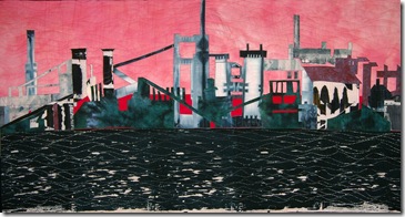
There are many different ways of looking at colour in art work. It’s important first of all to have some idea of what the artist intended by her/his choice of colour but also we should be aware of all the nuances that occur in our own experience of colour. Colour affects us on so many different levels: perceptually, realistically, theoretically, symbolically and emotionally – even historically and culturally.
However, despite this heavy load of meaning, many of us use colour rather “intuitively” – I know I usually have…but now I’m thinking I might be able to improve my intuition a little! I also have tended towards a pragmatic approach using whatever fabric was available, saying to myself – well if what you want is not in the stash, then use something else!! Use your imagination, woman! Not a very thoughtful approach. (but a typically Yorkshire one!). So I need to be thinking about it more and there are fabulous examples in art of extraordinary colorists from which I can learn mightily.
We look at colour in so many different ways. As quiltmakers most of us look at it in a rather pure abstract sense - as in: “ I think I’ll make a blue and white quilt, or a red and green quilt”, before considering any other meaning of a particular colour. I know I did that for a long time; my first few quilts were all blue and white, and then I went on to other colour schemes, just responding to the color purely in and of itself. I never though: How does red and green feel? Can I explore that? I was afraid that might be too complicated and academic an approach.


and then a black and white one.
It would be interesting to look at your own quilt chronology and see if you did just the same thing! As quilters, pure colour in its most abstract sense is often the starting point.

Of course, in “real life”, colour is used in a much more representational way: the sky is blue, (well sometimes), so blue denotes the sky. If I want to make a landscape piece that was quite literal, I could use the actual colours of the landscape. 
Colour is also very much related to the medium upon which it is placed. In the fiber arts we have lots of possibilities!! It’s lovely to contrast a colour on a transparent fabric like silk organza with the same color used much more opaquely on a tightly woven cotton. And very interesting, though challenging, to take the contrast a step further onto a coarsely woven fabric like linen. I have played with those ideas too; I found after a while it was difficult to make the coarser fabrics engage with the more refined ones!!! But the allure of the transparent silk continues to beckon!! I also have enjoyed comparing colour on a straight weave fabric (I might be using the wrong term here, I’m not a weaver) with a twill fabric that has a slight sheen. That’s something I’m exploring now. Often when I’m dyeing I’ll put ordinary cotton, twill weave and a transparent silk into the same dye bath. The prospects of working those 3 fabrics together into a piece are quite delicious!
One aspect of colour I have not (knowingly) used is the symbolic meaning that is linked with many of them. Black for death, white for brides, red/white/blue or other combinations for patriotism etc. This way of looking at colour would occur more in conceptual pieces and I have seen “conceptual” quiltmakers use colour in this way.
I have, however, used colour in an emotional context. Red for anger, deep purple for sorrow, yellow for cheerfulness and so on. This has happened more when I was in a specific mood and needed to express it by working with the colour that symbolized that mood often unconsciously. I can definitely look back over my quilts and link the colour stories to the emotional events of the time.
So…take a look at your own colour history…is your experience similar to mine? Or are you using colour very differently? I’d love to know!
If you have been, thanks for reading………Elizabeth


3 comments:
Thank you for some very interesting ideas about color. Recently I noticed I was using the same colors, and started to pick another color that would be the focus of my quilt. Now I started a quilt that used 3 shades of one color, using, so far, four colors. I think your idea of trying a quilt focusing on how 2 colors work together is a good one.
Thank you for shining your light on colour; it is fascinating to focus on the influence two colours have on one another.
Very interesting! I have a long way to go in the quilt art thing, but this post has definitely given me lots of food for thought. I like the idea of using the same color on various textures, as in silk organza and another highly textured/woven silk.
thanks!
Post a Comment