Thursday, April 30, 2020

The Purpose of Art


I love this pond in our neighborhood and walk by it every morning...and often in the early evening too when the light is quite different.  
And here's my quilt based on it...


There are positive things about a lock down..you discover all these wonderful gems right under your nose!!  And there isn't much traffic to bother you!
Yesterday (on the back road into Watkinsville for those that want to know!), I saw this wonderful sight........


It's a meadow lying fallow and full of wild flowers.  The yellow is those little bobble headed fellows!! and there were tiny blue flowers intermingled.

My daughter yesterday was asking me the purpose of art  - and my reply was to bring beauty and joy to everyone, to point it out where we might not see it, and to celebrate it.

Dostoevsky wrote:

"...mankind can live without the Englishman, it can live without Germany, it can live only too well without the Russian man, it can live without science, without bread, and it only cannot live without beauty......"


And, if you have been, thanks for reading!  Please comment!! I'd love to know what you think art is for!  Elizabeth


Friday, April 17, 2020

Use value not color in designing your art work!!!

I’ve been thinking more about color …..
Everybody loves color and quiltmakers can’t wait to get to it!  In my workshops (both quilting and watercolor) I try to persuade folk to judge a design by its value pattern, but alas the seduction of the color addiction has folk slavering and shaking – “oh color more color I’m so deprived, when can I get my next fix?!!” 
And color is such a visual feast!   I’m just as bad as everyone else for wanting to gobble it up, for making sure I’ve got the biggest dollops on my plate!! 
The children always ask “but when will we get there?” and the quiltmakers say “when can we use color?” with the same plaintive tone!!
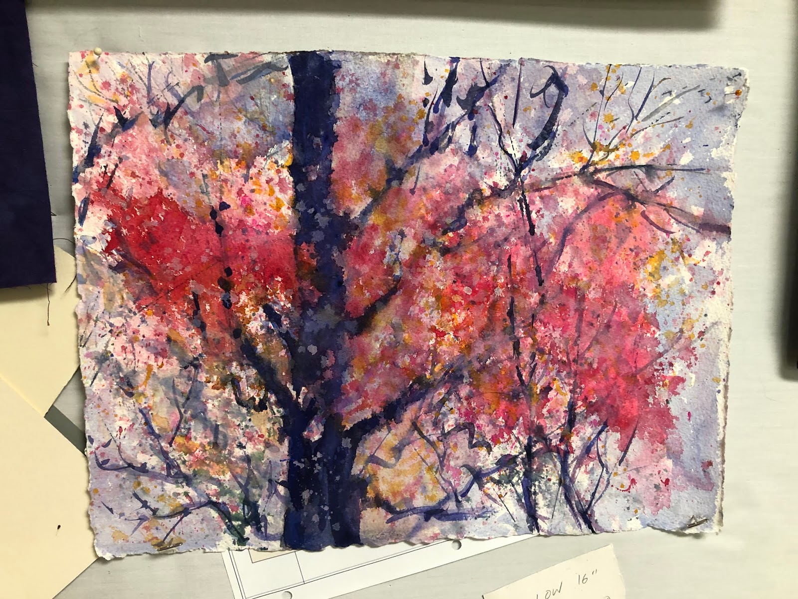
Here is a quilt I made that has a lot of color:
a new day 72
The design for this quilt, however, didn’t have any color in it – it was a black, white and grey value sketch.  So let’s look at this piece desaturated i.e. without any color:
a new day desat  One thing that is evident is that I have quite a range of darks and lights…several of the darks run together to form interesting shapes (though I probably could have used to have done more of that and it would have been stronger).    There are just a few lights – this is because my main theme was the first light of a new day just beginning to catch the buildings…and that fits the theme.  The sky also is a mix of darks and lights just as you see at dawn (I’ve been walking a lot at dawn this summer!  100 days over 90 will do that to you!) which again is very relevant to my theme.
Now how would this quilt have looked had I not had this strong value pattern underpinning it:
a new day reduce contrastWell…it looks like I dropped it in dirty dishwater!! dragged it through the mud…even so it’s rather hard to reduce the contrast in a piece that has a lot of contrast enough to make it clear that all mid tones are a bit dull!!  But I think you get the idea.
So…avoid the mud puddle!!
but what if I was one of those color junkies that uses all saturated color?
well …..look:
a new day too intenseNow, do not tell me you like this!!!  I’ve had to get a pair of sunglasses on to even view the screen!!  too much saturated color definitely spoils the broth, ruins the child and leads to sensory overload!  And I’ve seen plenty of quilts like this!
Very interestingly, reducing the intensity of the color actually isn’t so bad, at least not to my neutral loving Armani clothes desiring self:
a new day lower intensityThere’s something both restful and mysterious about all those beautiful neutrals….but of course I know it wouldn’t sell and probably would never catch the juror’s eye in those tachistoscopic presentations they have to choose work from.   But this image does show, I think, that a good design doesn’t need color to work – it does need value contrast however.   If I subject this to the mud bath, I get:
a new day lower intensity lower contrastIt looks something like what I had to drive through on foggy days before they began to work on clean air.  Of course, this is what the politicians and big business want us to go back to; this is how China is doing so well economically.  However that’s another issue!!  sorry to bring it up, the picture just reminded me.
Another thing to watch out for in designing with color is the balance of color temperature.  It’s best to have a distinctly warm feel, or a distinctly cool one.  My original idea (the first picture above) was that the overall temperature of the piece would be warm, a warm fresh new day.  But what if I was uncertain and had an equal mix of warm and cool colors?
a new day equal tempsDoesn’t that look so weird and unsettling?  it’s looks as if  I’m uncertain about my message.  And the equal balance just doesn’t look “pulled together”.   Part of this too is because once you have an equal number of cool and warm colors, you’ve also probably got more colors than you need – too many colors is far worse than too few. 
Color is a complex dish!!  You need to make decisions regarding value, hue, intensity and temperature to get it just  right.  And now for a cup of tea – I need to get the temperature, the freshness of the water, the steeping time just right!  and it’s got to be in my favorite mug too!!  Think on!
If you have been, thanks for reading!! 
And do comment on your reactions to these variations on a color theme……  Elizabeth

Thursday, April 9, 2020

Time to be creative....


A beautiful morning....and no need to go out! Can't go anyway, also nowhere to go...like so many I'm at home for the duration...so went for a walk around the garden (or yard as it's called in the USA)...to see what inspired me..I love the misty sense of the new leaves on the maples and and gauzy veils of redbud flowers....
I'm also fascination by the way they can obscure the branches to some degree...
it's all shapes and values folks...and color! 
But like a good cook (which alas I'm not!!) Nature puts the colors and shapes together so beautifully to create something magical...


 I love the way the clouds of color drift horizontally.....
and all the different pinks and golds and lavenders....
see how the pink appears like dots on the tree trunk below???


Look and look and look...take a few photos...and into the basement aka "The Studio" when VTBI (visitors to be impressed!) com.....
to try my hand out at painting ...


so...tell me what you think???  I got the composition from the third photo, but most of the colors from the second one...and the idea from the first one!

and...if you have been...thanks for reading!
Love comments!!!  c'mon---you have time today!!!!  Elizabeth

Thursday, April 2, 2020

Love, Plague and Quilting!


We are enduring one of the greatest pandemics of all time...and I keep thinking about a book I read some years ago called Love in the time of Cholera by the Columbian author Marquez.

Here's a good review of it

https://mikefrost.net/love-in-the-time-of-covid-19/

In the story, the heroine has to decide between two men: she makes the pragmatic choice for her mate...but he is a doctor who is devoted to finding a cure for cholera...that's his first love!  and so.....we see how that plays out over time!

And it brings up the point of  WHAT we love as well as WHOM we love!
Right now, many of us are focussed on very dreary stuff - all that sanitization for example....our house has never been so clean!! Which is not a bad thing really. (I think!).

Also there's an awful tendency to stay glued to the internet or cable news for the latest disaster number...but actually - once you have the best game plan at hand i.e. staying home with sufficient basic staples in the cupboard to keep you going - it would be healthier to switch off the dire news.

There are good things to be learned, and practiced.   In my former life - of 3 weeks ago (!) I was racing around town, socializing, teaching classes, taking classes, exercising at the Y, checking out various dance opportunities - square - swing -  salsa - ballroom....
going to the library, shopping etc...an endless round of activity.

Now, I'm quietly at home, taking life much more slowly...and realising that I probably didn't need all that rush and bother!

Now I can relax with a book, or some paints or a pile of fabric and the sewing machine....
and it's great!!!  It's time to try out some new ideas...I have taken a lot of classes in the past, and also bought a bunch of DVDs, and I'm reviewing those and thinking where to go next.

 I do miss not having easy access to a teacher for critique/evaluation though.  and also the encouragement of fellow students and artists...

Noting that...I have made a point of being Very Available for critique/evaluation/coaching etc to my online students at academyofquilting.com
Take a class with me, and you can ask me a question any time, show me your work and we can discuss your next steps.  And that feels good.  For you and for me.  And that's what my doctors and my dear pedagogue are doing...
And there are lots of other classes on that site, and many other sites on the 'net.  Think on!

We actually can enjoy our various beloved activities in the time of the plague.....and that will help us get through.

And, if you have been, thanks for reading!!
Please add your thoughts in the comments....I will reply!!!

Elizabeth