I’ve been doing some exercises in value studies to try to improve my composition skills. If you have a strong composition worked out ahead of time, much of the work of making the quilt is done. When you’ve made a few quilts, it’s not hard to figure out construction, quilting and finishing – after all that really is the busy work. The secret of success is that strong composition. I know many people compose their pieces on the design wall but I find all that getting up and down with different bits of fabric – different shapes, colours, textures, values etc – to be extremely arduous! and frustrating!!
“ Oh no! I tried 20 pieces of fabric here and NOT ONE looked right!”
Have you been there? I know I have!
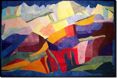
So what I’ve been doing is taking some of the photographs I took in Scotland last month and working out interesting value studies. I don’t know if I’m going to start (or actually continue) a landscape series yet – it’s not a subject I tackle very often…though I have made a few:
Landscapes do offer broad sweeps of values and it makes it easier to assess the values underneath, unlike the industrial or building pieces.
Here is the underlying value pattern of this piece: As you can see I have a large light area at the top with a rather boring straight line intersects with the middle values on the right. With hindsight this piece would have been more interesting had I made that line more varied.
When you examine the basic values (light, medium, dark) of a piece the work will be stronger if:
there is an unequal amount of light, medium and dark value
the shapes of the light, medium and dark areas are varied
the shapes have interesting edges.
It’s also good to have the most contrast between values in the focal area of the quilt – because such high contrast will draw the eye.
Let’s look at another landscape piece I made: and the underlying value pattern:
Here I think the straight line is even more evident, especially as that is one of the highest points of contrast. On the other hand, I do have a much better proportion of values: mainly mid values with a moderate amount of dark and a small amount of light.
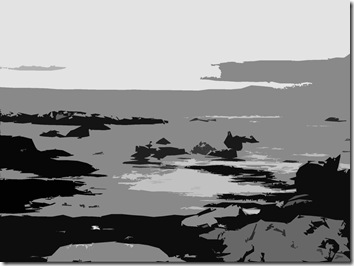
Now to look at a photograph and to consider the value pattern BEFORE I start work!
Several possible improvements are immediately evident: the sky is a big rectangular chunk of pale (apart from that one cloud) – so I think it would be good to deepen the value of the clouds and get more interest into the top portion. Also it would be good to increase the size of the distant island and maybe deepen its value too. Not much, just enough to see it as different from the sea. There is a nice strip of light sea between the main light sea area and the sky that leads your eye out and it would be important to preserve that. The round chunk in the foreground is not very interesting and it could be omitted, or given a bit more life. The high contrast of the sea birds forms a very nice focal point.
I’m going to keep on practicing!!! the program I’m using by the way to pull out the values is Photoshop, but it’s important to learn to do it by eye, so before I Photoshop the photograph, I do a rough value sketch to see if I’m getting it right. Then I can get immediate feedback from the computer. Practice plus feedback is the best way to learn.
I’m also very happy to announce that I’ll be teaching a two week class at Penland next year (June 27-July9)…..and they have computers loaded with Photoshop available for students !! This is brilliant!!! That will give so many more compositional possibilities.
If you have been, thanks for reading! Elizabeth


2 comments:
Excellent! Thank you! I think working initially with only three values simplifies the process then one can add in more variety as needed. The coordination of your values and the original photo is very helpful!
Lately, I've found deciding on the values in a piece overwhelming. Even when I do value sketches, I find it hard to picture it in my minds eye how it will eventually look on the wall. Maybe I should try value mock ups.
Post a Comment