Monday, March 30, 2009

Not just Change...

There’s a wonderful quote from Emily Carr, the Canadian painter of the wild forests of Western Canada, that is something to hold in mind while making a piece:

"The subject means little. The arrangement, the design, colour, shape, depth, light, space, mood, movement, balance, not one or all of these fills the bill. There is something additional, a breath that draws your breath into its breathing, a heartbeat that pounds on yours, a recognition of the oneness of all things."

What is the difference between a quilt that simply portrays a pastoral scene, or a still life or a skyscraper or a pattern of squares and triangles and one that brings those things to life?

As Robert Genn says:
“Don't .. leave your (design)to the vagaries of nature or the limitations of your initial conception--but rather to your own higher nature and finer sensibilities.”

Get out your quilting books…catalogues from major shows – and find the pieces where there is more there than a simple portrayal of the subject matter. What have they done? What elements have been added, changed, or subtracted? (let me know if you think there’s another verb I should have in this sentence!)


When I stood under the Cement Works recently to take photographs, I was struck by their rusting height, how abandoned and dusty they were and the repetition of shapes. There was also a sort of old lady elegance to the site. To achieve a feeling of more height, I can make the shapes taller and narrower, and emphasize their curvature at the top. I can utilize a very vertical design structure to the piece rather than a horizontal, curving or circular one.


I can take the shapes that I find the most interesting and repeat them more often than they occurred in reality, and drop out those shapes and lines that were less intriguing, or only occurred rarely. I can choose the many colours of dust: cream, sand, brown, grey, dusty pink etc to emphasize the dustiness, make the dust palpable, soft and inviting!

I can bring out the rustiness by pulling out the contrast of the markings on the various surfaces.The shapes are crowded together with gantries towering above them connecting one side of the plant to the other…can this be emphasized by slightly changing height and placement? of course….let’s move a few of these things around!

People may say “but it’s not like that in Real Life”! but the quilt, (I hope)won’t be about real life, I could just give them a copy of the photograph for Real Life, or the address for that matter……. The quilt (and possibly quilts!) will be about what I saw, what I felt, what I thought about when looking at it and similar structures – I want to convey this by subtract, add and change. And now I’d better get down to it!!

Next post I’ll write about the blocking out process.
So, if you have been, thanks for reading! Elizabeth

Friday, March 27, 2009

Reading, surfing, thinking……

I like to spend the first half hour or so of the day improving my art education.  While it would be lovely to go back in time, be young  and full of energy and at an amazing art school, I don’t think any of those are likely to happen!  However, I have always learned better by reading, making notes, thinking, explaining what I’ve read to others..than by sitting in a lecture hall doodling and daydreaming.

My favorite magazine for quilt artists is Art in America – I really think one’s  imagination is much freer looking at work in mediums  other than quilts,  AinA rarely show quilts or even fiber art (sadly, but maybe one day!) .  My favorite online newsletter is Robert Genn (you can sign up for this and it comes twice a week in an email – 3 snappy paragraphs that may be irrelevant – delete! – or may set you on trail across the internet – heartily recommended).  Today Genn’s  newsletter (Painter’s Keys) was about Virgil Elliottt who wrote The Oil Painter’s Bible – available from your local library. (Support libraries!).  So, you’re thinking “oil painting?! what’s that got to do with quilting?”   But the book is largely about art as a whole, how we see what we see, how great painters are able to engage us so that we will continue to be intrigued by their work for hundreds of years.  You can always skip the chapters on oil painting brushes and so on!   I read again a section on the illusion of depth in two dimensional work.  In almost every workshop I teach, someone asks me about achieving depth.   Elliott sums up the techniques neatly into geometric perspective (developing a horizon or eye line and relating other lines to it) , atmospheric perspective – the effect of light+atmosphere on objects as they are at greater distances from us and selective focus.   While he advocates much practice with all of these to the point that the artist is so familiar with them they become intuitive, I think that  even a little understanding is sufficient to introduce depth into a piece.  As well as the effects of atmosphere and light,  using detail and high contrast versus a blurred, soft focus, low intensity blending of colour can indicate depth and areas of interest.

Thinking about selective focus, I wondered how one might use hard and soft edges in quilts.  Obviously people who paint whole cloth can just utilize the lessons straight from painters.  For those of us who piece or applique (whether by stitching or that other method!), I think  we could “lose” the edges by using more muted colours or, as Paula Nadelstern does, use fabric that has the same or similar background colour.  It’s an intriguing possibility and I shall cogitate upon it for my next quilt!  Dominie Nash loses edges by the use of overlays – semi transparent organza or organdy.  Which, interestingly, is exactly how the oil painters do it – with layers of paint, the top layer being transparent.  So we can lift their ideas!!  Talking of Paula Nadelstern, she has the honour of being the first living artist to have a solo show at the Museum of Folk Art in New York City – it opens on April 21st – so do go if you’re in town!!

Back to my morning art education: Art in America always has a long section of reviews; the wonder of the internet is that you can immediately look up any artist who catches your eye to see more work.  Today I was struck by the paintings of Paul Bloodgood  and those  of Gladys Nilsson, both of whom had  shows  reviewed in the February issue.  I rushed to the computer to see more, and then started thinking: what is it I really like about this work?  What has the artist done that is pulling me in?  why do I respond to these more than to the other paintings who were reviewed this month?  I have some ideas….but really need a cup of tea for more intense cogitation….so, if you have been, thanks for reading, I’m off to get the kettle on!    Elizabeth

Wednesday, March 25, 2009

Elements and Principles: the design plan, determining your objectives.


There is a tired old discussion that still seems to raise its hoary head amongst those who have nothing better to talk about: whether certain media (or mediums as they say now, which always makes me think of spiritualists – and I don’t know about you but there’s no way I’m making something out of slime!! (as in ectoplasm!)). (Sorry! My knight’s move thinking got the better of me again!) These hoary heads argue whether certain media should be considered “art” or “craft”. For those of us striving to make the best work we can, to communicate our ideas as clearly and richly as possibly in the medium, we know that what we’re doing is both art and craft. We’re making original work as artistically as possible and with the best craftsmanship we can. It should be both!

I was listening to a talk by Bruce Hoffman the other day where he appeared to draw a line between “fine” art and “decorative” art which I think makes a start in placing art quilts, but it’s not the whole story. I remember being in a discussion lead by New York critic Janet Koplos – she was asked why art quilts just weren’t accepted by the galleries in New York.  She replied by observing that while many art quilters might feel they were unfairly excluded from the mainstream of contemporary art, whether or not they did work that would be accepted depended on what their objectives were. That the art work currently desired by the NYC art world had very different objectives – at present being concerned with art whose main goal is surprise, things turned around, made from unlikely materials, even shocking, startling, different. These are not the objectives of your average art quilter! It’s not that one type of reason for making art is good or better than another – it’s just different.

I like the categorization system (if one is needed – and as human beings we do like to group and predict) outlined by Feldman (I’m sorry I can’t find a url for him). It is more detailed but less hierarchical than the old court case of Art v. Craft which implies a winner and a loser. He described 8 different kinds of designed work: in alphabetical order:

Abstract: some designs are “abstracted” from reality. This can be completely – bearing no relation to reality whatsoever – and that’s probably very rare. More likely there has been some initial visual reference. The work of Ricardo Mazal demonstrates this clearly: he took a photograph of a few branches, then gradually simplified and simplified the image, cropping in closely, dropping out natural references to the point where the image becomes unrecognizable and finally making a monoprint based on the simplified photograph:  The book about his work: From Abstraction to Reality is listed on Amazon.

IMG

Conceptual: where it is the idea or concept that is conveyed that is the most important – over and above any concerns about beauty, craftsmanship, particular medium etc.

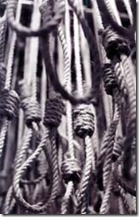
nooseLR A good example would be the 2004 exhibit 552 Georgians: A Memorial, created by John English. This was an installation of 552 individual hanging nooses representing Georgians lynched between 1880 and 1930 accompanied by an audio track listing their names.

 
“While a single noose has long been a symbol of terrorism, this assemblage of 552 takes on iconic status,” said English. “Only by acknowledging the grim reality of our collective history can we continue the process of healing and reconciliation between the races.”


decorative: formal design where the elements (line, shape, value, color, texture) are arranged creatively.

Descriptive or realistic: documenting one’s visual world

emotive: to evoke a mood (Picasso’s Guernica painting of horror and outrage)

narrative: to tell a story, send a message (e.g. Cave paintings – the hunt, religious paintings, the wonderful tapestries in the Cloisters museum in NYC).

utilitarian: a practical function, like the design of a computer or salt and pepper pots

Surrealistic: Salvador Dali and many others.

Obviously there is overlap between these types of design – they are not true categories in the sense that they exclude the other types…but I think it’s helpful to consider what you’re trying to do at the outset, and which type of communication is most important.

The success of the design lies in how well it achieves its objectives.

And, as for me?

cityofmistshp  My reasons for making work vary: In my quilt City of Mists, I definitely wanted to evoke that soft melancholy, tender mood that has a whisper of hope that you feel on one of those flat misty days – literally feel!


hours1pm In a short series (I may revisit!) about times of day, I was interested in more of a narrative mood conveying the story of my day:


In many pieces my aim is a combination of descriptive, decorative and conceptual in that I am describing what I see, in a creative formal arrangement of elements with, at the same time, a specific formal message implied. This is especially true in the latest Industrial Landscape series. My foremost aim is to make work that anyone would want to look at for a long time in their home, office, or waiting room; work that is both simple and complex, elegant and earthy, intelligent, meaningful and easy to understand. Phew!!!

And, if you have been, thanks for reading!!

Elizabeth

Monday, March 23, 2009

An interesting day for the industrially minded

And here I was wondering where the next inspiration would come from!

I noticed in yesterday’s paper that there was to be an “artists’ panel” in an alternative gallery downtown (Athica).  The gallery is located by the old cement works – what inspiration!!!!  white against blue…I think I got some interesting photographs – I took a lot (per my advice yesterday!)…and will spend today sketching out various elements, combining things, omitting things and trying to convey the dusty feel, the complicated pipes and gantries, the rusty chutes hanging over open air, the desolate rail cars and tanks, the peeling paint….. and look at those crinkly roofs!!!

IMG_1164 IMG_1166 IMG_1170

There are so many interesting textures, and a lot of colour.   But talking about colour…in the gallery (when I could finally drag myself away from the cement works!)  I was totally seduced by some gorgeous paintings of abandoned industrial interiors by Morgan Craig of Philadelphia.

Do go and visit his site – here’s a quick snap of  my favorite:

IMG_1177

His colours are both tender and sumptuous; the paintings are full of light and atmosphere.

He talked about wanting to paint the all the memories of these old structures so that they were as evocative as Proust’s famous Madeleine!

As well as showing the beauty of old industrial buildings, and their memories, he is fascinated by the way Mother Nature (She Almighty) is gradually reclaiming the territory.    They are, he said, the “modern sublimity”.

He also told us that Philadelphia is currently allowing its heritage of historic industrial buildings to be destroyed while at the same time  fabricating a much more sanitized children’s storybook history.  

It’s so inspiring to see accomplished fabulous art made with similar goals and ideas to one’s own…there is a way up this mountain!!!

and, if you have been, thanks for reading!!
Elizabeth

Sunday, March 22, 2009

Between Quilts/ Working from photographs

And now I’m in that limbo between quilts…sometimes they’re just falling on top of one another, overlapping so there’s always something to work on ……..but then there comes a point when everything gets finished at once and there’s a stillness.   What is the next piece going to be?  Will I start with a clear cut idea for a shape?  that’s frequently a starting point for me.  Another possible place is a particular colour combination.  I’ve been away a few days up in the North Georgia mountains and the colours of the hills – smokey blues, going  to dark green and the deep pink to mulberry of the new leaves coming, plus lots of white flowering pear trees…hmmmm…..seeing a beautiful scene, I’m always tempted to take a lot of photographs, print them out and then start to work.  But…

..you have to be careful when working directly from photographs…..  The temptation is to go in with a literal translation but there are so many problems with this.  The camera doesn’t see things like we do – it has one eye, and most of us are blessed with two.  Images are flattened.  The effects of light are changed and the glow is lost.  I’m often so disappointed when I look at my photos of some amazing glowing side or back lit effect I saw in the garden and it’s just dull and flat.    The shadows on a photo are much darker and often without  the many subtle colours – and the camera’s eye is so Overinclusive!!! too many meaningless details!

In my workshops I encourage people to bring photographs as a reference or starting point. From this start they develop sketches, simplifying content, emphasizing what was important about the experience, pushing the colour, blurring the surroundings, moving elements that either overlap too much or are not connected at all. 

As I look at a photograph  I ask myself attracted me to this image?  what lines, shapes etc in the photograph support that first impression, and what is irrelevant or weird and should be omitted?  Is there anything that should be repeated?

I like to print the photo in black and white so I can assess the value pattern – and usually adjust it.  I also like to invert the value pattern and see if that is more interesting!  You can get some really surreal effects inverting colours  as well– that’s a lot of fun on a grey day!

Artists have worked from photographs since cameras were first invented.  I was reading in Gurney Journey (an excellent blog – see my links) – that art historians have discovered that nearly half of all the photographs taken in Paris in the late 19th century were commissioned by artists for figure studies.

James Gurney suggests making a quick sketch – however rough – of what you remembered as being important and memorable in the scene before you even look at the photo – that way you’re not so influenced by the camera’s memory which can overwhelm your own.  Remember those pictures from childhood where you can’t remember if it’s the event itself you recall, or just the repeated viewing of the pictures by family members?

He also suggests that having mined the photo for the nuggets you need, that you put it away and continue to work from your own memory.

It’s a good idea too to have several photos of the same scene, capturing different aspects – you can put all of those into one quilt even though the camera can’t capture them all in one frame.

Here’s some examples – hopefully I followed my  advice above!!!  You’re free to comment!

lendalbridgesq lendalbridge OLYMPUS DIGITAL CAMERA

Above, the original photo, taken from the bar (Roman fortification)walls in York, UK,  a long time ago (old photos often stick in my memory)…next Lendal Bridge 60 x 60, then a second quilt Museum St 35 x 54. You can see how I’ve continued to simplify elements and sharpen the colour contrast in the second piece.

westcliffwhitby theredgate westcliffsteps

Above an old photo which we took in Whitby, Yorkshire – one of my favourite spots of one of the narrow ginnels that go up the cliffs….in the first quilt, The Red Gate, my area of interest was the red gate…which as you can see I repeated.  In the second piece, West Cliff Steps I played with the light, putting one side into deeper shadow, and the other with a bright glow.

It is fascinating to work from photographs, but as in everything – don’t be too literal!!!

And, if you have been, thanks for reading.

Elizabeth

Wednesday, March 18, 2009

Elements and Principles: Unity, harmony

In previous blogs I’ve discussed the elements  we use in making a quilt design – the shapes, the values, the colours and textures.  Now I’d like to introduce some of the ways in which we can organize these elements into a pleasing and interesting arrangement.  One of the most basic principles is that of  Unity: harmony in the elements!   This was the second thing I tended to forget when I first began to make up my own quilt designs. 

The first thing I forgot was to have some variety, or tension.  I wrote  about that on Feb 27 in “The Art of Unpredictability”.   I’m pretty good at forgetting things, by the way!!  So, to begin with my designs were Really Boring because I would draw out a design for a little block and then repeat it without change across a rigid grid, making sure I had enough fabric so I could use the same stuff in every block!!  I look back now …and am amazed -  “what was I thinking?”.   I remember clearly being sick a lot as a child and examining the wallpaper pattern in the bedroom desperately looking for a place where they’d changed it a little bit – a red flower instead of a blue one (of course they hadn’t!)…..I even made a few small changes myself…not enough for The Parents to notice, of course!  And then, here am I a Grown Up  making boring wallpaper myself!

But then…when I stopped being boring, I launched straight into chaos.  too many elements, too mixed up.  Thankfully I didn’t take any photographs of the worst efforts..but here’s a later worst effort:

IMG_1159

As you can see, there are a number of mistakes…but the one I’d like you to focus on is how I quite arbitrarily seem to change those circling elements, so I have 4 different things spiraling around.  Go and look at nature!  She Almighty usually gets it right – as a sea shell, or snail or tree rings circle round, they don’t suddenly change shape, colour, texture, value balance!!!  I do like the last two strips by the way, there is some relationship to each other both in tone and in meaning (the tiny pictures on the third strip are of windows)….those two alone would have been enough.

It’s essential for a good design to have the separate sections of the piece strongly related to one another.  I needed to show a lot more restraint!  (in many ways!)


Since then I have learned that Unity is achieved by planning ahead which the shapes, colours etc  will be the dominant ones.  Everything should go together e.g. a squirrel’s tail on a bulldog would look weird..or a bar of a Souza march in the middle of a Chopin nocturne.   Lines, value, color, texture, shape or direction that is not repeated, echoed, integrated elsewhere in the piece can compromise its unity.

ymcollage2

Here’s a second quilt, done much later.  Now in this one I have a number of different elements but because I’ve used that strong vertical yellow as a dominant element it helps to pull all other  sections together.

One shape, value, color temperature or texture or direction should predominate – this leads to unity. these can be combined but one must be dominant.   Or put it another way: choosing a dominant design element limits the possibility of chaos.   Unity is, therefore,  achieved via dominance.

barton cityofwillows detail 

In this detail from City of Willows, you can see I’ve a variety of colours and line direction and values, but the shapes repeat, the low intensity of colour repeats and the texture is dominant.


A general theme/structure must be imposed upon parts by the whole. This is true for the whole piece, but also for any subdivisions..it also holds true for each design element.    We know this from any study of nature, and the amazing fractals we can observe.  It’s actually very helpful to look at nature to see how all these design principles/guidelines work so successfully for both beauty and practicality:

I’ve often wondered how people were successful at creating wonderful art quilts when they say they work quite intuitively and don’t plan at all. While, I suspect that many of them are not successful, there are some major exceptions. People whose work I like a whole lot! Nancy Crow, Emily Richardson are two such.

So how do they do it?  I think it’s because they choose a dominant design element right at the outset of the piece, or the series of pieces.   This then leads to repetition which pulls the work together. However, they both love to cut freely and so their shapes vary somewhat – but not too much: unity with variety.

so – take a look!!!   At my quilts, at your quilts, at those of your favorite artists, and above all at Nature!  Observe first the harmony and unity, then look for those little differences that give the variety and interest!

And, if you have been, thanks for reading!!
Elizabeth

Monday, March 16, 2009

Industrial Landscape # 7

I’m happy to say I’ve finished my seventh industrial landscape piece.  It’s fairly small – 24” by 45” and is in a vertical format – unusual for me recently.   I’ve been working on wide and short horizontal views because that’s how I first saw the steel works in Hamilton. 
Sometimes in order to get the picture you want you have to go to considerable lengths!   OLYMPUS DIGITAL CAMERA         I volunteered as “crew” on a sailboat in order to be able to view the steel plant across the water!   Now, while I’ve always wanted to sail, I know nothing about it!!! So I just had to fake it and make sure I kept my head down at the right time, and be quite assiduous about bringing up beers from the cabin when asked to do so!

I’ve now made a series of 7 quilts based on this trip across the lake (by the way we were in a race and came in last!!  but it was so much fun).    I’ve pictured all seven quilts on my website.

Most of the quilts are very horizontal, but I wanted to make a black and white one that was more of a closeup and thought the vertical format more appropriate.  I wanted to contrast the plant buildings with the environment – I’ve done this in the other pieces focusing on the water, but this time I thought more of  local plant life – completely absent as far as I could see from my deck viewpoint!   

I’m not sure what to call the piece – so please advise me!!!  I was thinking of a play on Flora and Fauna and calling it Flora and Ferra (but there’s no such word as ferra to denote iron and steel – though it makes sense to me!!)…..but Flora and Ferra has a nice ring to it.   Another possibility would be Plant Life.  What d’you think?

Here’s the piece:

floraandferra canon pic

And, if you have been, thanks for reading!

Elizabeth