Why are focal points important? It’s because they are a tremendous help in
capturing people attention – a very good reason for having, or at least
considering, using them.
I’m assuming that we want people to look at our work? Even though there are a few artists out in
the desert or closeted in their own homes who make work for reasons other than
viewing , and often brilliant work too, they are rare. Rosie Lee Tompkins was a
prime example of this. For most of us,
we want people to look and be fascinated.
We want to be fascinated ourselves! I’m struggling to learn
watercolor and I can say without a doubt it’s a lot harder than quiltmaking or
piano or square dancing – the other things I’m working on. I’ll paint a picture
or two and if there are no glaring horrors (alas far too many of those), hang
them up on the wall, and see what happens.
Usually they bore me stiff within a very few days. They just look bland and blah. Well, there’s a lot of reasons for that, but
a key one is lack of a focal point, or center of interest area. In fact there’s usually a whole lot of no
interest at all! And I feel that about
many quilts that I see online.
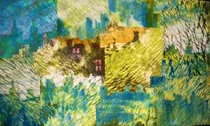
The focal point (also termed center of interest) is a
technical way to provide interest or emphasis in a work of art; it serves to
capture our attention initially and then, hopefully, keep it – as least for a
short while. Usually the focal point is
pretty obvious in a representational work, but can easily be achieved in an
abstract piece too.
Can you have more than one focal point? Indeed yes, but one should be more important
than the others. A more focal focal point, or in the case of the tenor on the
stage a more vocal focal!! (sorry, couldn’t resist!).

As to how to achieve the focal point? There are several
techniques.
I think that contrast
is one of the most important. Contrast
in anything: shape, line, value, color or texture. A big shape among little ones, a jagged line
amongst curved, a very dark value in a light area, a highly saturated color on
a neutral background, a detailed flower amidst soft blurry ones. As human
beings, we are drawn to the one that is different. There’s probably a good survival reason for
this, but we can exploit it to make our work stronger.
Isolation can also be used:
one element is alone, there’s a lone child on one side and a group of kids
in the rest of the photo – where would you look?

Placement is
another possibility – if an element has all other elements pointing towards it,
our eye tends to go to it. The light at
the end of the tunnel. The ball in the
golf game – to which everyone’s gaze is pointed.
Of course, if want you want to communicate “the sameness” of
everything, the unrelieved repetitiveness of it – like some Techno music – then
you can deliberately avoid having a focal point. In a way, then, the absence of a focal point
becomes the focal point. Andy Warhol’s soup cans are often cited as being an
example of this.
And sometimes if there is a lot or overall interest and
variety, as, for example, in a sampler quilt, then our attention will be caught
by the multitude of ideas we have to explore.
A multitude of focal points!
So, if you do have a focal point where should it be? Unless there’s a specific point to be made
with an unusual placement, we’re both used to, and more aware of, a placement
that is just a little ways off the exact middle of the work – in any
direction. Having the focal point right
on the edge of the piece (unless the message is alienation or something like
that) is not as effective in keeping our attention on the whole piece. Having it slap bang in the middle (unless
we’re communicating something about targets, or feeling like a target) tends to
make the work rather static.
Look back at photos of your quilts. Do they have focal point or not? Take a couple that don’t have them and using
software like Photoshop or Gimp, add one in – using contrast, isolation or
placement. In this case, contrast is
probably the easiest to achieve. Print out both versions of the quilt and show
them to a few folk and ask which one is more interesting. Don’t tell them what you’ve done! Just test out the idea that having a focal
point makes an art work more intriguing.
And now, my focal point is a nice cuppa tea!! Off to put the kettle on!!
If you have been, thanks for reading. Elizabeth


5 comments:
Good blog about focal pt. I am thinking that maybe our next master class lesson will be on focal point!
that's a good idea!! aha! but not next month.....
Excellent post! I think I'll look at photos of my work on the computer, probably not as good as full size, but it'll work I think. I've not examined them for focal point. Thank you!
The point you make about altering thing digitally is great. sometimes just taking the photo and looking at it can make you see what a piece needs, because it makes you step back and look at it from a distance. I find that always helps.
By the way, I am loving reading your book!
Yes, I have tried watercolors and it IS alot harder than quilting. There is less control over the outcome unless you are very good.
Post a Comment