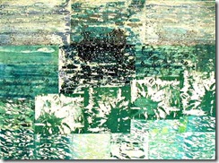
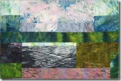
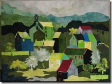
I know a lot of people like to start making quilts just by randomly pulling out interesting fabrics, but I find that a little too haphazard for me, I usually like to know where I’m going!! More or less anyway!! So when I start thinking about which colors I’ll use for the next piece I “label” that thought in my mind as a “scheme” or a “plan” as to which colors I’ll combine for this next piece. I also love arranging things and thinking mathematically about how many possible arrangements there actually are.
If we work from the old 12 pie slice color wheel (and I know Munsell’s 10 slice model (bigger pieces!) is now fashionable but 10 is not such an interesting number as 12 when you come to divide it up!) – eniow going from the traditional wheel d’you realize there are actually 12 analogous schemes (3 adjacent colors) and 6 complementary (2 opposite colors) ones, and that’s not even thinking about monochromatic and split comps and all the rest of it? Some of the combinations are very popular, others you rarely see – so it’s kind of an interesting challenge to look through one’s oeuvre and see which schemes you’ve used and which not.
And, as an aside, talking about the Quilt Pile I just found the Missing Quilt! hooray. I was looking for another one to mail off ( a nibble! a nibble!) and couldn’t find it either! Horrors! Well I can’t have accidentally put TWO quilts into the thrift store pile, I reckoned – so a major overhaul of the whole quilt storage Etagere (yes I know that dates me!!) was required – and lo and behold two of the little bu**ers had descended behind the shelves down underneath and were getting upto lord knows what down there!! Well now I’ve found their hiding place, that’ll be the first place to search for missing persons. No more shenanigans from them!
Getting back to the color schemes: the wheel has 3 primaries (red, yellow, blue), between them 3 secondaries (orange, green, purple) and between each of them another color identified first by its adjacent primary which is then hyphenated with the adjacent secondary color as follows:
1. red 2. red-orange, 3. orange, 4. yellow-orange, 5. yellow, 6. yellow-green, 7. green, 8. blue-green, 9. blue, 10. blue-purple, 11. purple, 12. red-purple. The 12 analogous colour schemes are, of course: 123, 234, 345 and so on.
Don’t know why but I’ve not made many analogous quilts, I think they are a little too smooth and soothing for me. but here’s a nice cozy one: Fire Dreams
red/red-orange/orange
I made that one just thinking about how you look into a log fire and imagine all sorts of interesting ruins that would look like that.
And one of my favorite pieces Farne Islands ….
also is about a soft dreamy sort of mood…on a boat going out to the Farne Islands (a bird sanctuary off the NE coast of England)….just relaxing into the cool sea breeze…
so I see analogous pieces as being more about a mood, a dreamy kind of mood.
By contrast I think the complementary color schemes are much richer, more content, more bite, more opportunity for tension and mystery. There are 6 basic complementary schemes: red and green, red-orange and blue-green, orange and blue, yellow orange and blue-purple, yellow and purple, yellow-green and red-purple. Of course you can always add on a little extra color. In fact when we talk about the color scheme we’re not really talking about Every Single Color in the piece, but rather about the Main colors because in most art projects using color you can always shade a color a little warmer or a little cooler as you work with it which means that you will probably be adding in some of those adjacent shades to the main colors simply to enhance and enrich your piece.
Looking at my quilts I realize that I’ve used the purple and yellow scheme an awful lot: Museum St
Here’s another:
y/m collage 2 (the poor thing never did get a proper name!)
I thought I hadn’t done many in red and green and immediately found three of them!:
Violet and yellow-orange only featured once and the yellow-orange is very dilute, but important in the piece.
Then I came across a blue-green and red-orange one, I’ve always loved the colors in this quilt: What Pretty Smoke:
another favorite combination of mine has been blue/orange:
West Cliff Steps
One combination remaining: red-purple and yellow-green…I had to challenge myself to make this one!

And, if you have been, thanks for reading!! Elizabeth


8 comments:
Thank you for this mini quilt show. Lovely work. I think I need to break out and do something with more red and yellows. I tend to use the cooler colours.
Great information. Thank you.
Yup--I'm stuck in the purple orange green area. So hard to break out of what we're comfortable with. And--loved looking at more of your pieces.
So glad you found your wayward quilts. Also, this is a good color challenge... so many ideas, so little time...
I love playing with color! Having the constraint of a basic palette is a great challenge and often moves me beyond my own thinking, which can get into a rut. It also pushes me to be less literal which I appreciate, since I'm more interested in the shapes of things than their realities. Thank you for an excellent post!
Enjoyed the article but some of your quilt photos are showing up in my IE browser as broken links. I would so like to see the examples that you provided. And can I ask how you did the wavy lines in the last piece? It's a beautiful effect.
so sorry about the broken links on IE, needlescape, I use Mozilla or Safari or Opera and they're okay so I don't know what to suggest. However many of the quilts are on my website somewhere or another!
the wavy lines are arashi shibori
Thanks for writing!!!
Post a Comment