I occasionally teach a workshop called: Extreme Doggie Makeover. I love doing this because there are usually several gems in the group that just need a little extra work to really shine. Rarely is the piece beyond all help – though there have been a few!!! Actually, the main block is more usually in the maker, rather than the quilt. It’s important to be willing to look at the quilt in a new light and to release old expectations or desires to hold onto a certain “precious” fabric or pieced section. Always remember what happened to Gollum and his Precious!!
Here are a few makeover ideas….I’ll revisit this topic in a week or two or so as it’s an interesting one.
Cropping
Very often the quilt has simply “growed too much” and needs pruning so that the main lines and theme can be in greater focus. Take a photo of the quilt, print out several copies, make two L-shaped “borders” and try different ways of cropping. As you discover different ways to reduce the excess fat, trim it off, center the remaining image onto another piece of paper so as to isolate it. Then pin all those possibilities up on the wall and review…..try not to make any judgments until you have them all up at the same time. Remember it’s important to make Visual decisions visually…don’t think you’ll remember what crop A looked like when you’re down to crop D!! do print and cut them all out. Then arrange them in order of how much they interest, entice and please you. At least 3 times I’ve discovered that cutting off all the “foreground” area of a quilt has vastly improved it. (Petergate)
Originally this piece to the left had about 1/3 as much again in the foreground…a beautifully shiboried piece of fabric that took me ages to make! so I was very reluctant to dispense with it….but cutting it off brought the viewer right into the old street and immensely improved the composition.
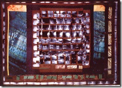
The same thing with the piece below…I’d added way too much other stuff:
So I cropped off all those side sections that had no relationship to what was going on in the middle.
Value
Many pieces don’t work because there isn’t sufficient value contrast. The easiest way to assess this is to photograph the piece and then in Photoshop (Image, Adjustments, Brightness, Contrast) increase the contrast and see if that helps. If you don’t have Photoshop, then take a picture of the piece, photocopy your picture in black and white only…and see if it’s mainly mid gray tones. That’s a clue!! Then try shading some areas, and lightening others. If you have neither Photoshop nor camera (I notice readers of this blog from some very remote areas! – and thank you for reading), then look critically through narrowed eyes at the piece. Do the darks and lights stand out? If not….take some small pieces of very light value and very dark value cloth in the same hues as the quilt…and overlay them in the darker/lighter areas to just punch up the contrast a little.
Overly busy areas
Sometimes the quilt just can’t breathe, you’ve got too much going on everywhere…the viewer is dazzled by the confusion of pattern and image. Are there areas that you could take out, replacing the excessive pattern with either solid, or softly modulated colour? Stay within the quilt’s colour scheme (and I do hope you had one!) and pin over some of the areas that are not important with other fabrics…follow the hues and values dictated, but keep the intensity and texture low.
Distractions
Do your eyes continually go to an odd corner or shape? Something that is not part of the main theme, but intrudes itself annoyingly? Can you shift that element slightly, or tone it down? Try covering it up and see if that improves the piece.
Balance/Symmetry
Is the quilt too symmetrical? Is the focal area slap bang in the middle? Most people are more attracted by a slightly asymmetrical composition. A little tension adds so much interest. Can you add an area to the side of the focal point so as to shift its central position? Or if the trees or other vertical elements are lined up too symmetrically can you move one or two? Or add in another?
I hope I’ve been able to make some useful suggestions and those doggies are leaving the parlour and going straight to the nearest show!
And, if you have been, thanks for reading!! Elizabeth


1 comment:
Valuable advice as ever - I find your blog very educational!
I was once told that if you can't make a piece work, take out your favourite bit - and it often works.
Post a Comment